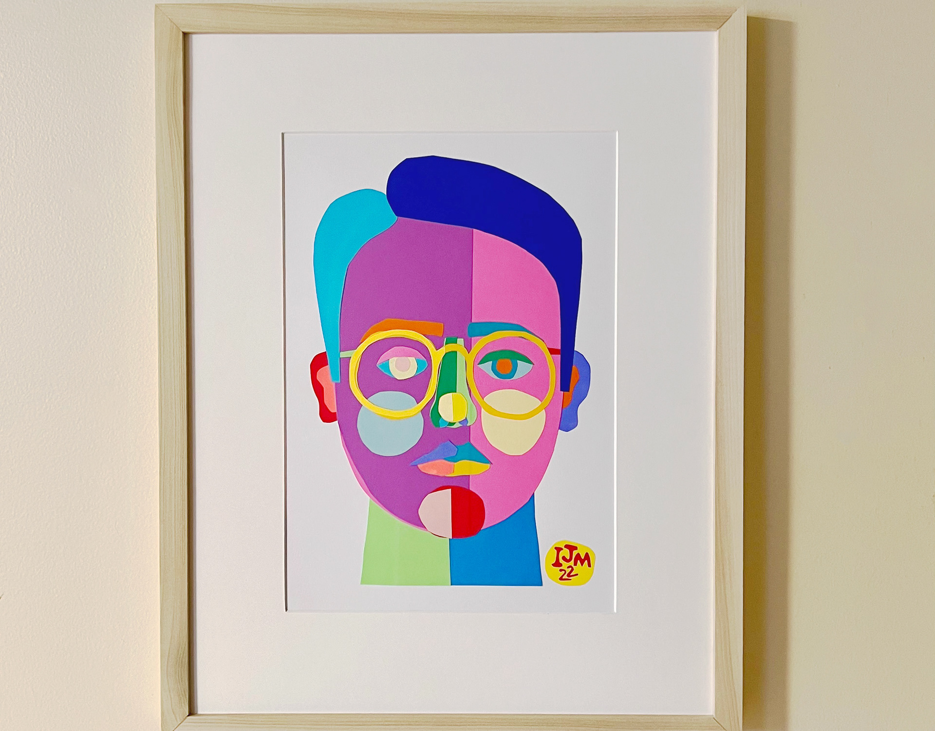
Marty's Movies & More
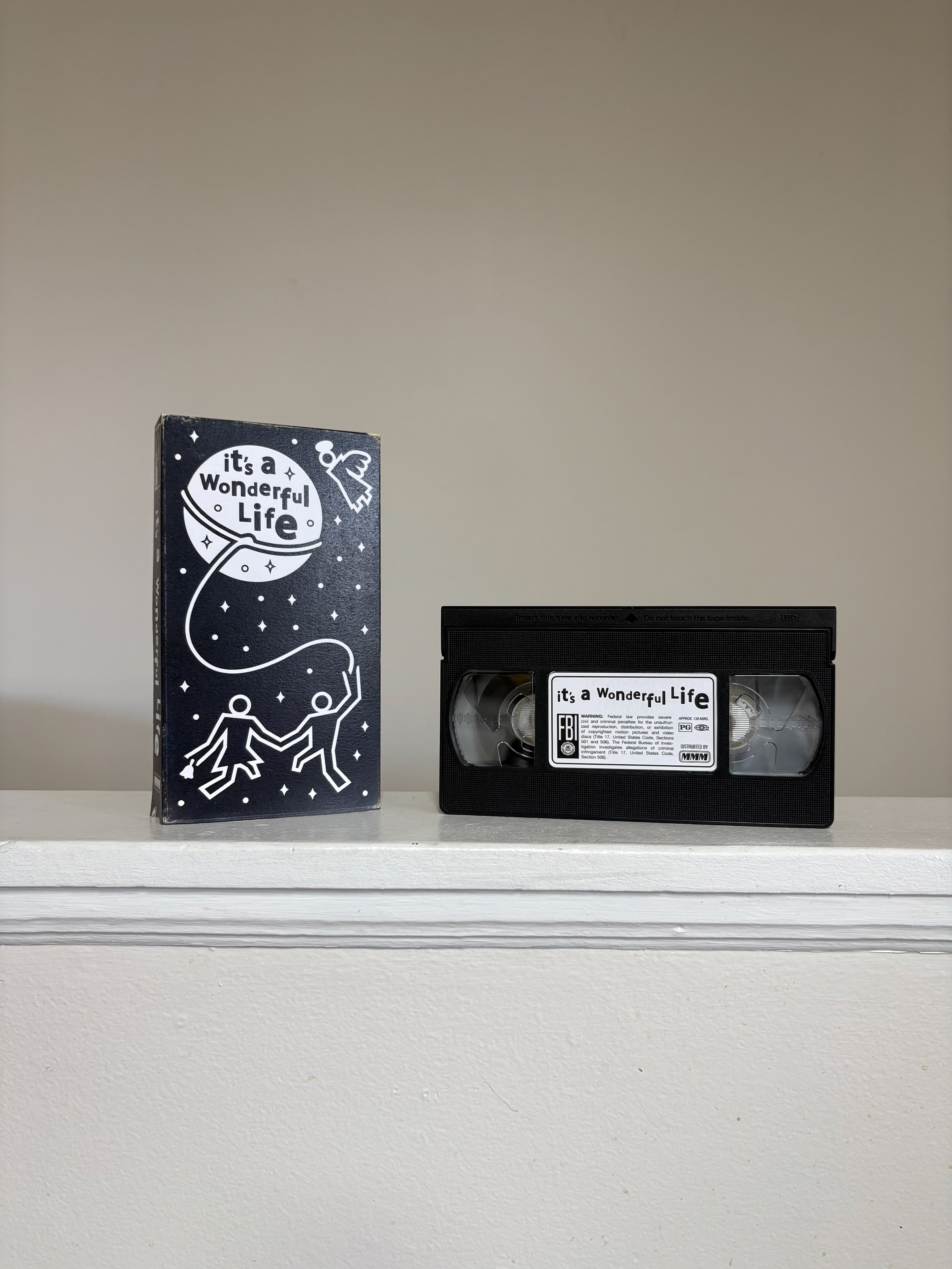
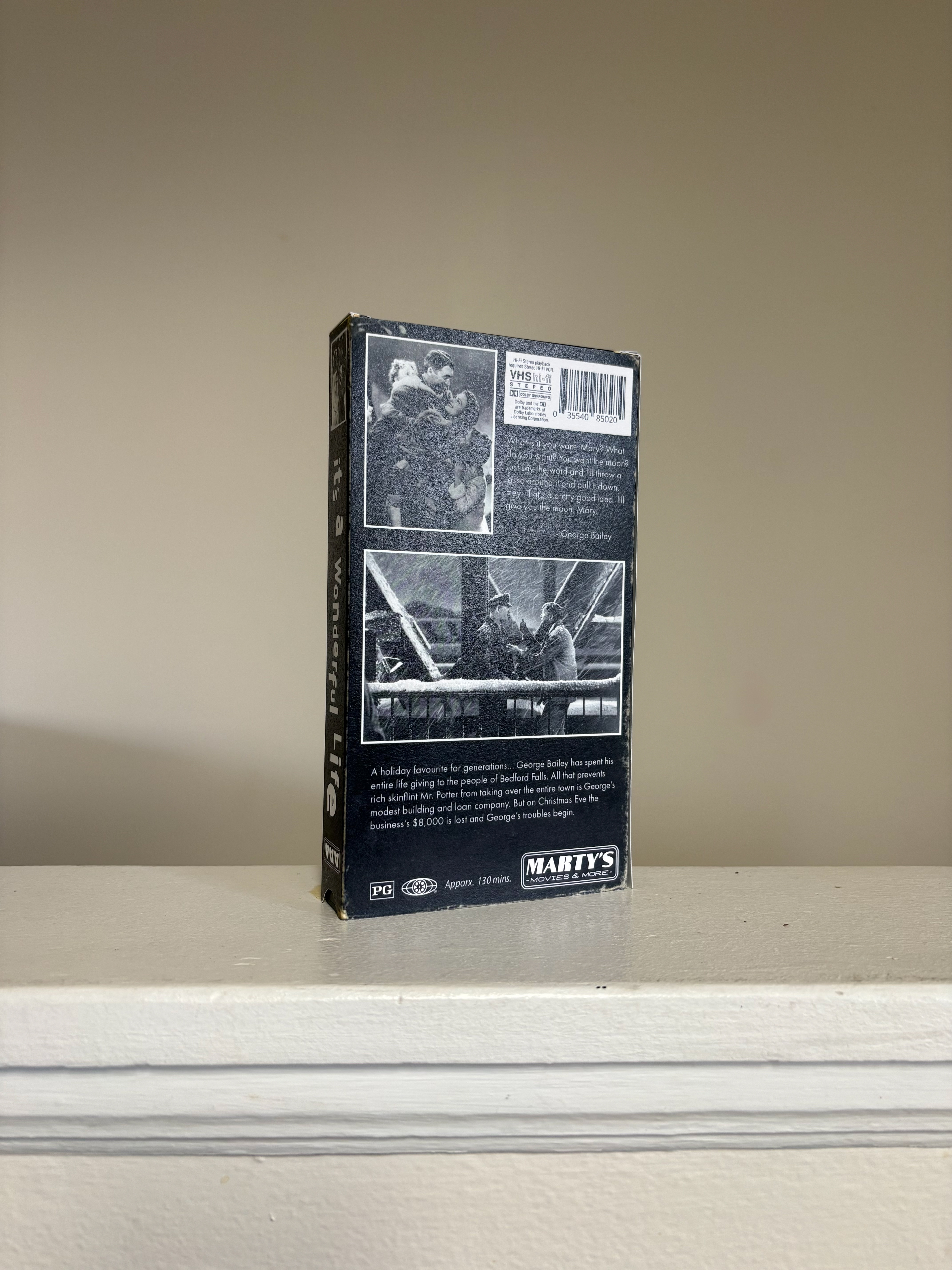
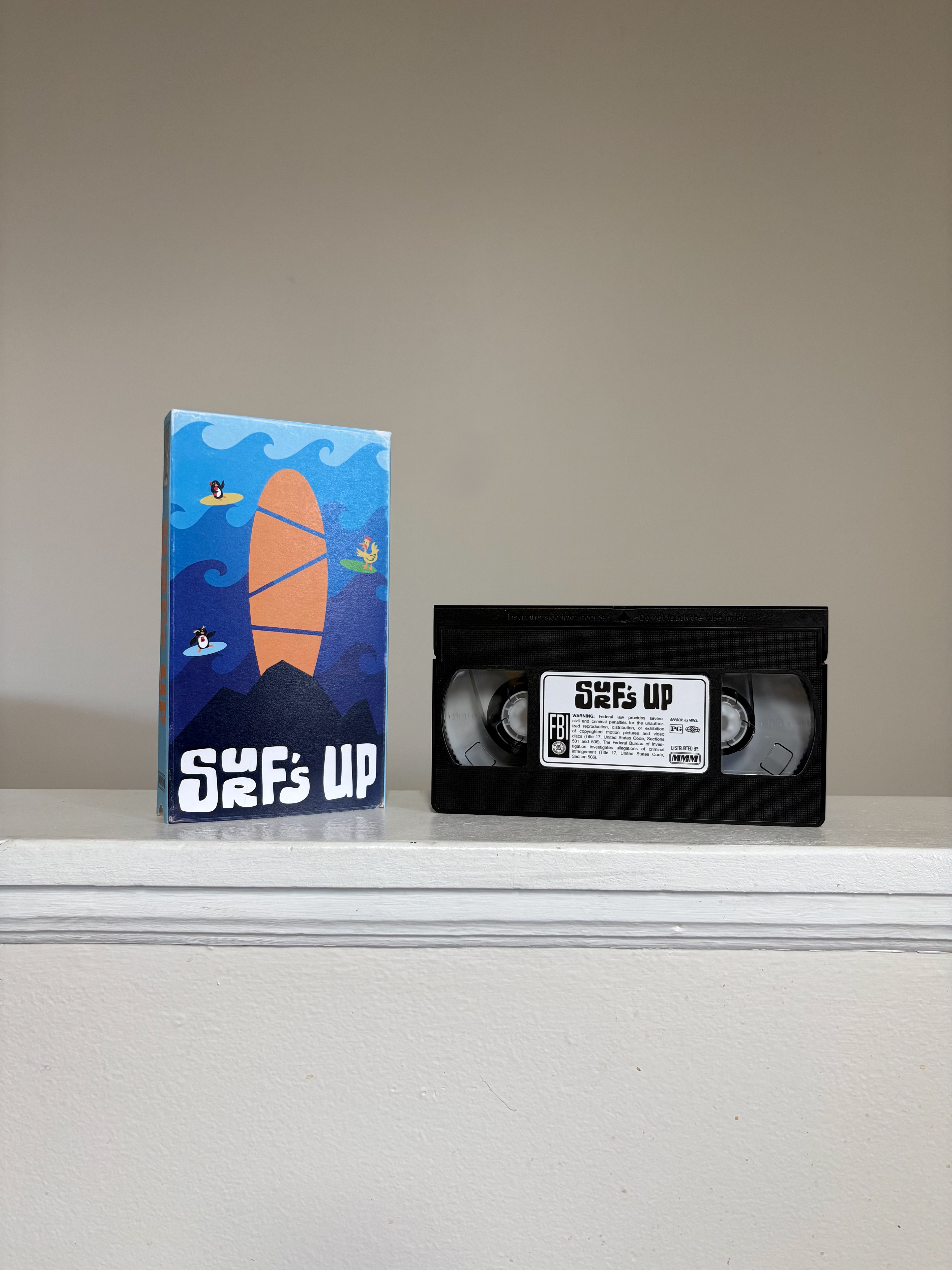
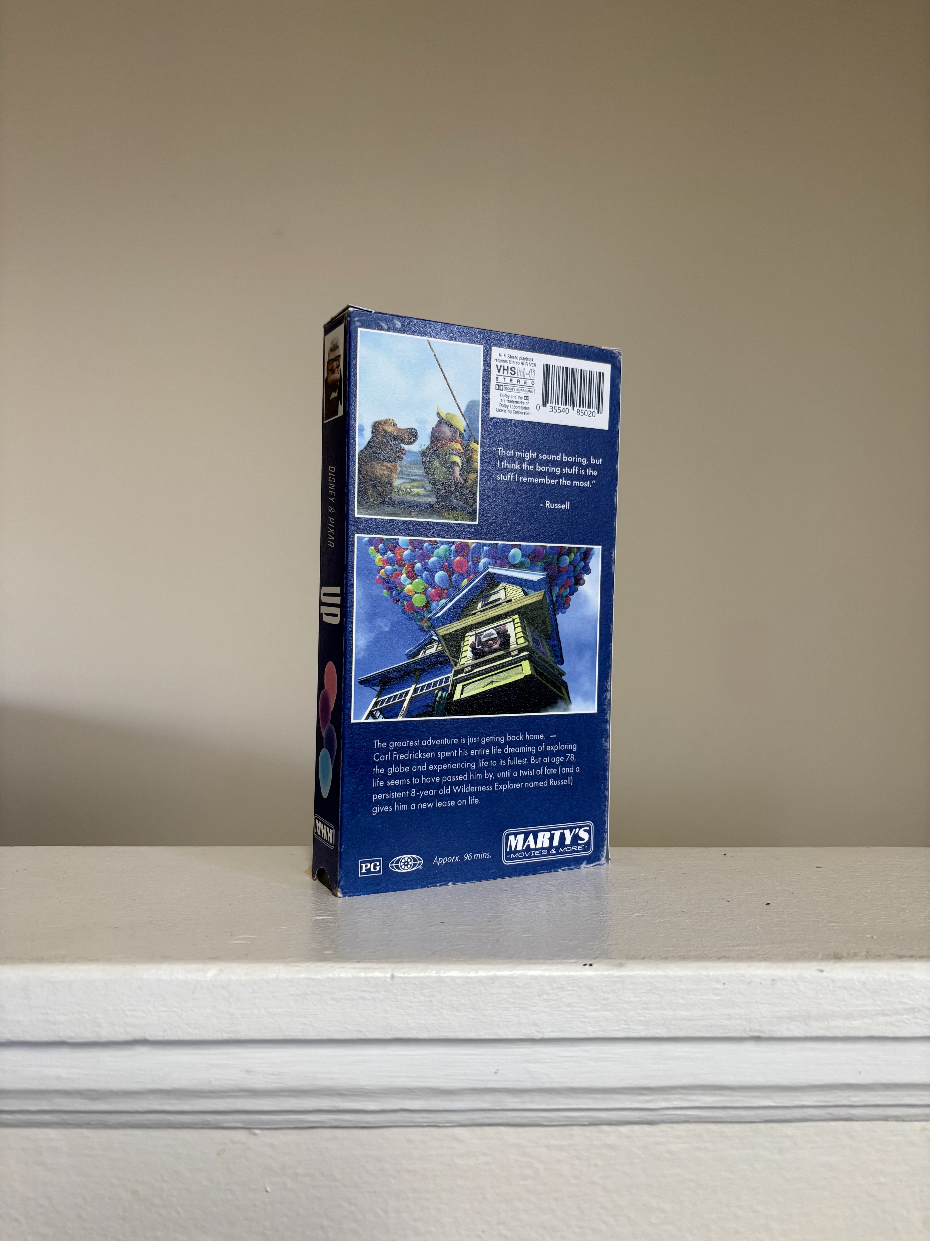
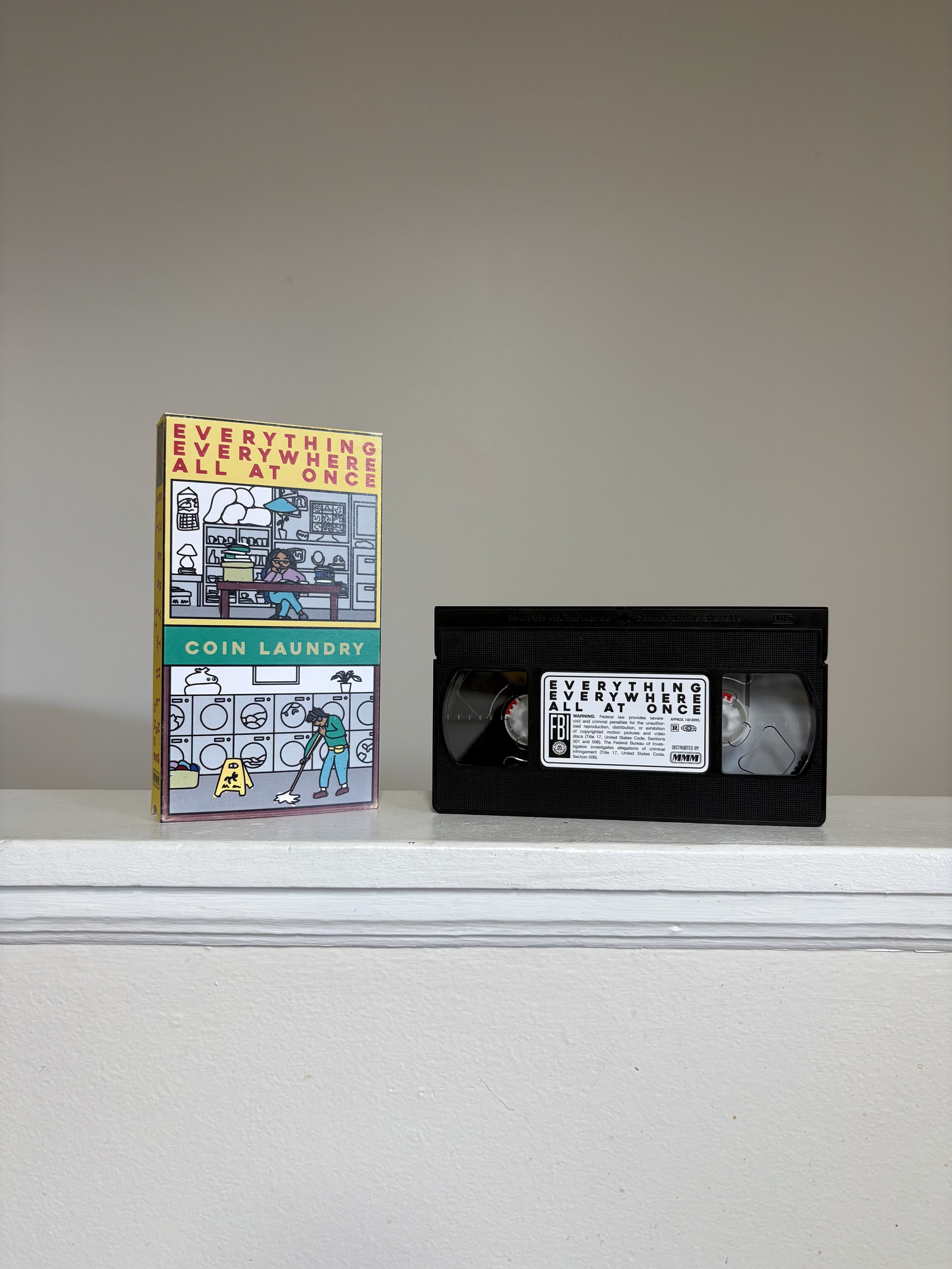
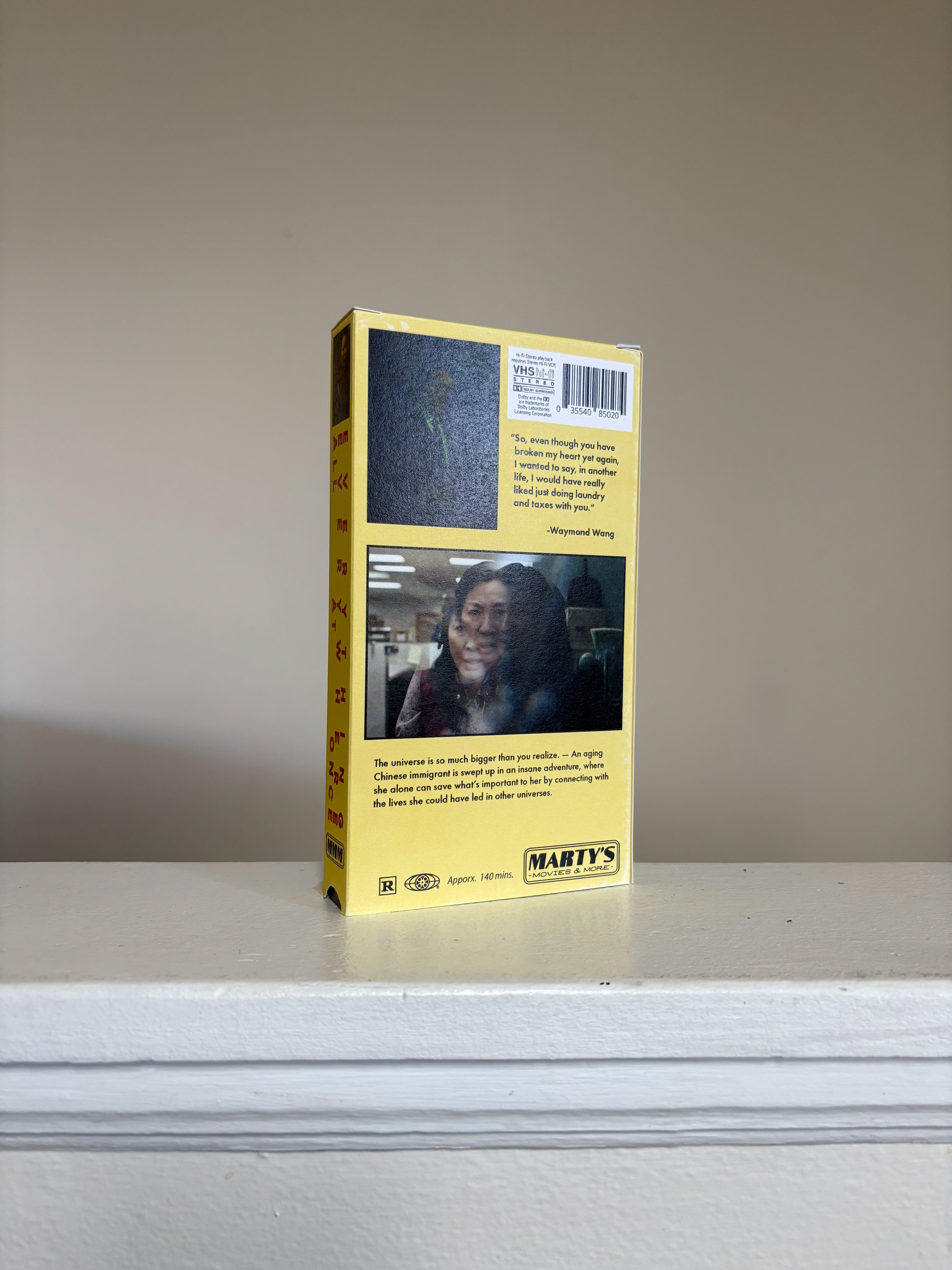
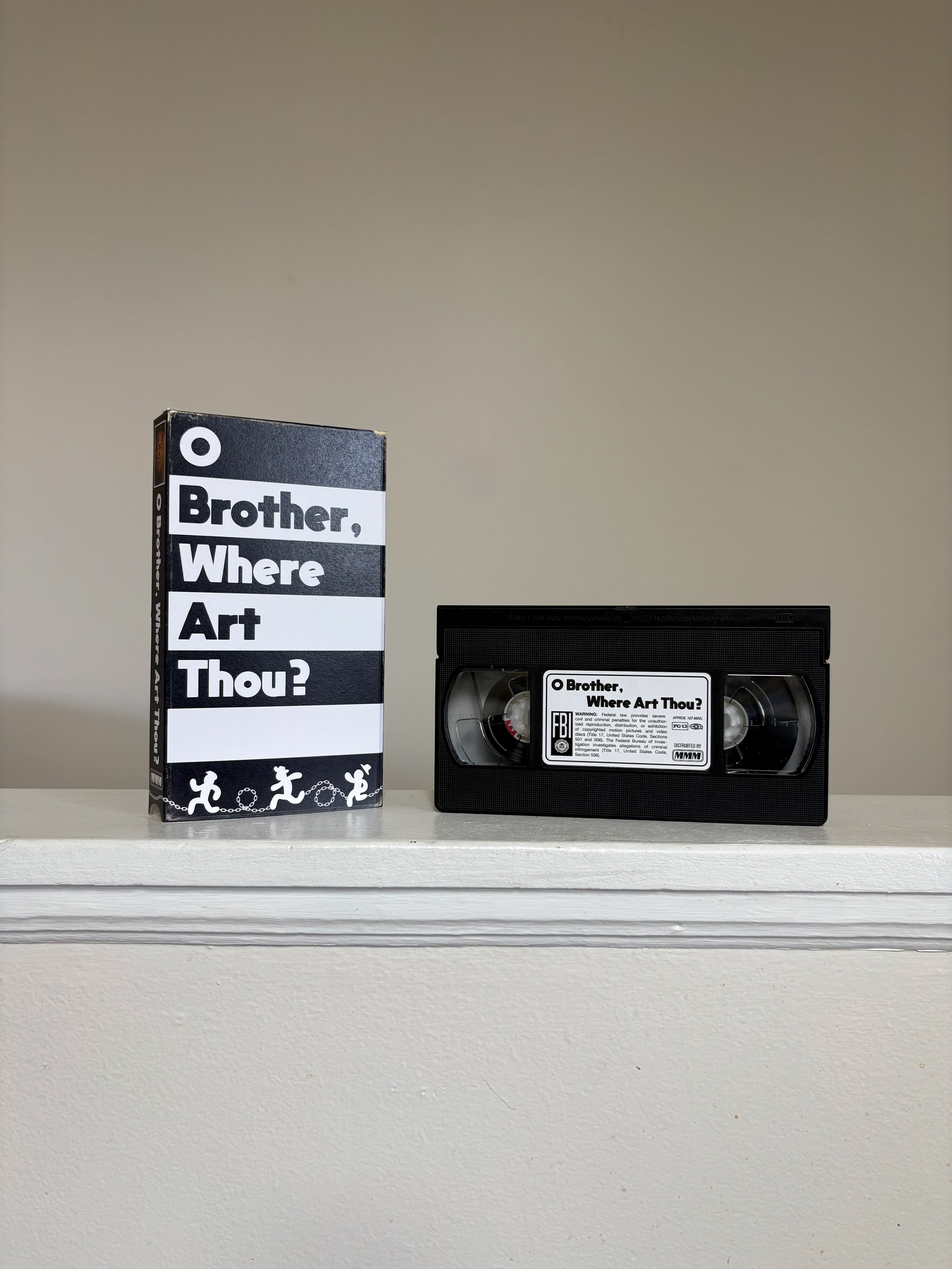
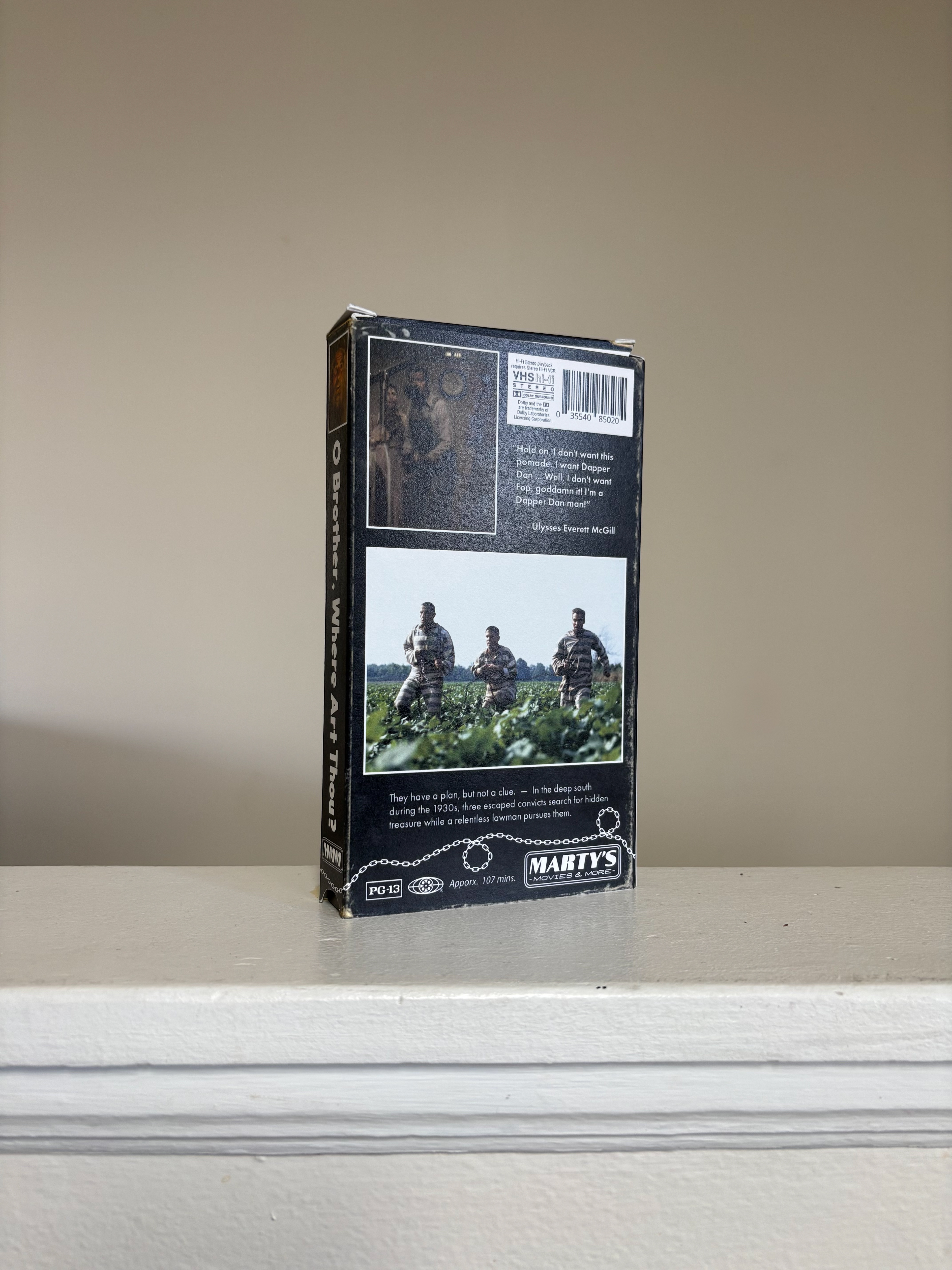
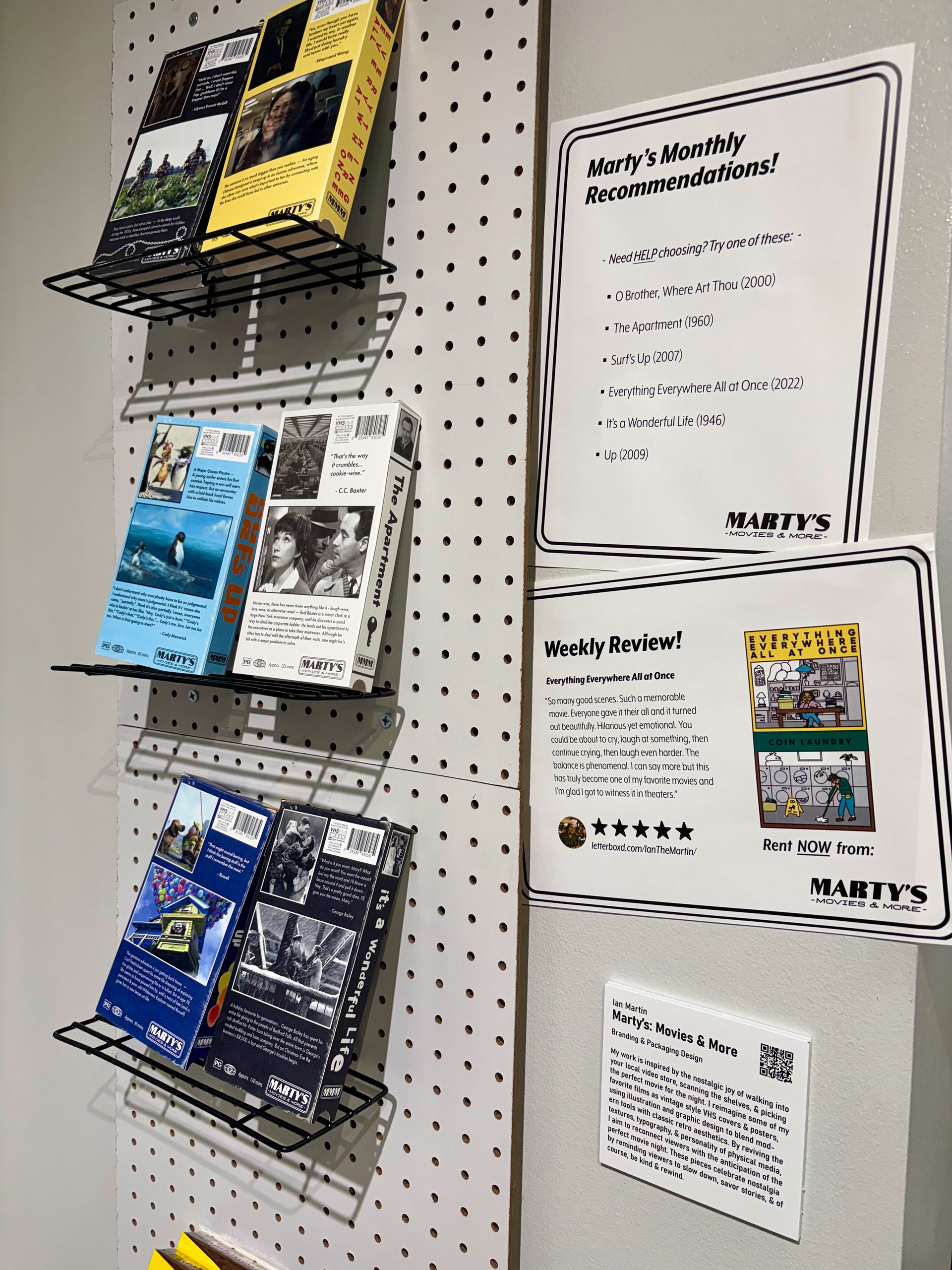
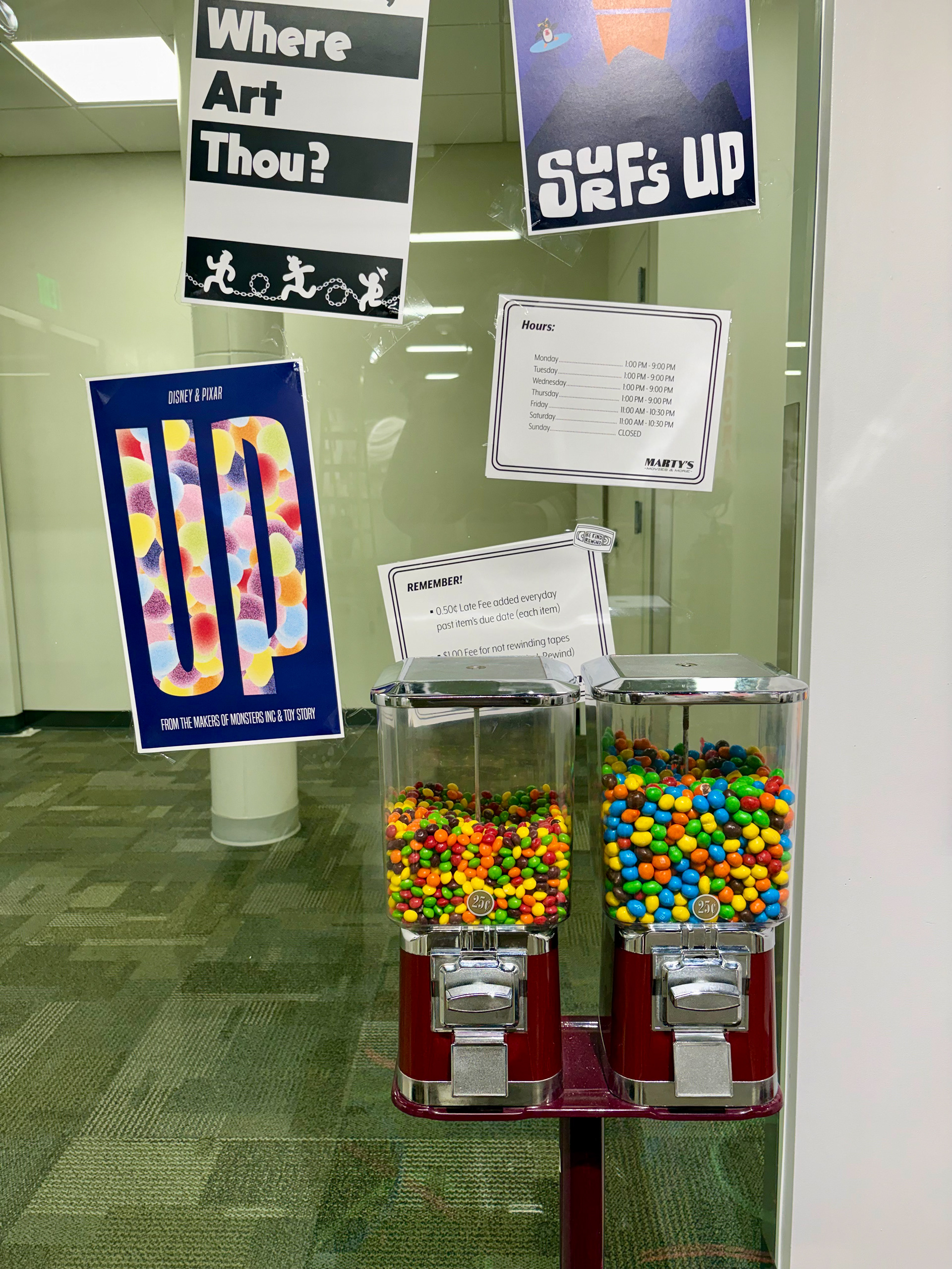
My senior capstone project is inspired by the nostalgic joy of walking into your local video store, scanning the shelves, & picking the perfect movie for the night. I reimagined some of my favorite films as vintage style VHS covers. & posters, using illustration and graphic design to blend modern tools with classic retro aesthetics. By reviving the textures, typography, & personality of physical media, I am to reconnect viewers with the anticipation of the perfect movie night. These pieces celebrate nostalgia by reminding viewers to slow down, savor stories, & of course, be kind & rewind.
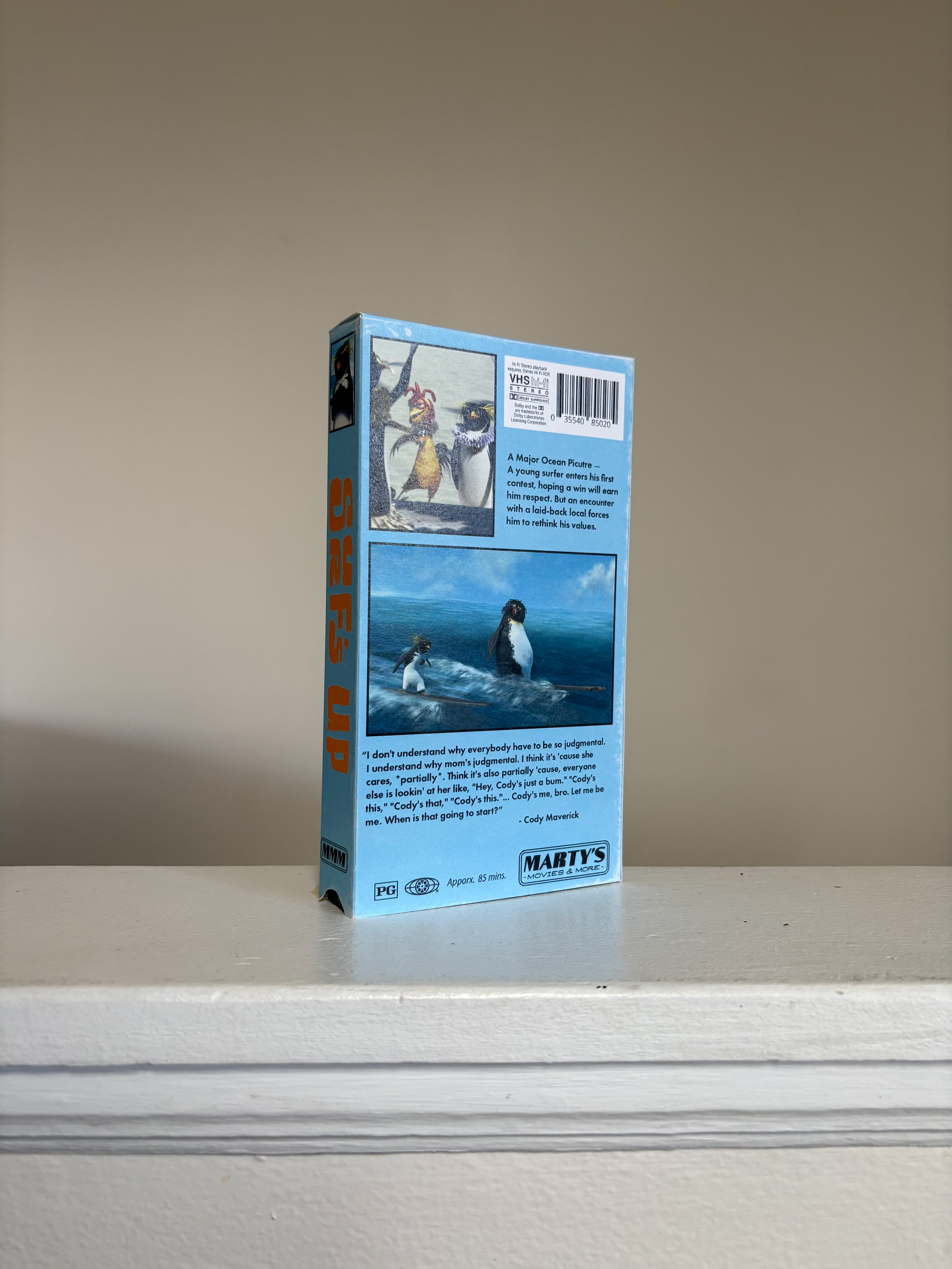
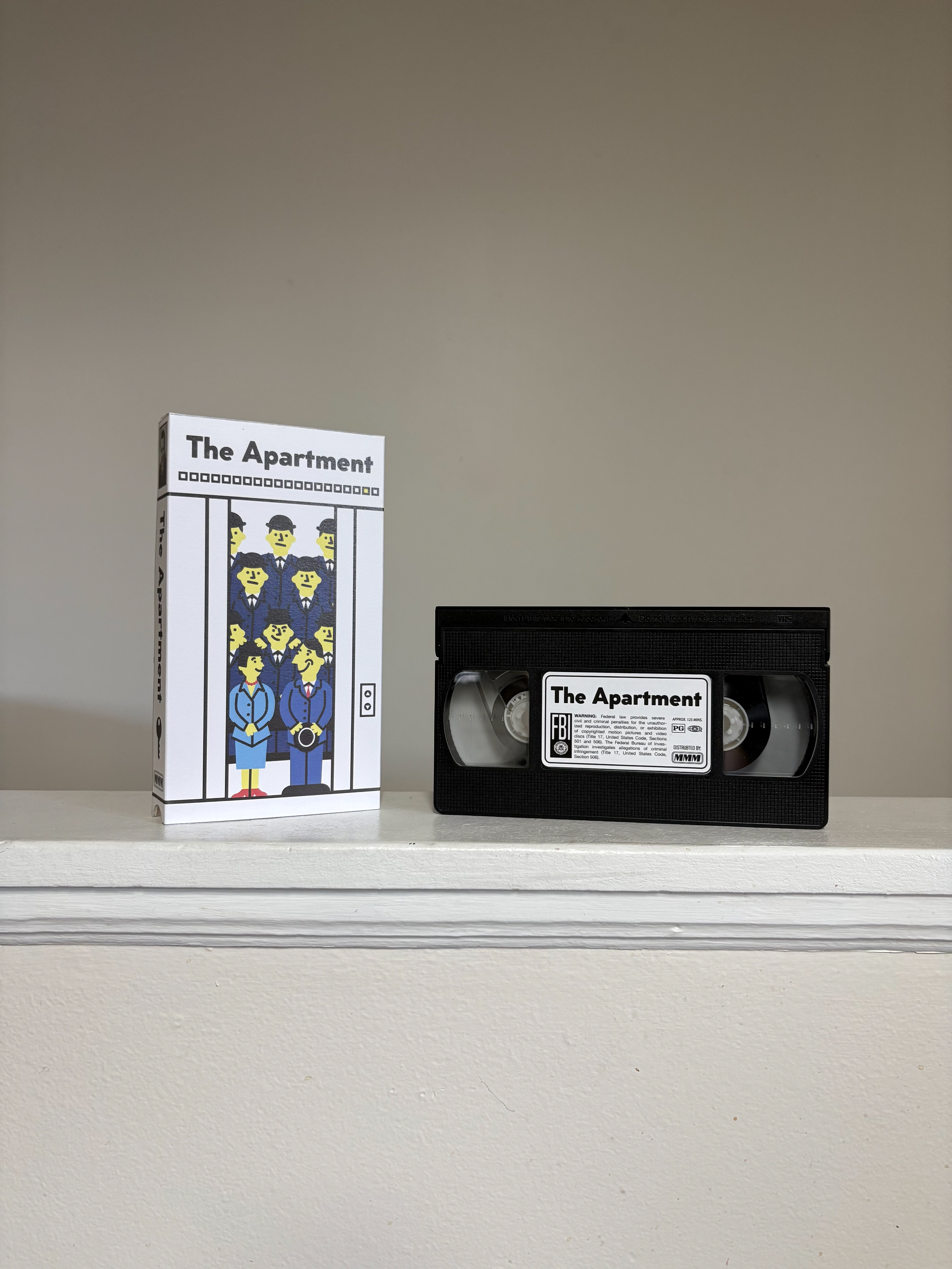
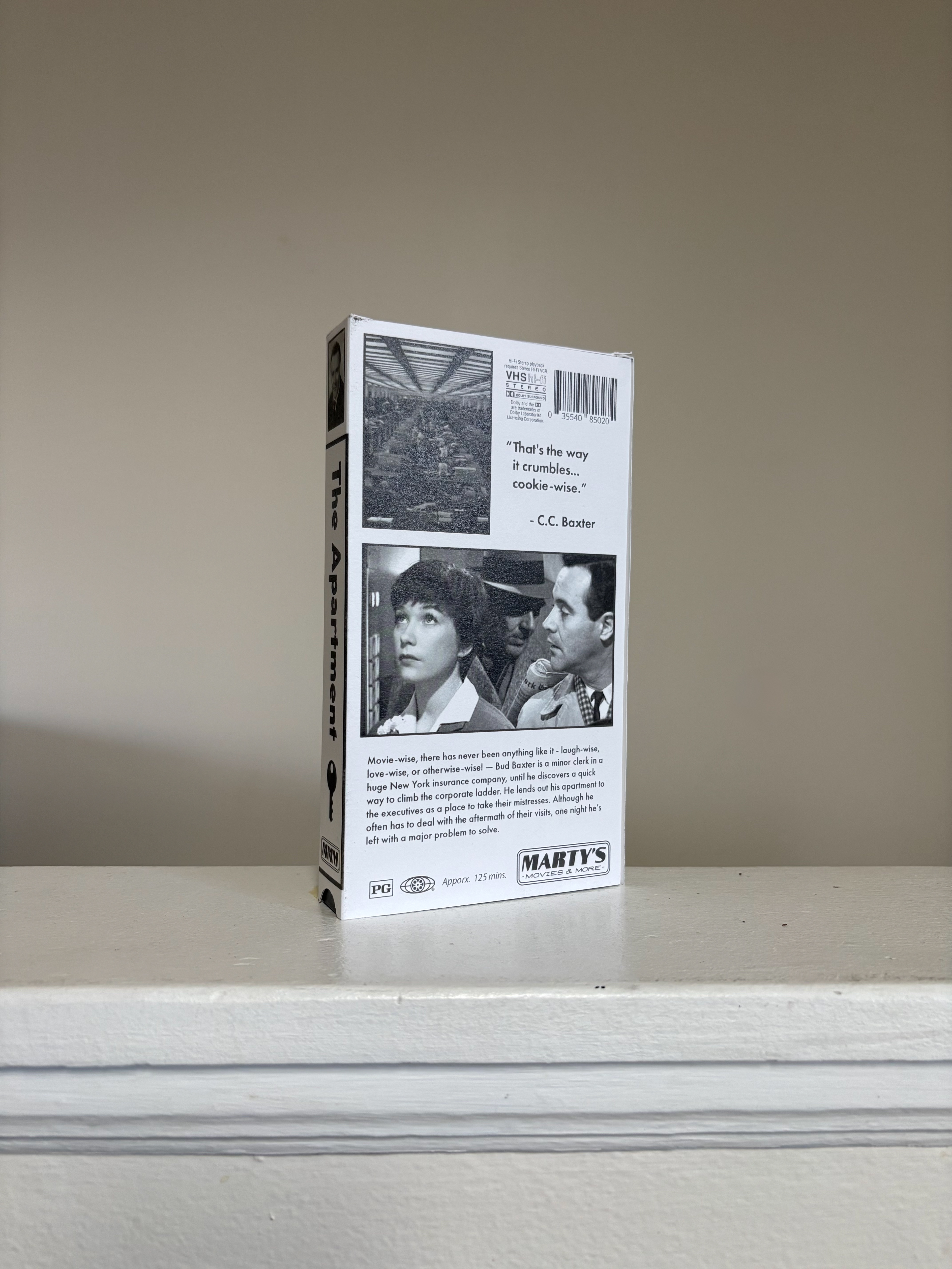
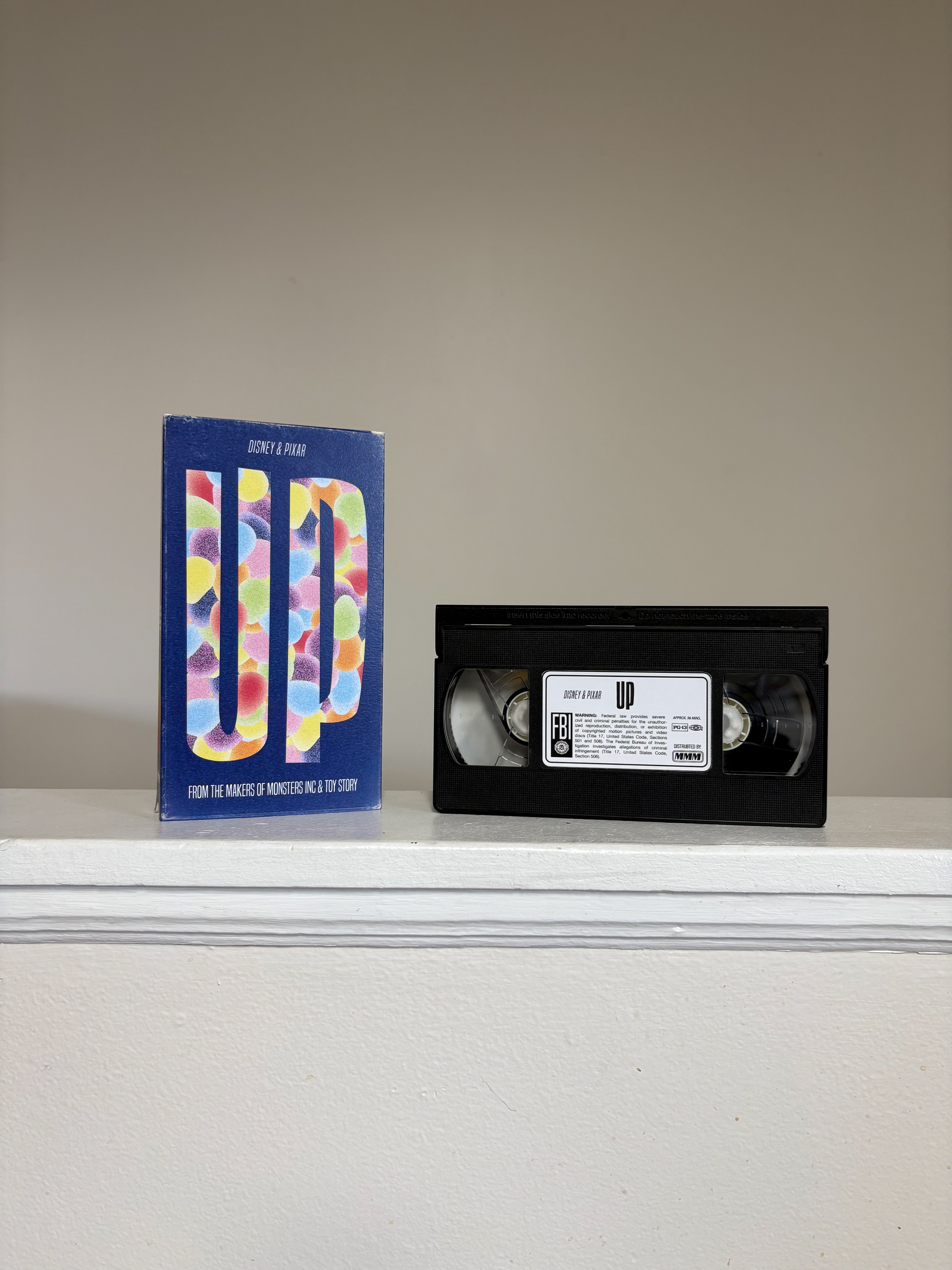
The Pickle Paddle
In the pursuit of finding a fun & well designed pickleball paddle, my brother-in-law & I were talking about how the only logical thing is to put pickles on a pickleball paddle. For this project, I designed and manufactured the following: pickleball paddles, stickers, patches, etc. Click the link below to get your own Pickle Paddle!
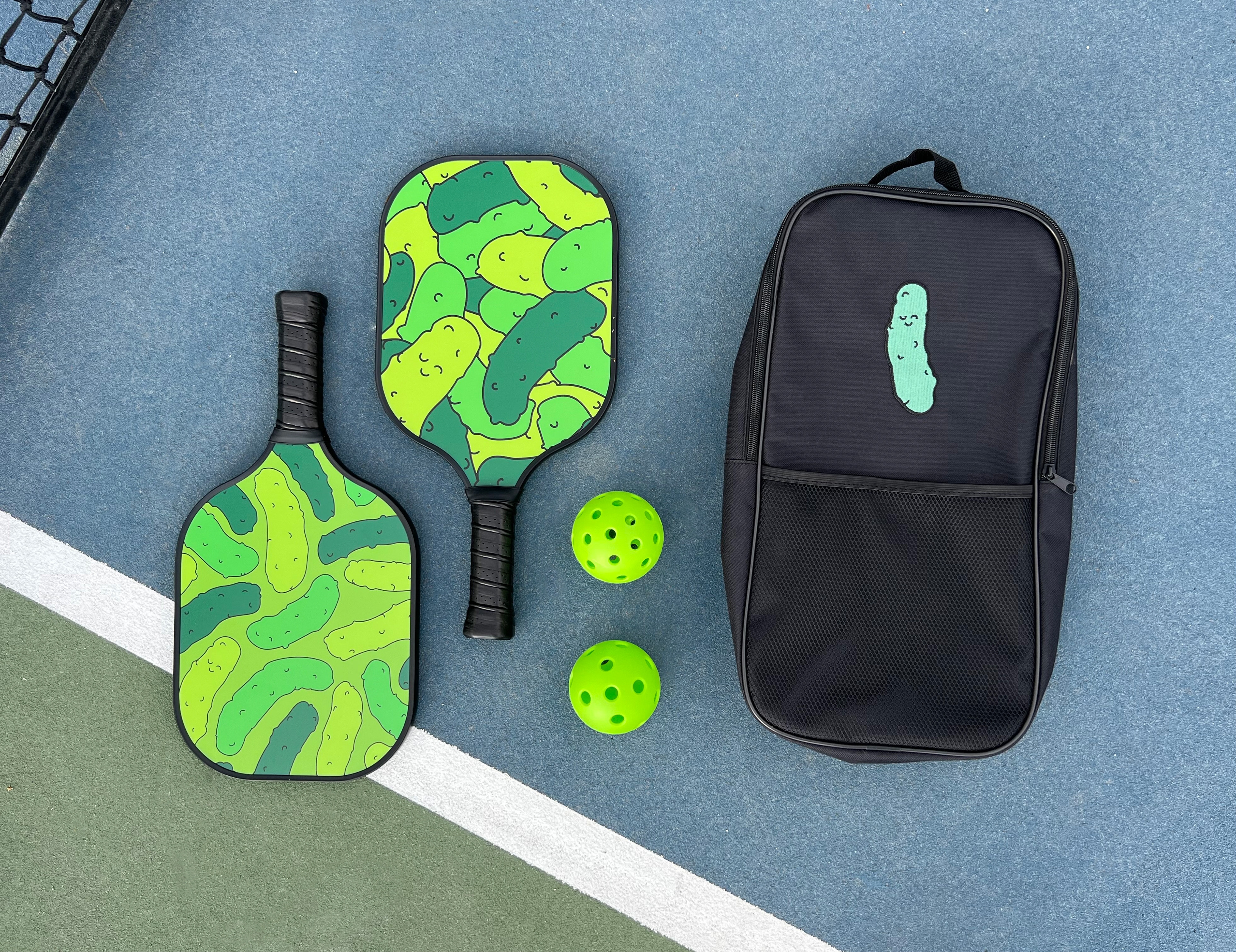
Pickleball Paddle Set Design
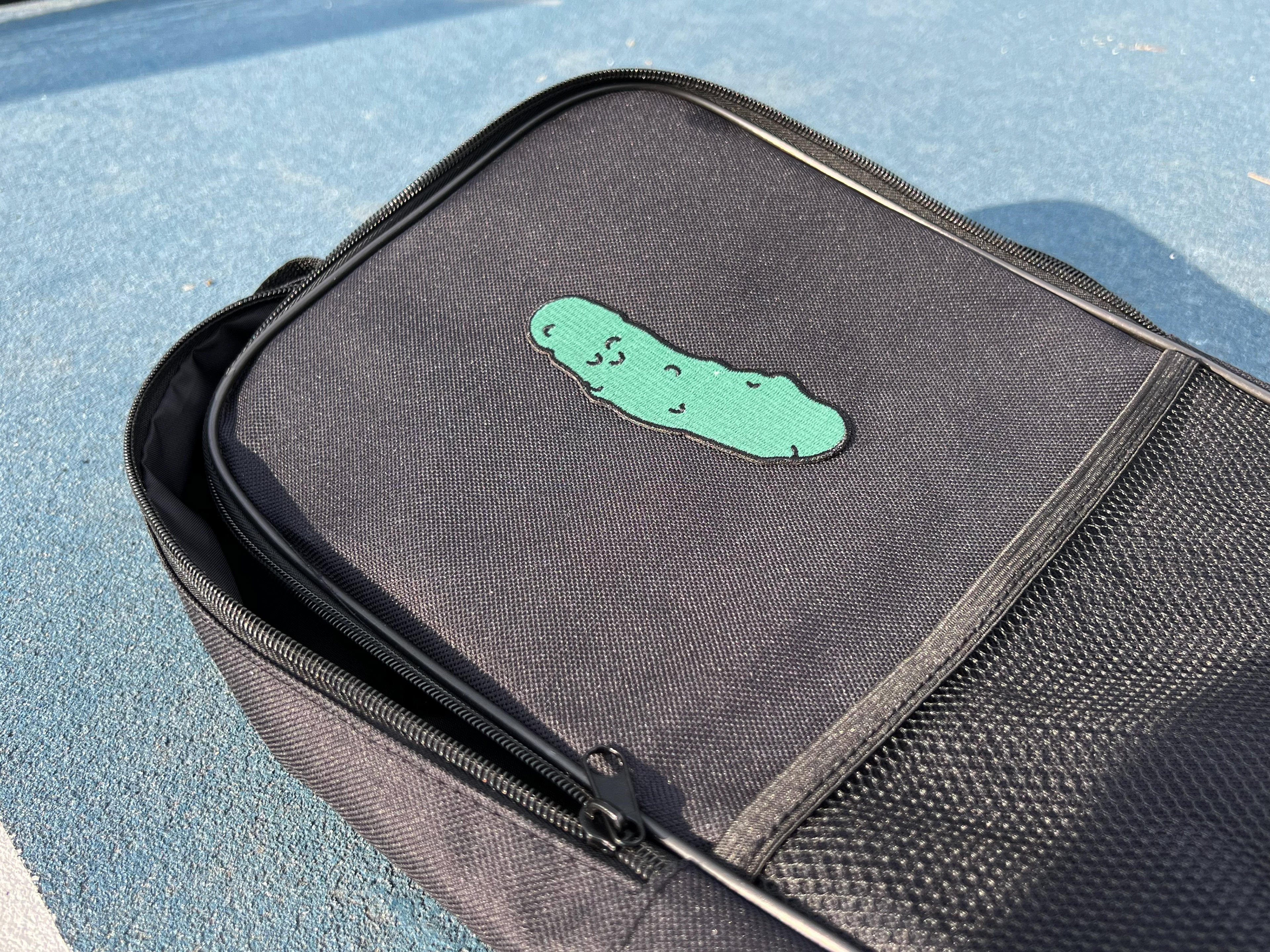
Patch Design
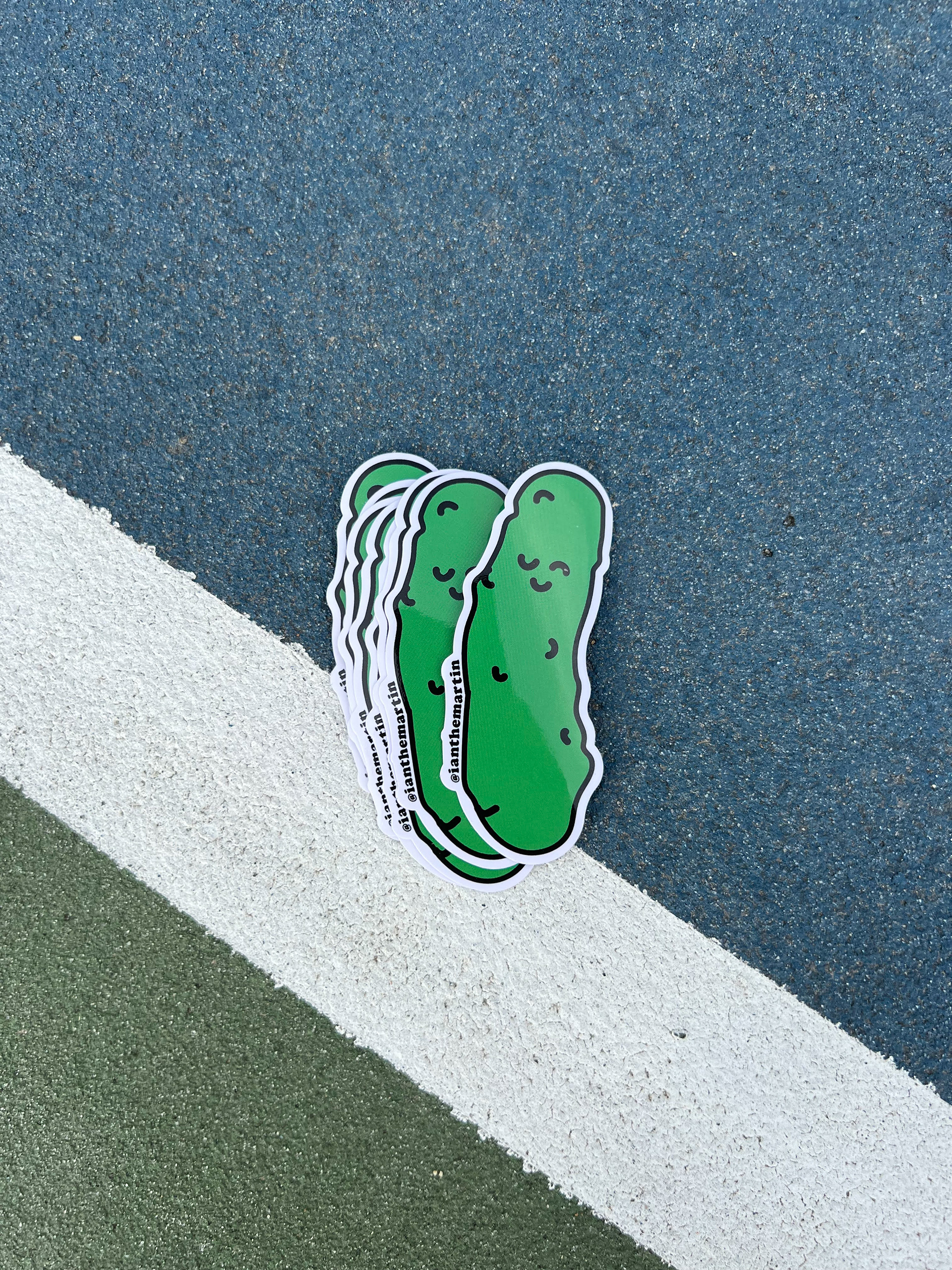
Sticker Design

Pickleball Balls
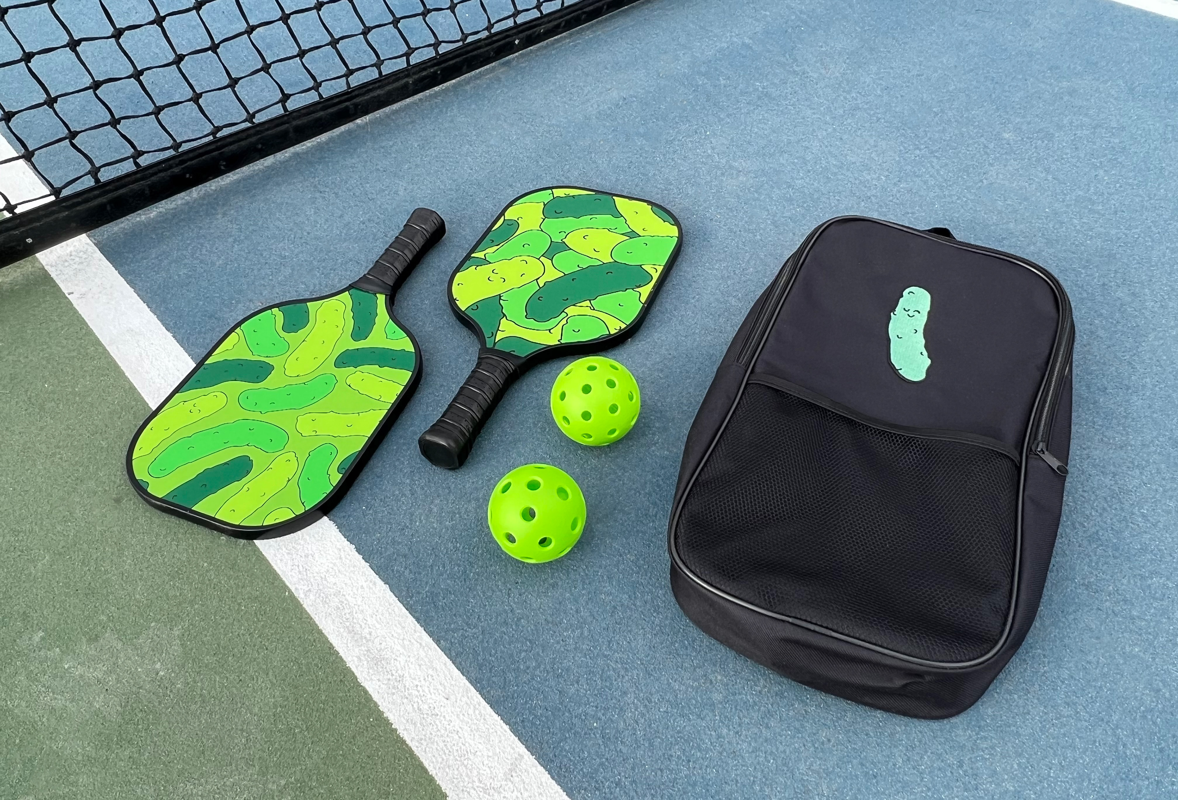
Social Posts (Holiday)
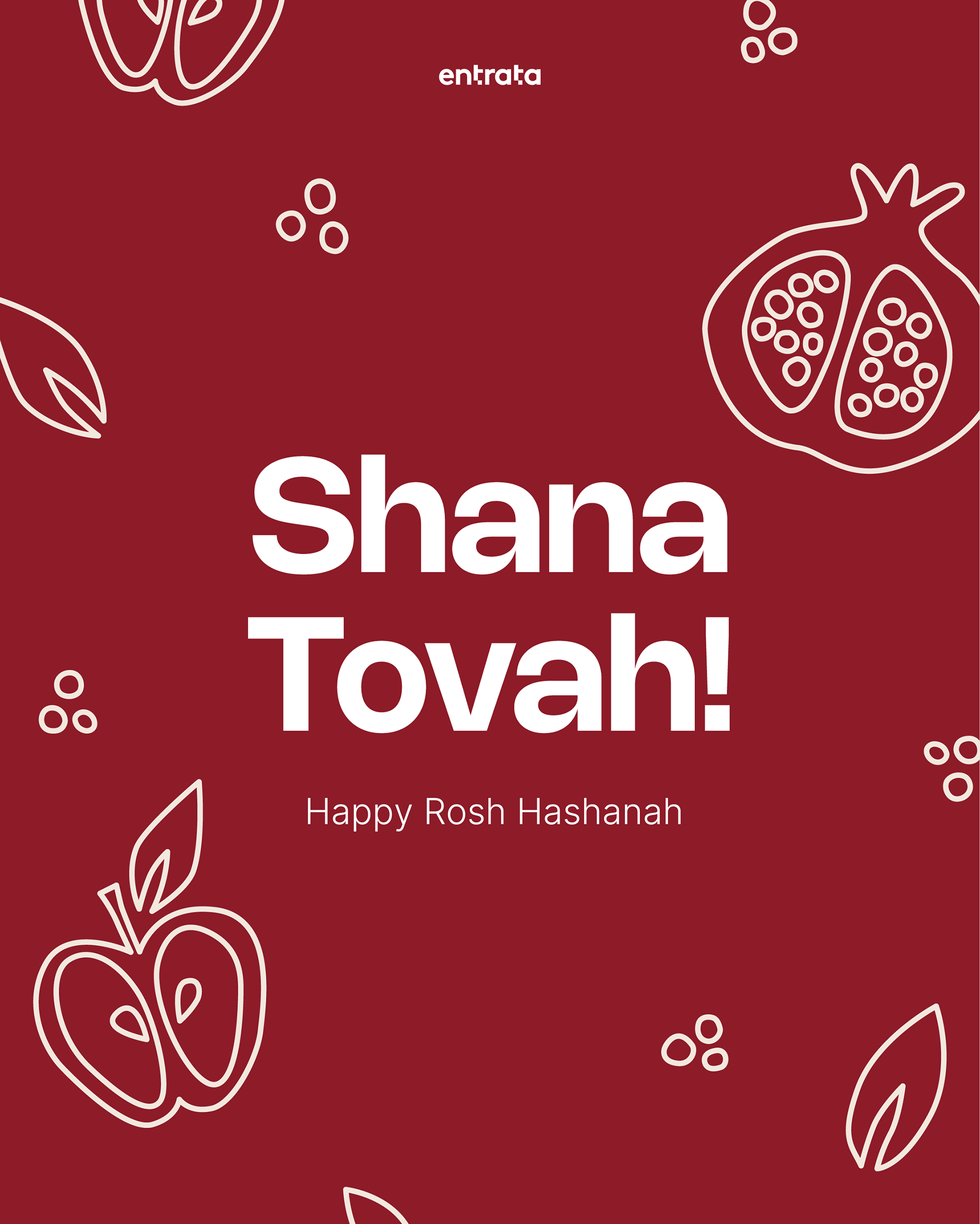
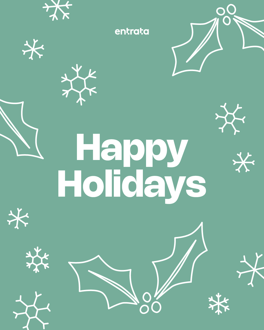
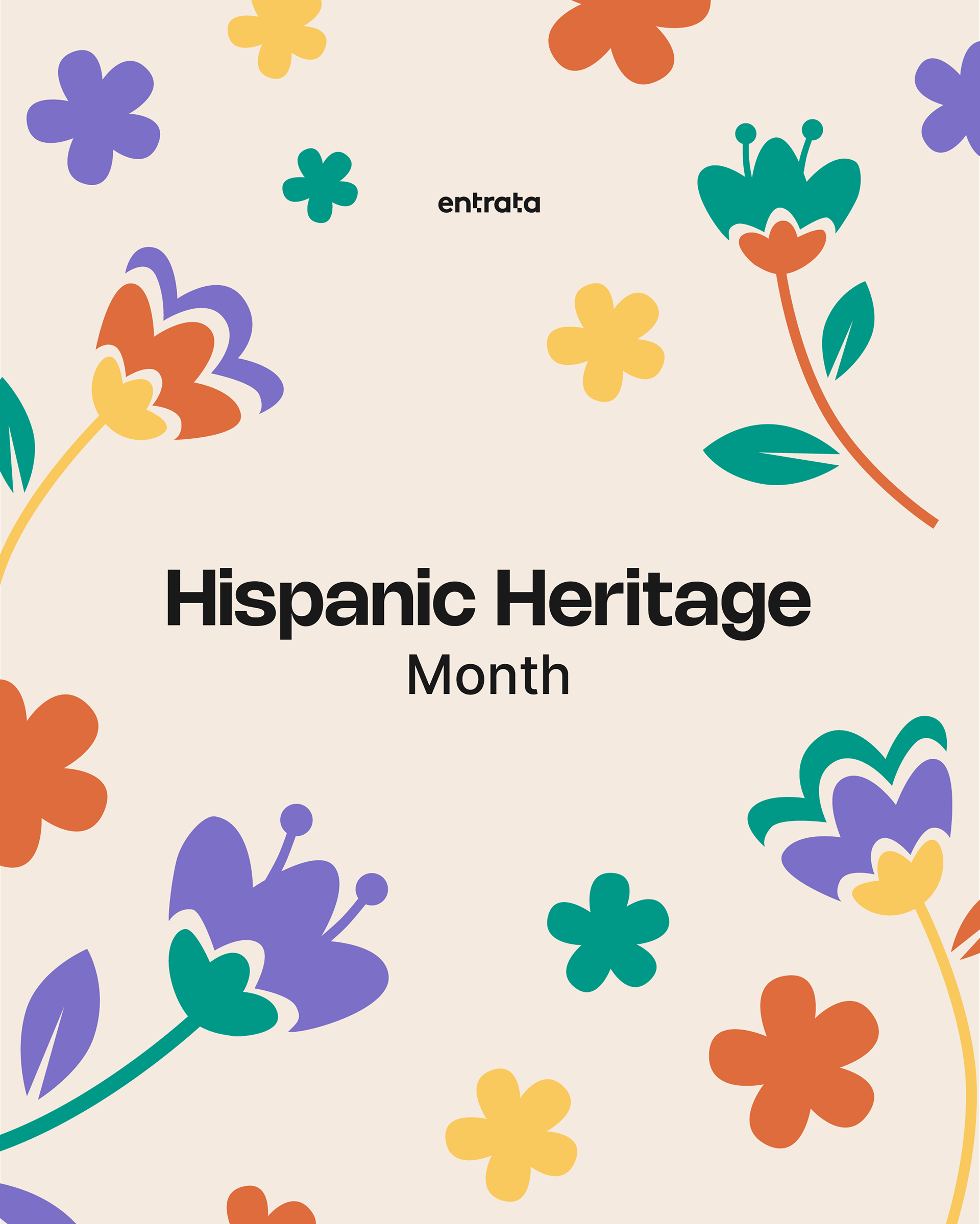
For these social posts created for Entrata, I developed a cohesive series using a simplified line-art illustration style. This approach maintained visual consistency across each piece while aligning seamlessly with the established brand identity.

Half Page Mailer & Internal Communications
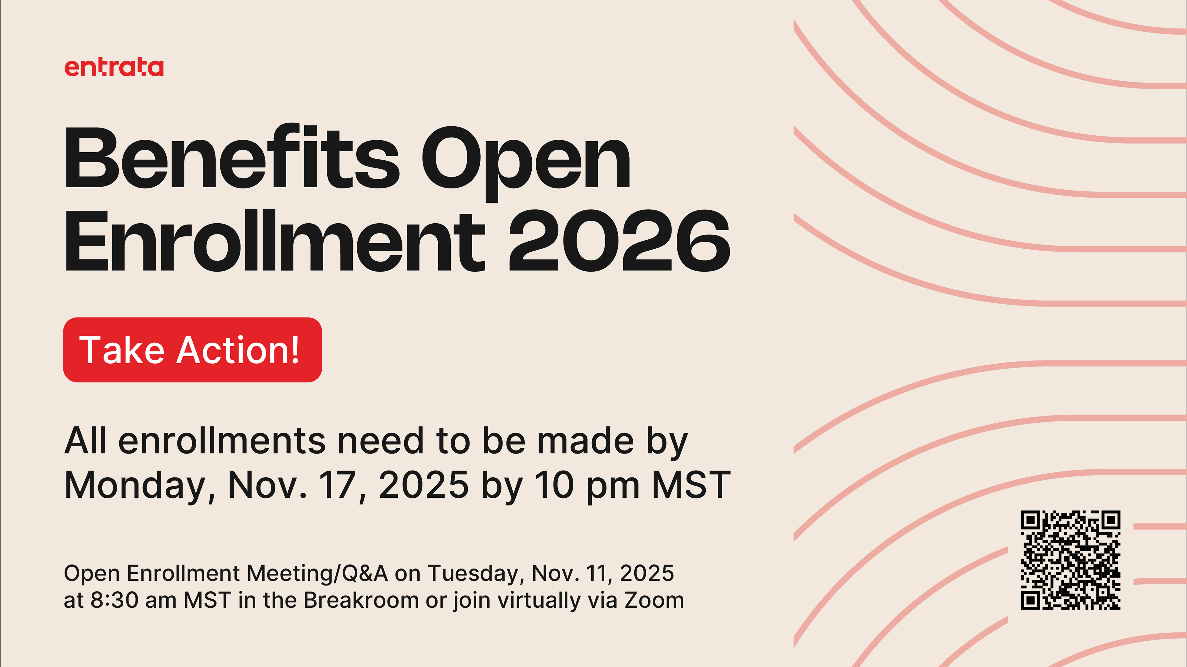
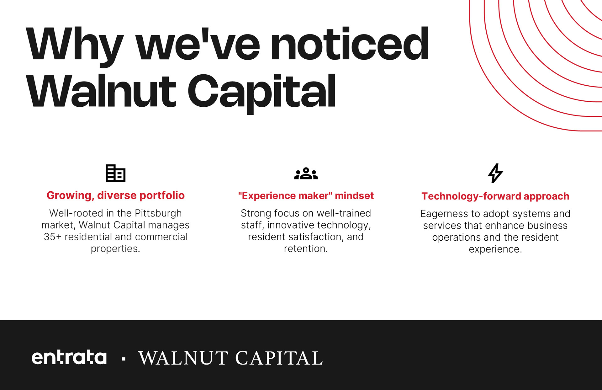
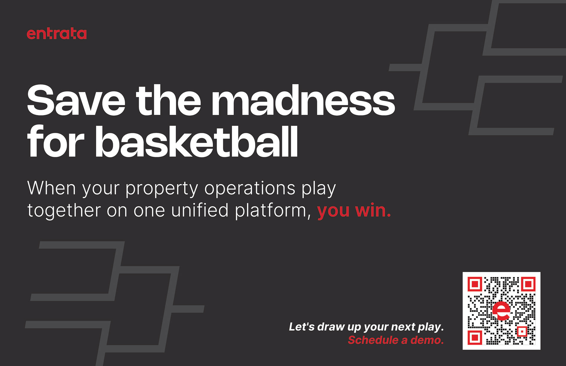
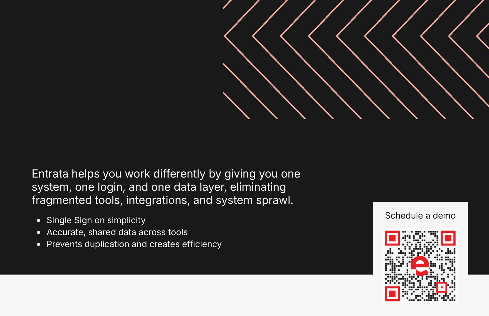
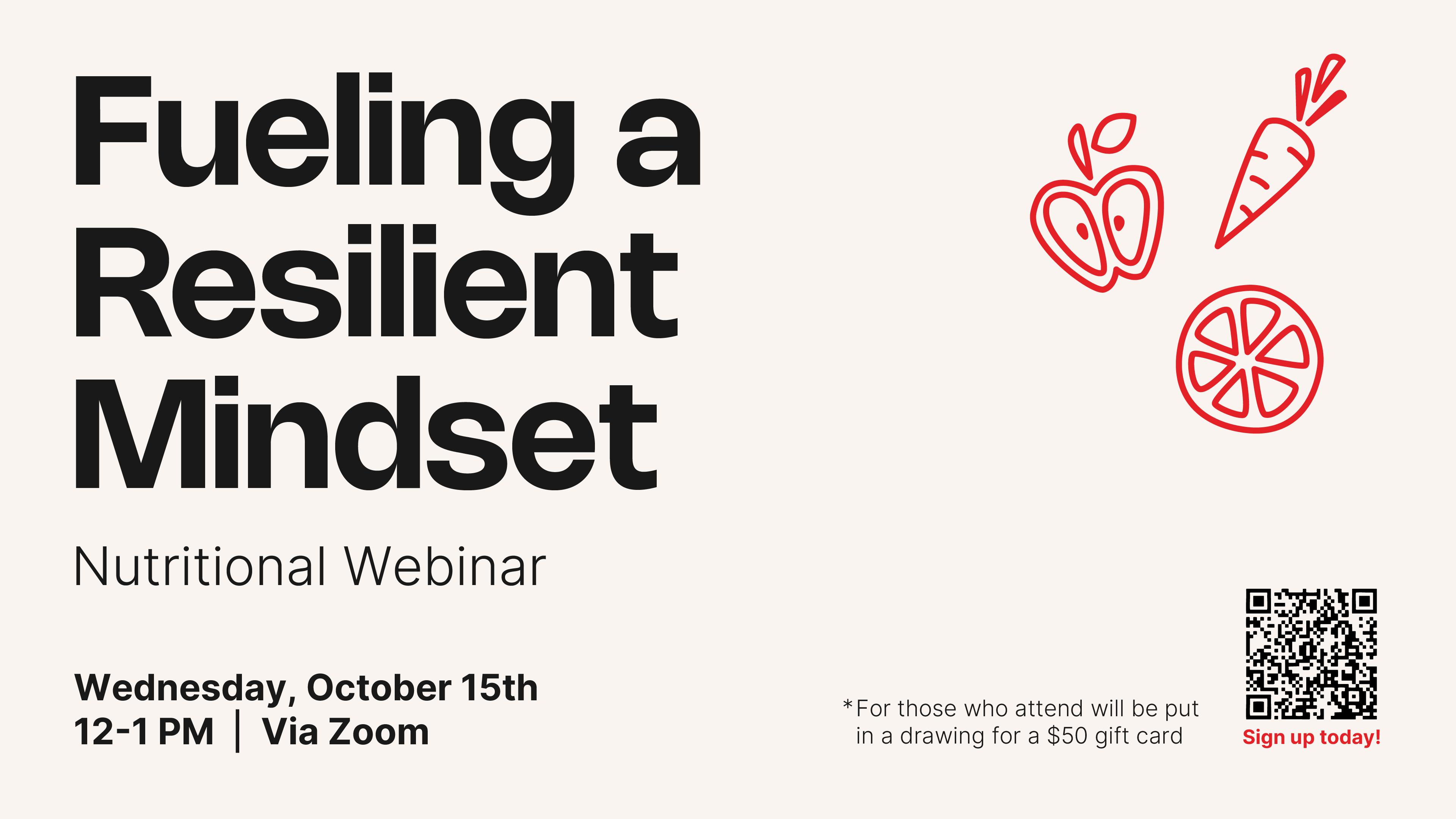
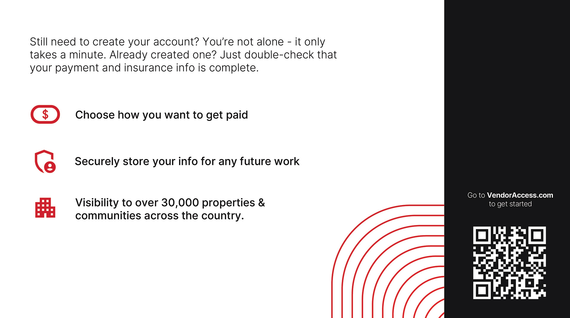
For these half-page mailers & internal communication designs I created for Entrata, I focused on creating a clear visual hierarchy and concise messaging to ensure the content was both engaging and easy to digest. The layout balances strong typography with strategic use of brand elements, resulting in a design that feels polished, purposeful, and aligned with the overall brand identity.


Movie Poster Series
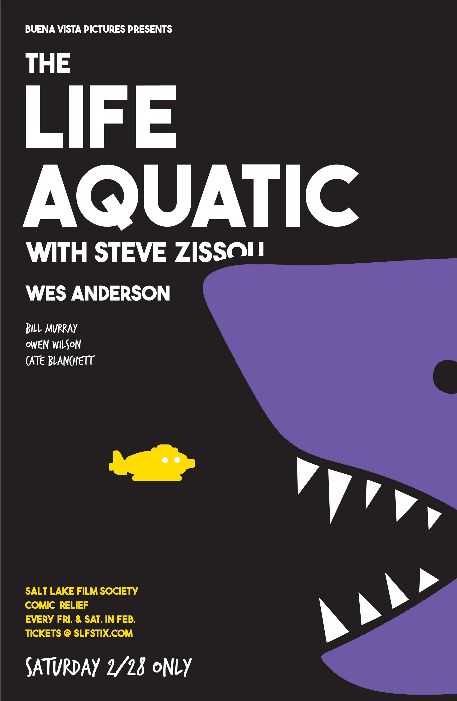
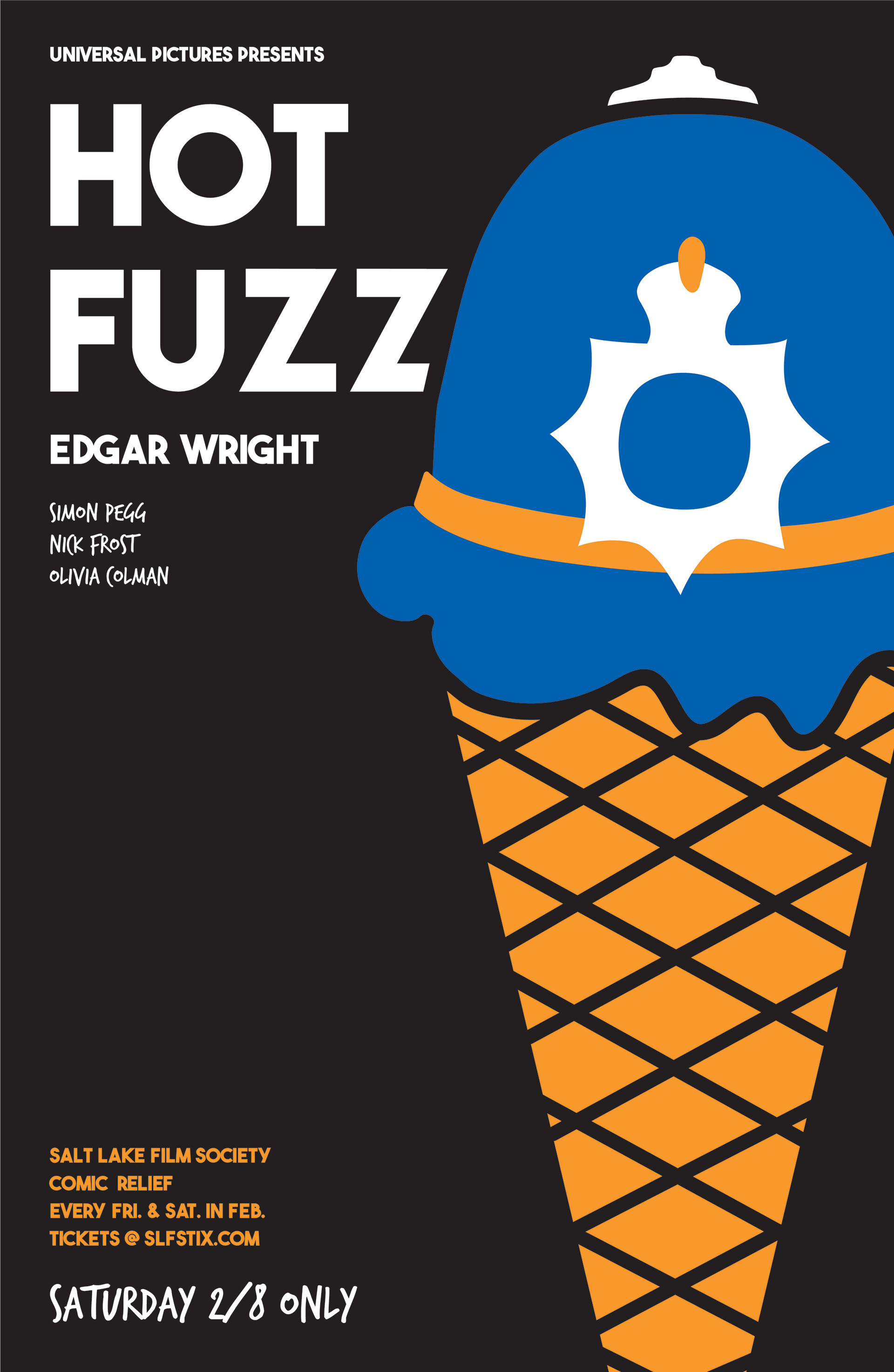
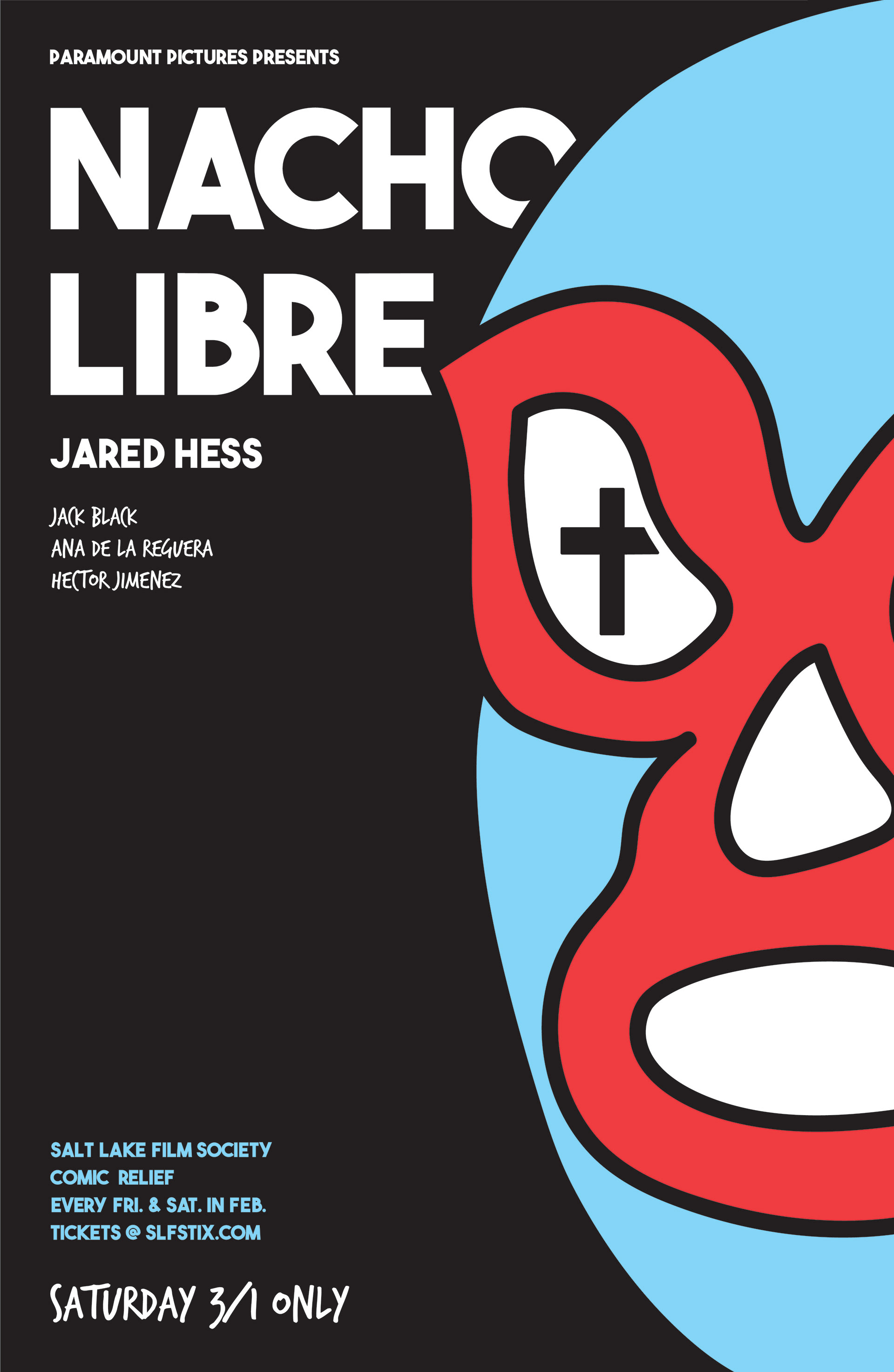
Nacho Libre, The Life Aquatic of Steve Zissou, & Hot Fuzz were all movies that were shown for the Comedic Relief Event for the Salt Lake Film Society. Even though each of them are very different movies, I wanted to keep a very cohesive style for all of them.
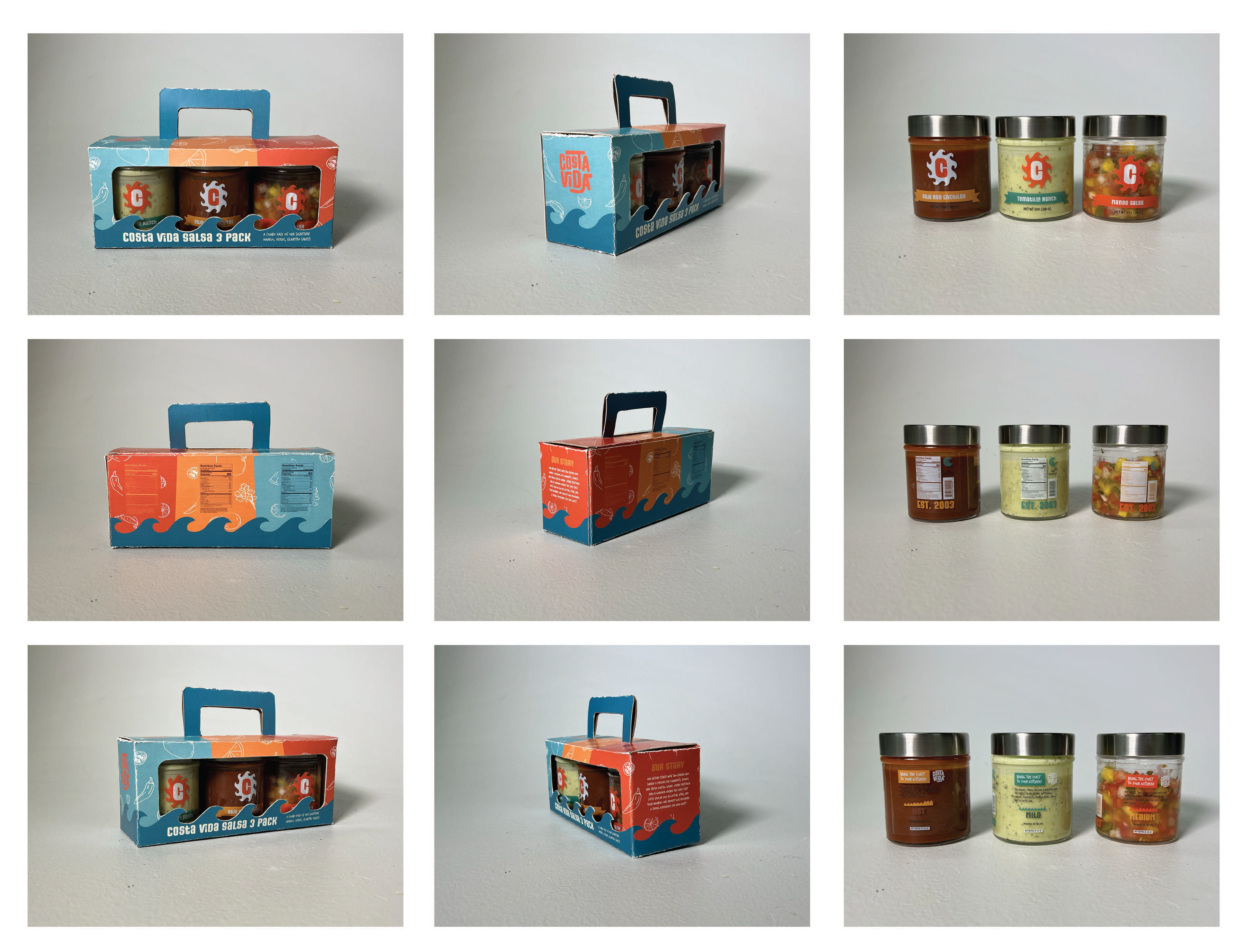
Costa Vida Rebrand
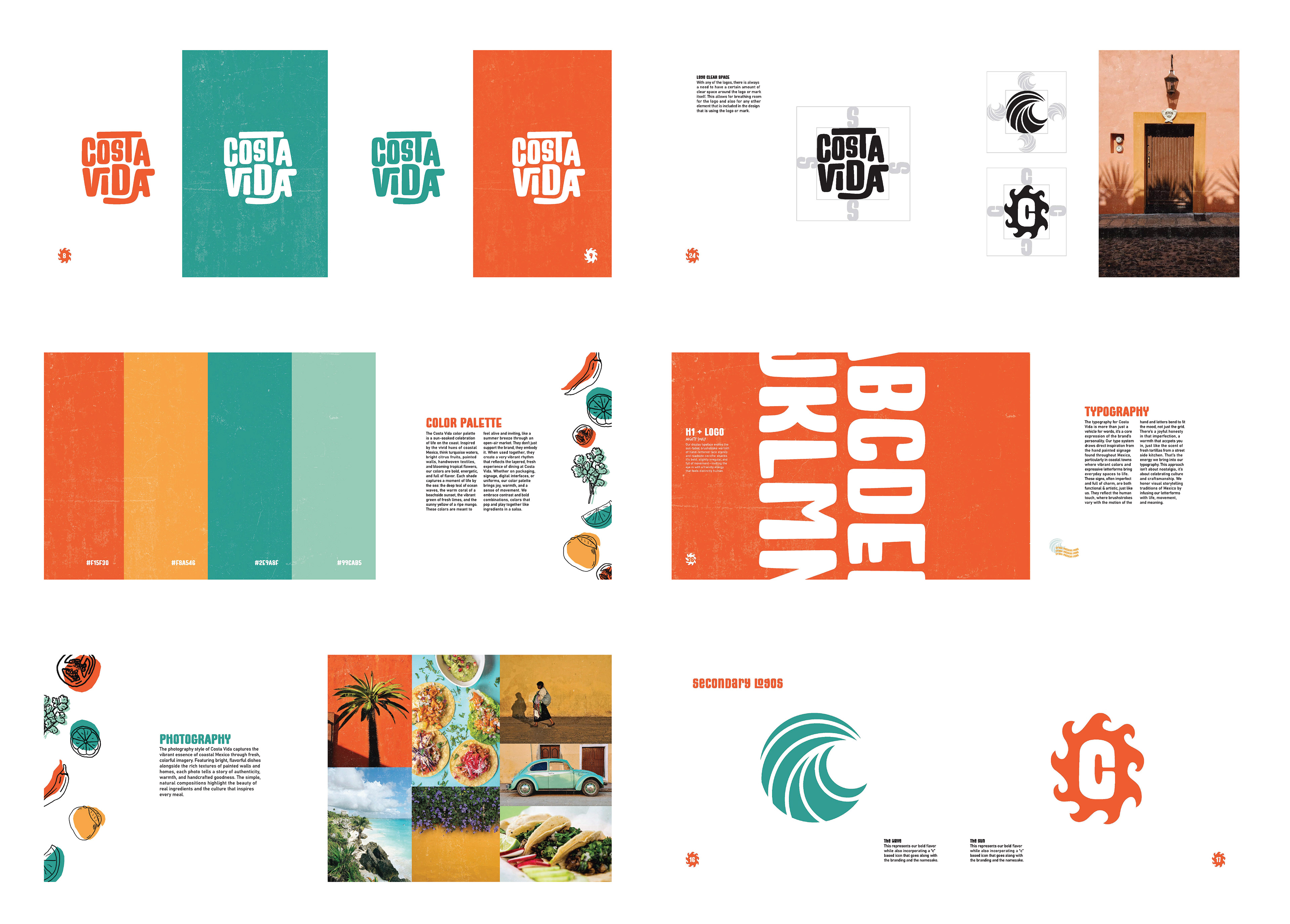
Re-brand project of Costa Vida.
Costa Vida Fresh Mexican Grill was inspired by the vibrant flavors and relaxed vibe of Baja California. Born from a love of fresh, coastal Mexican food, the founders aimed to offer more than a typical fast-casual meal. From day one, Costa Vida has stood out by using fresh, made-from-scratch ingredients prepared daily in every kitchen.
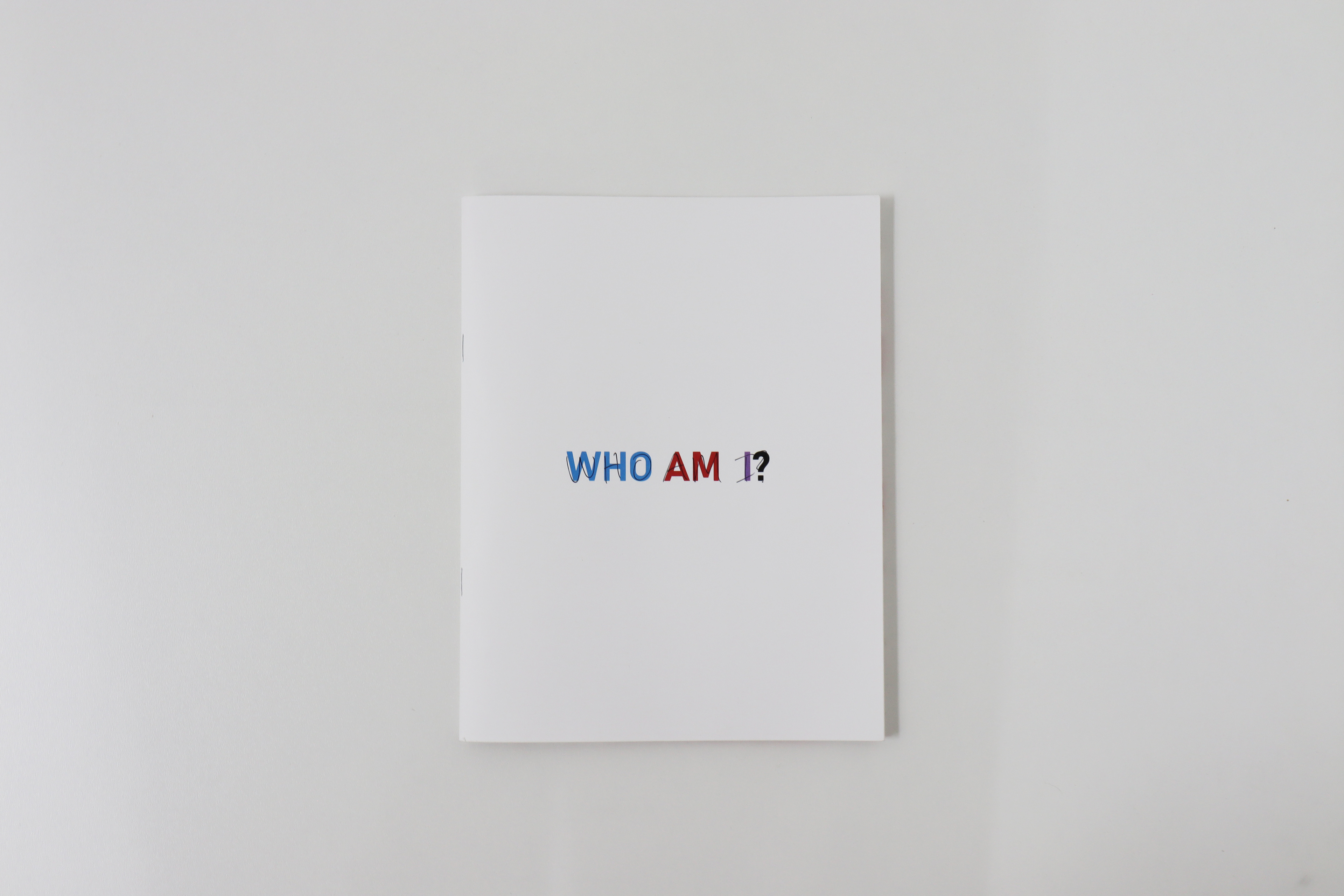
Who Am I?
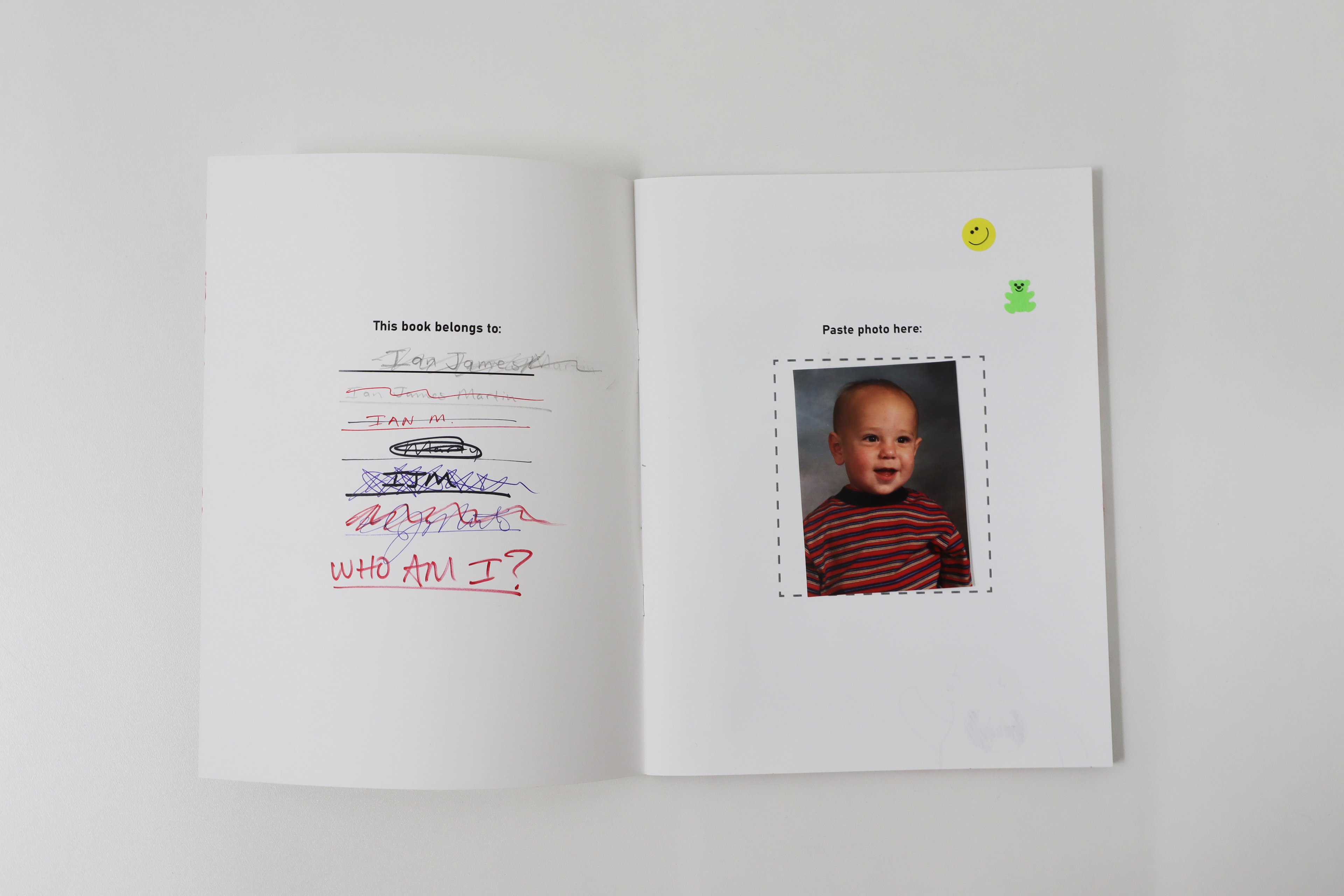
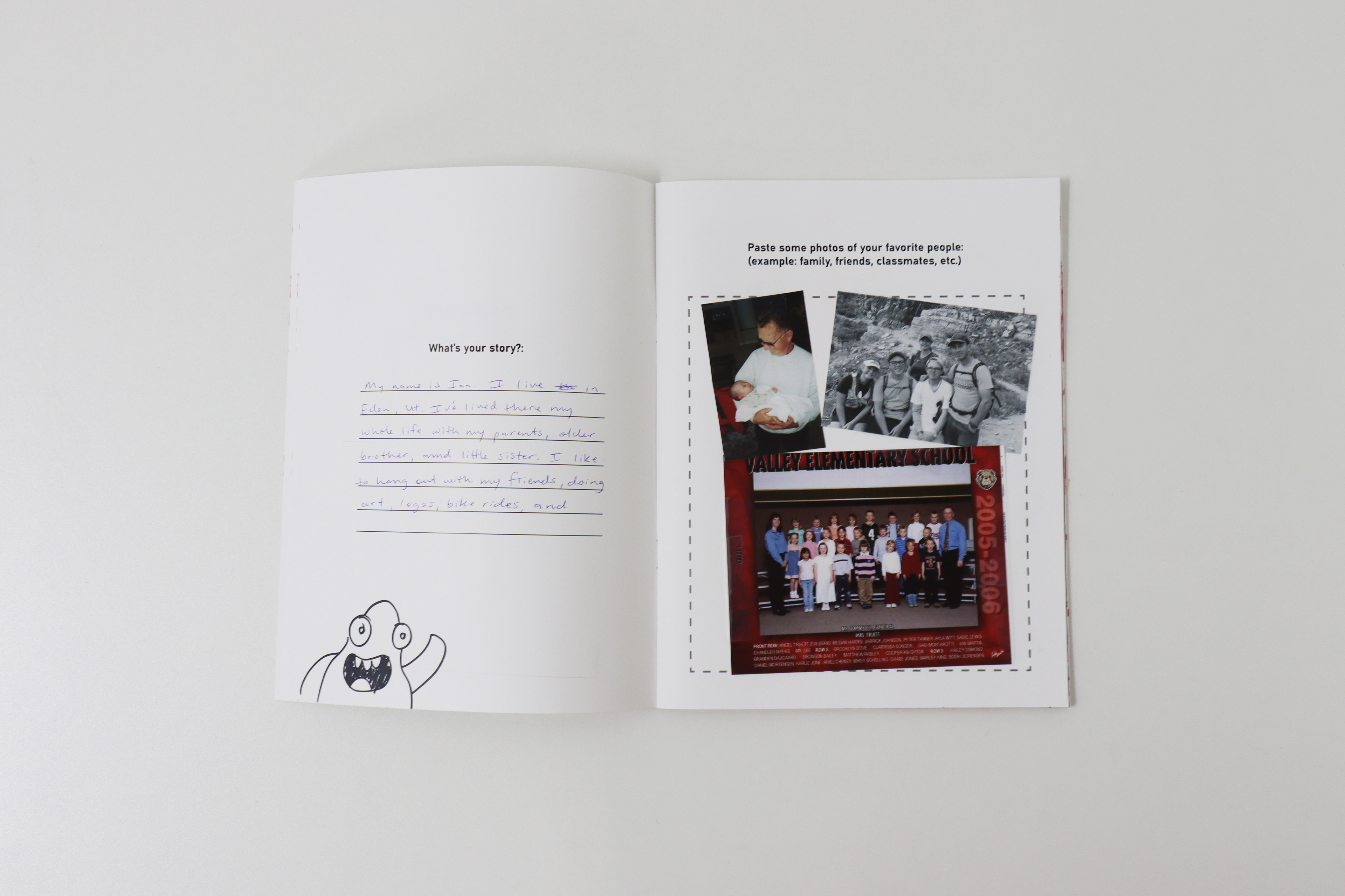
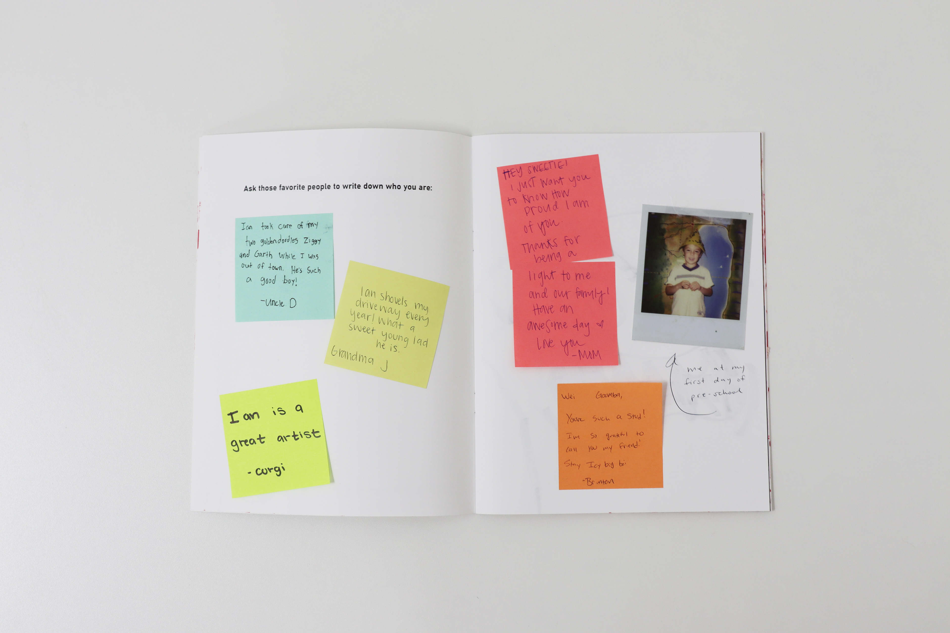
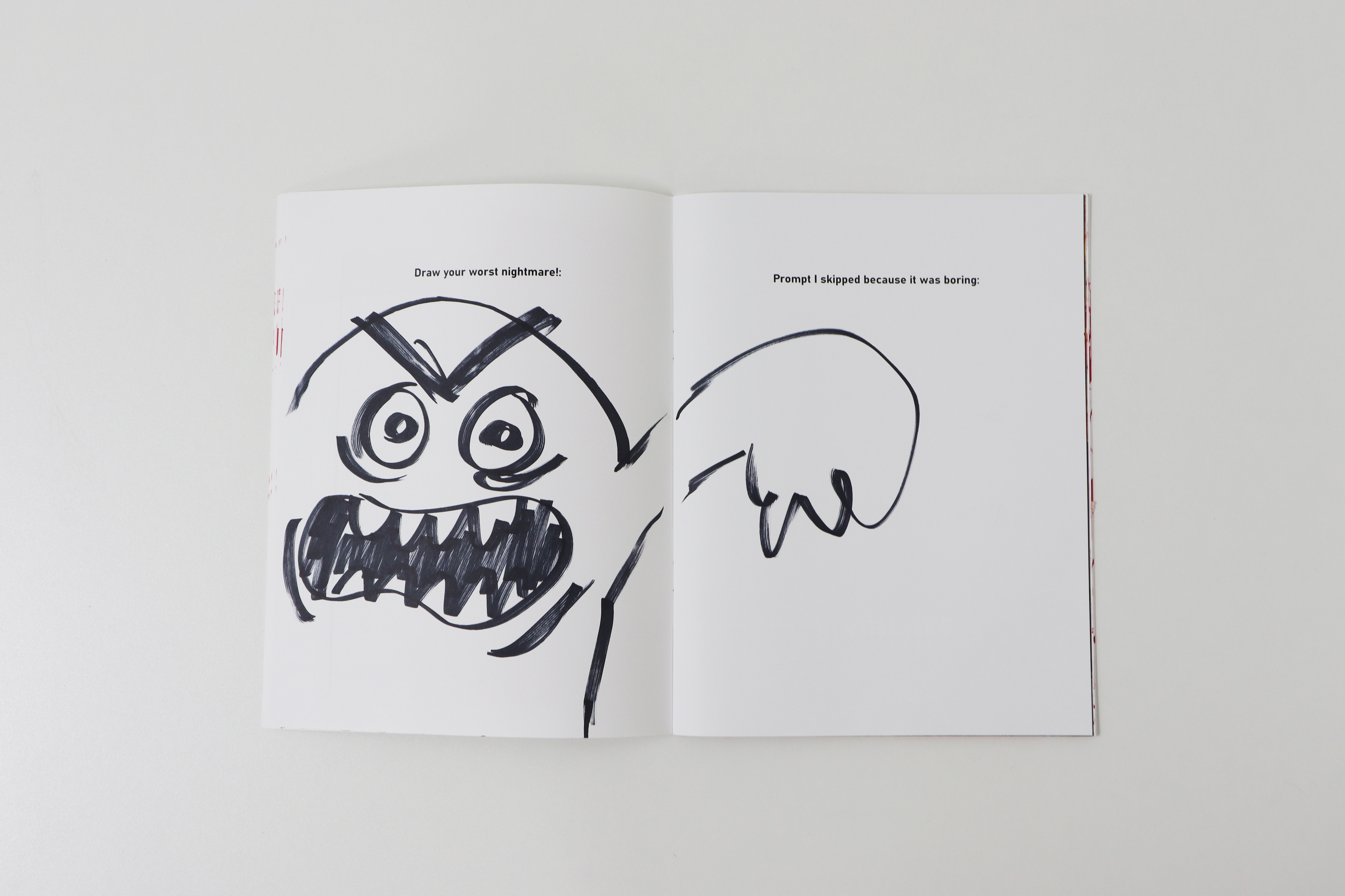
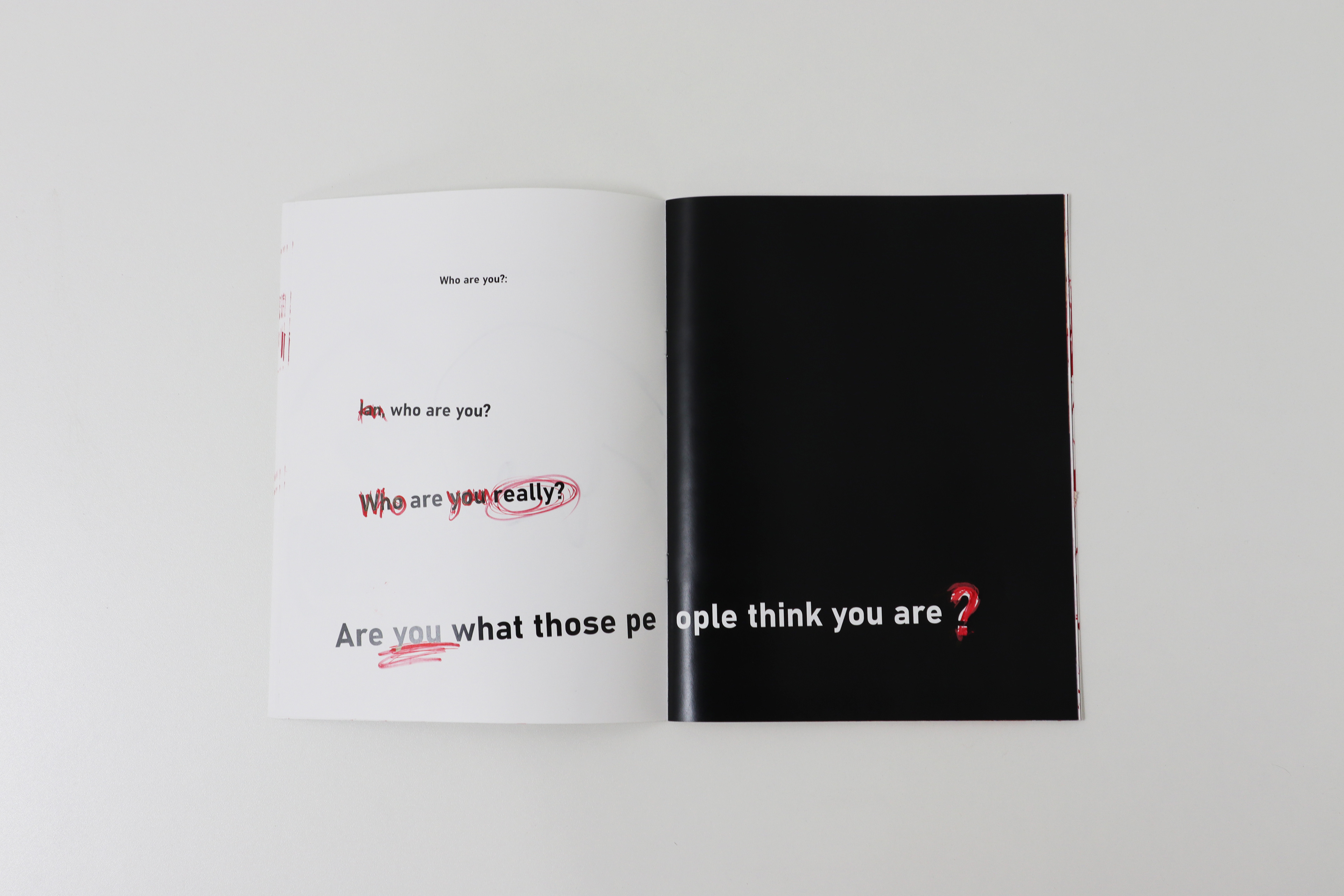
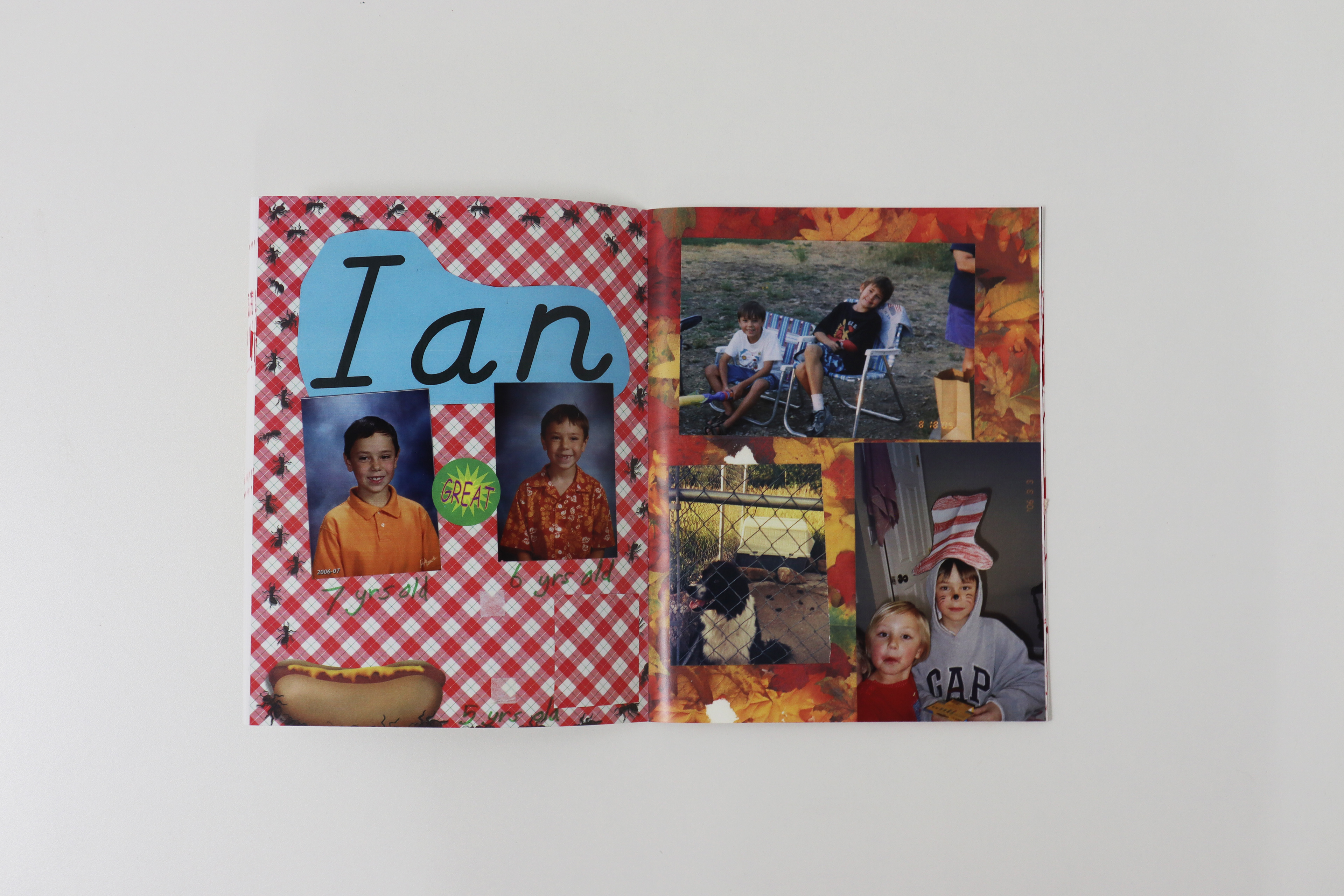
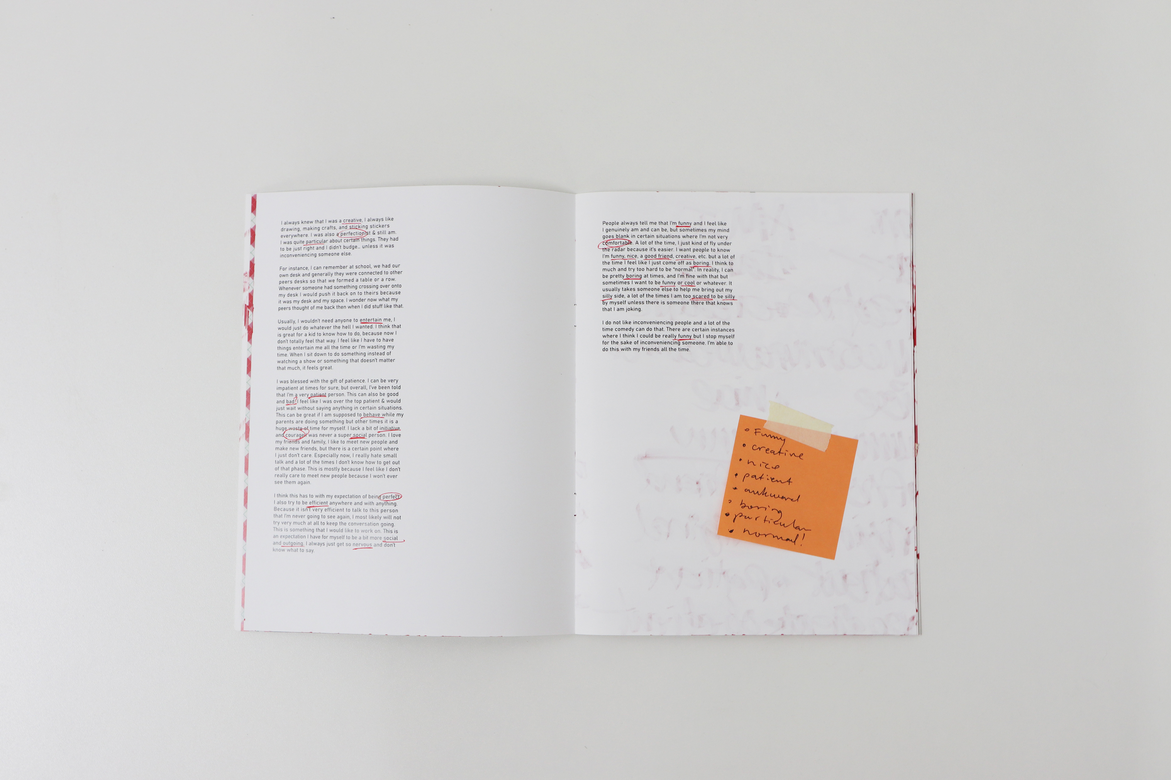
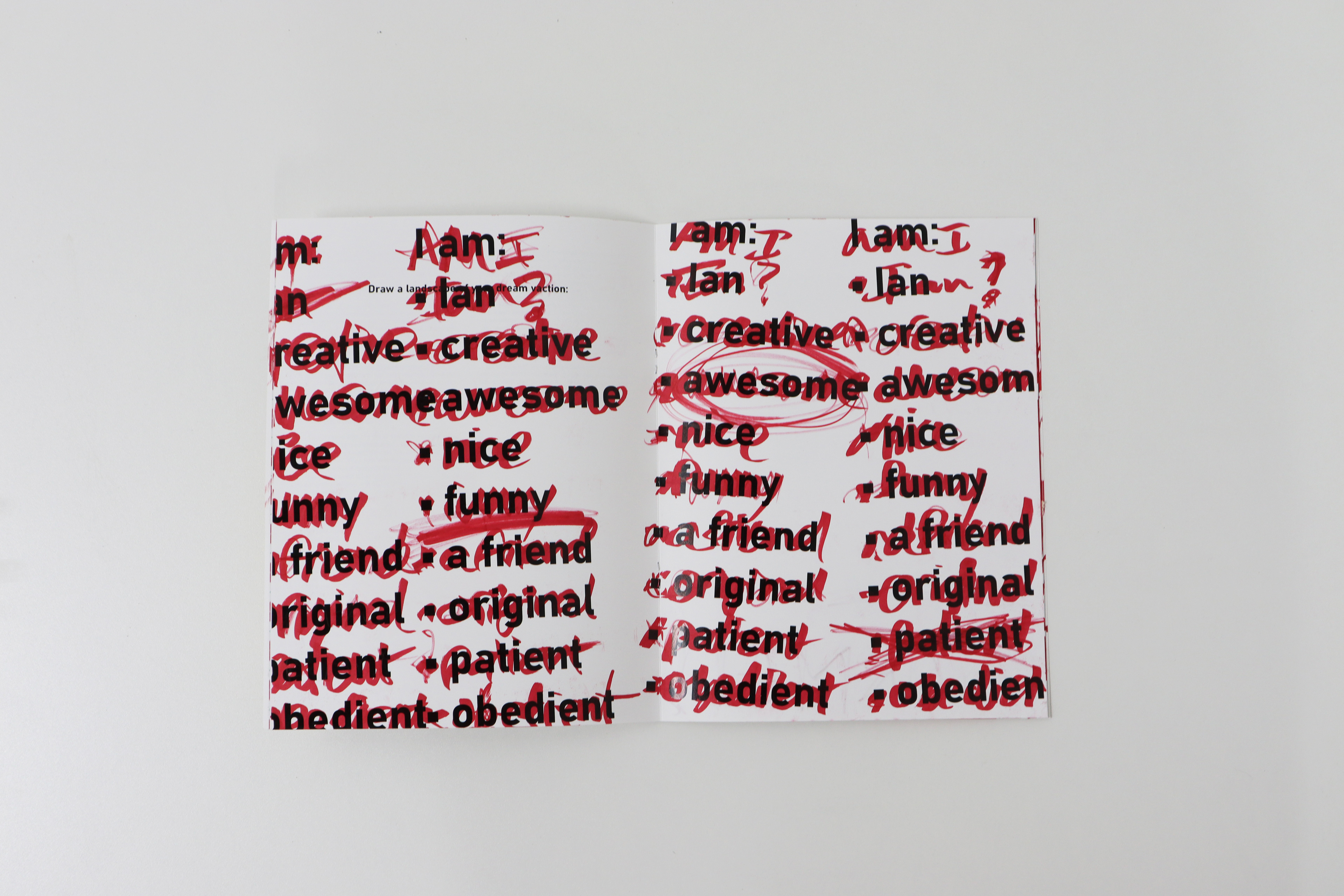
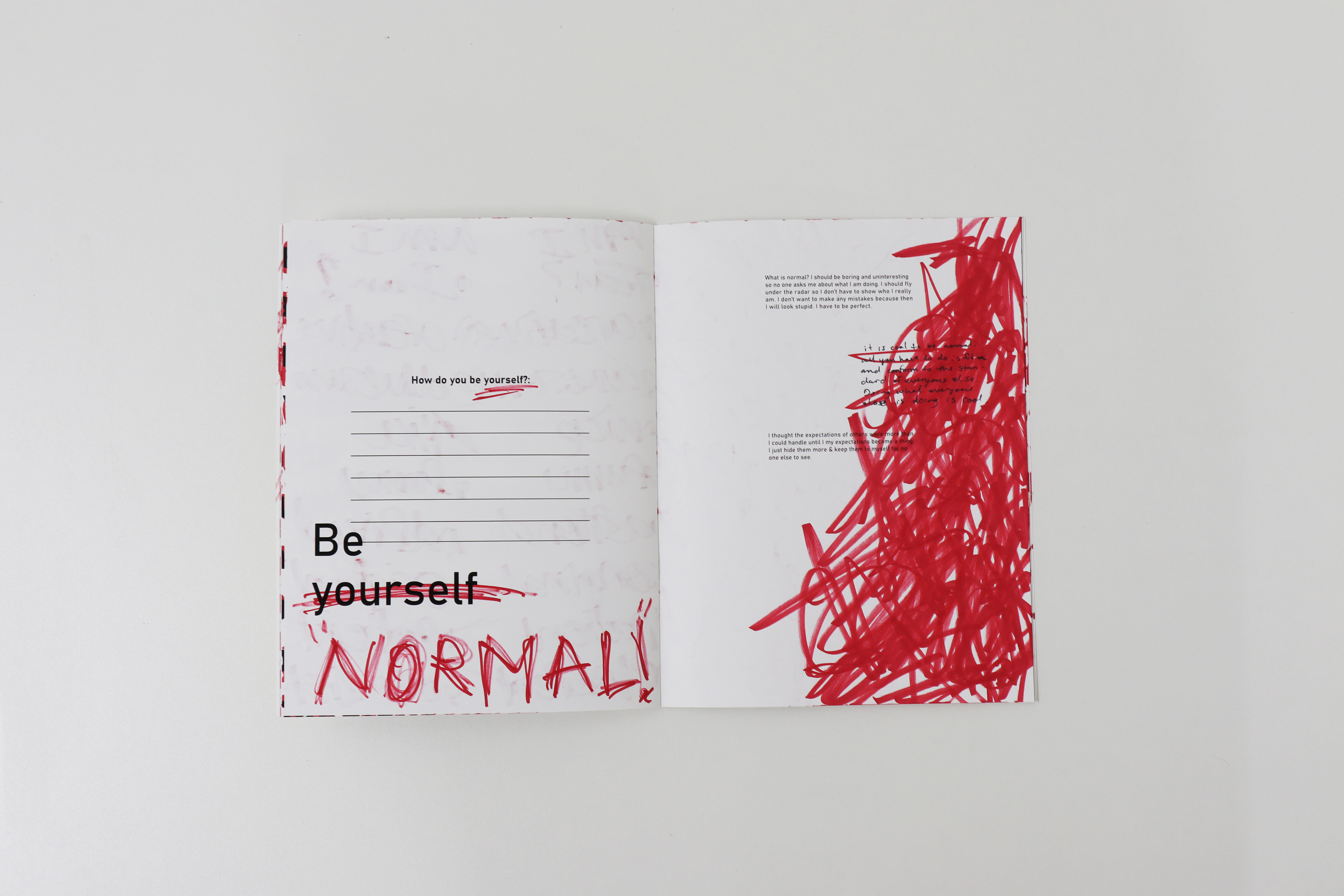
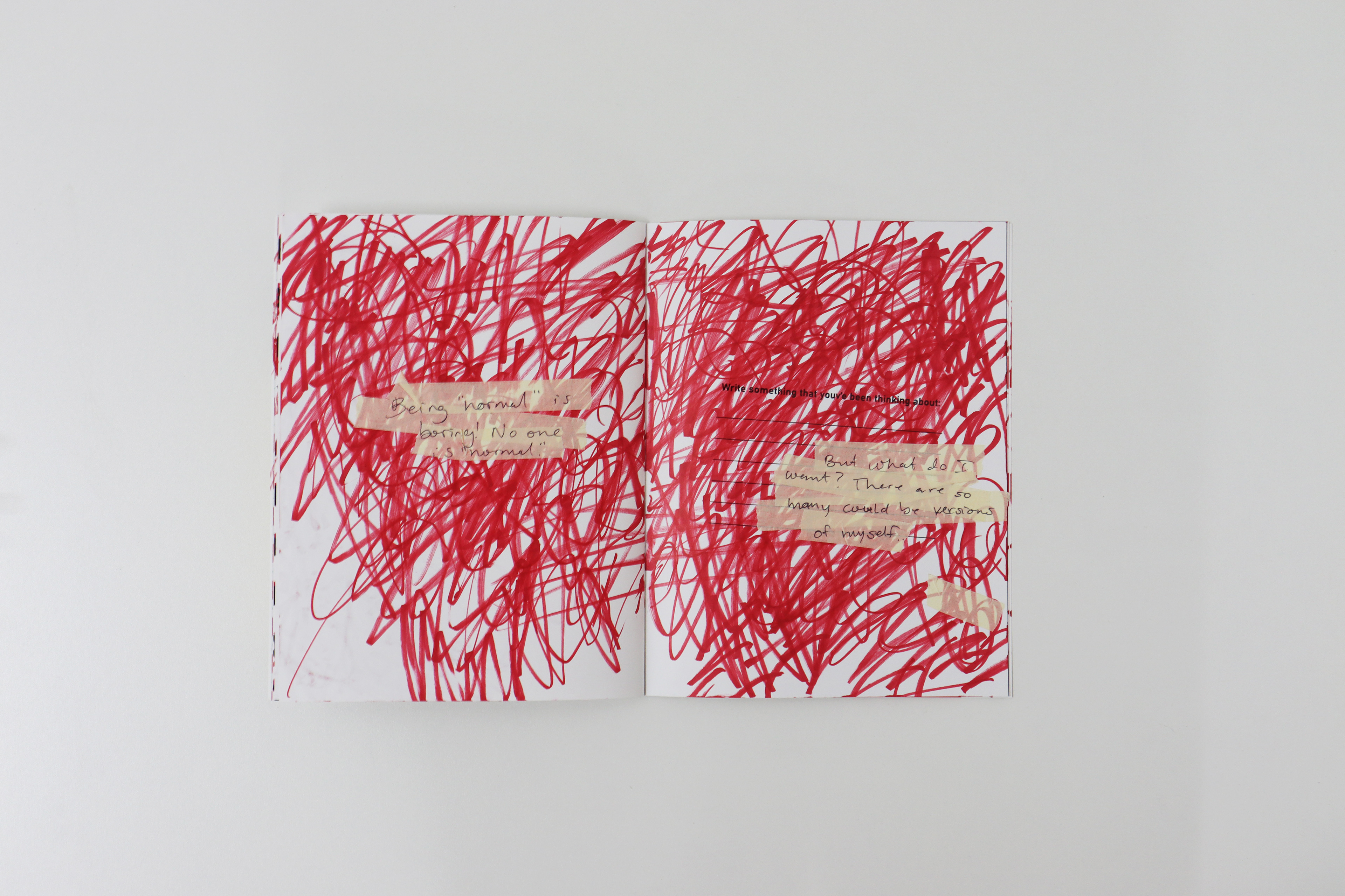
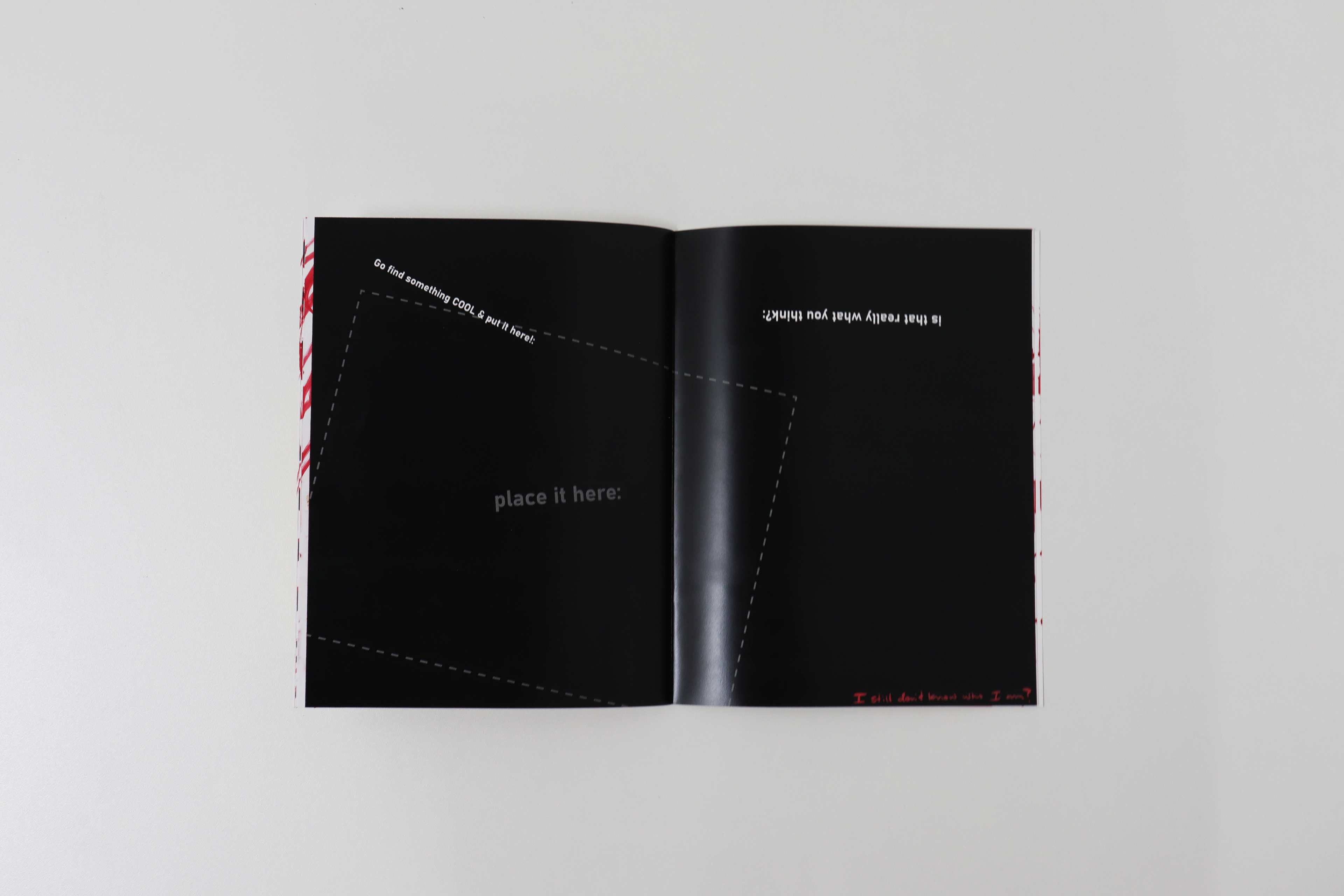
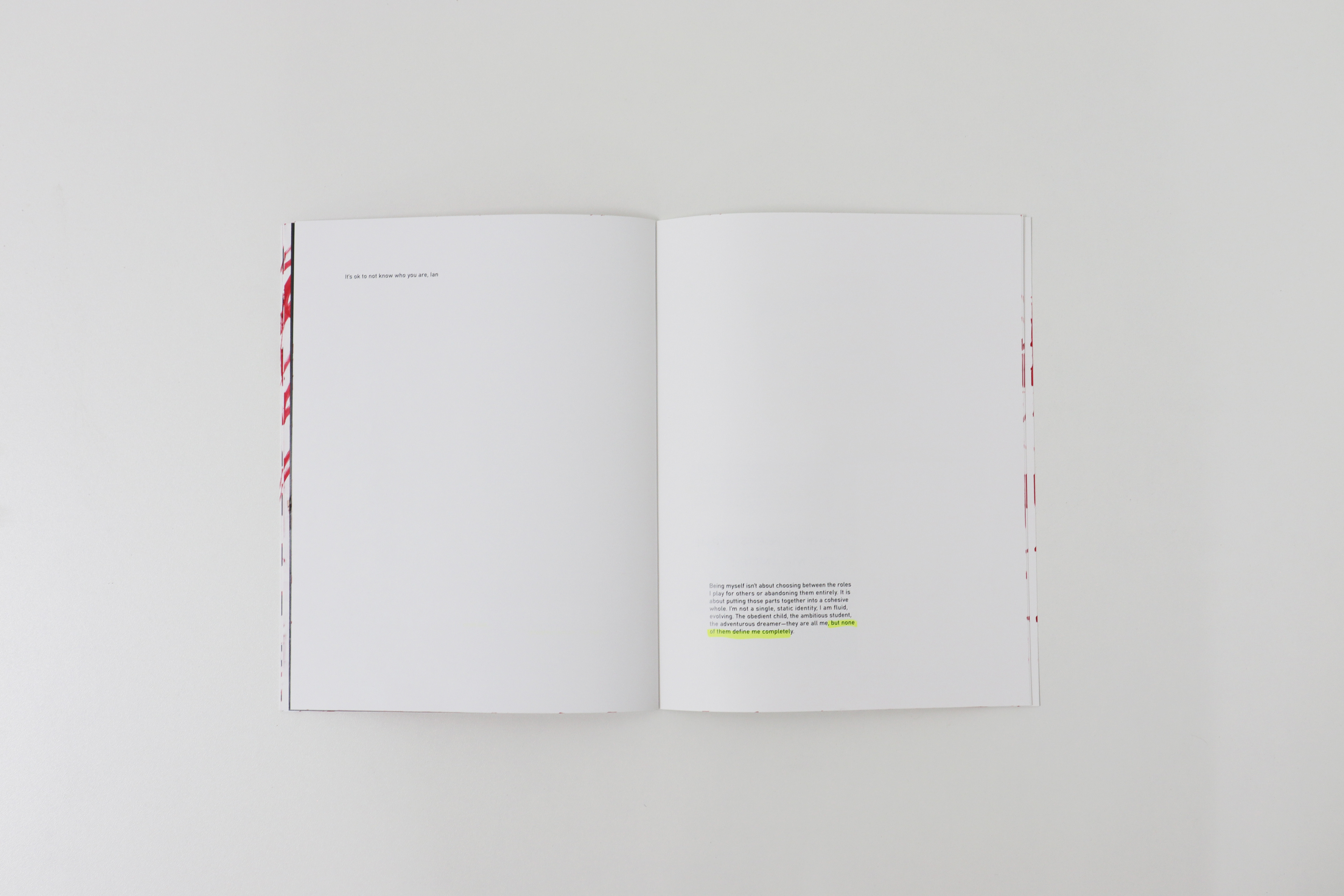
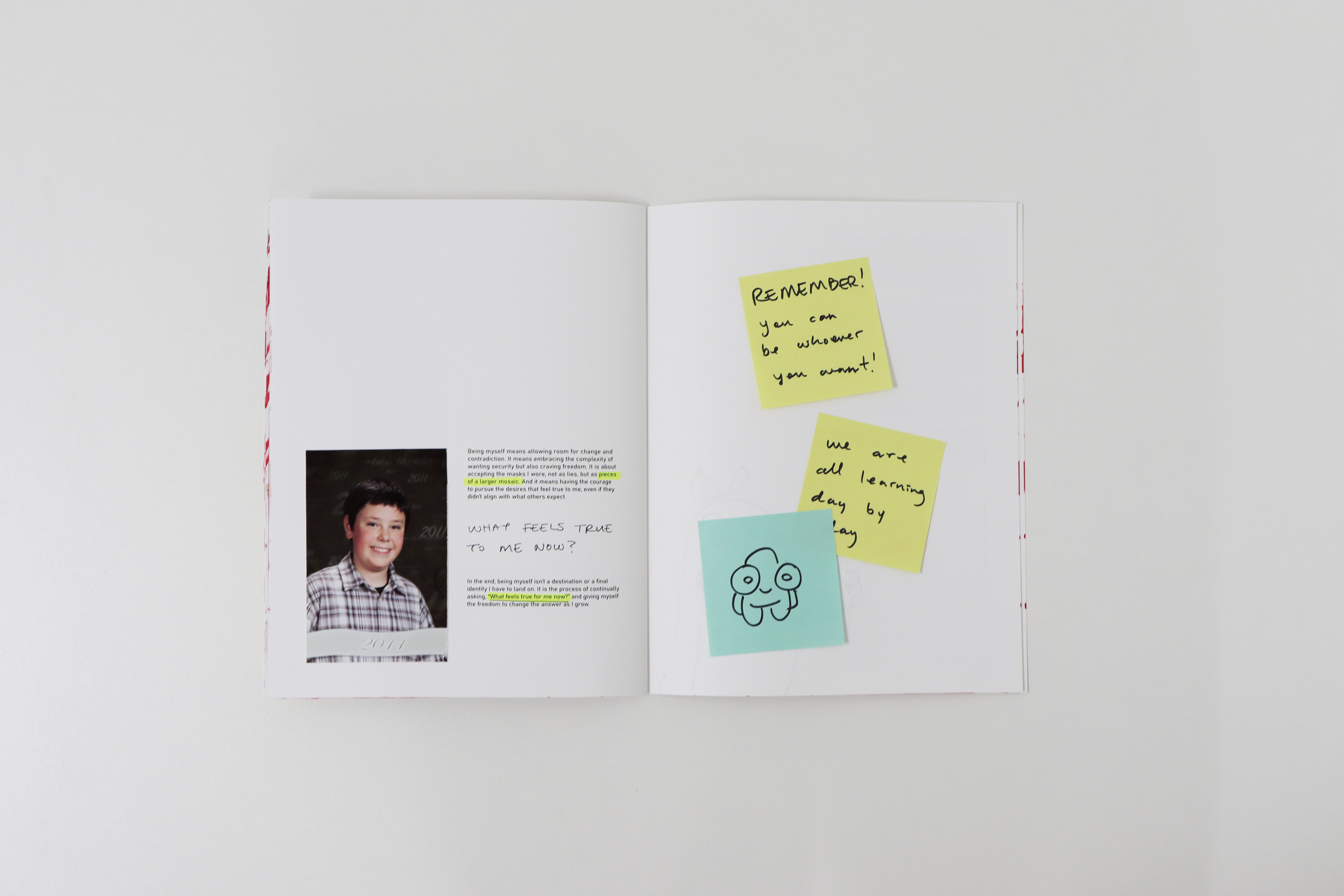
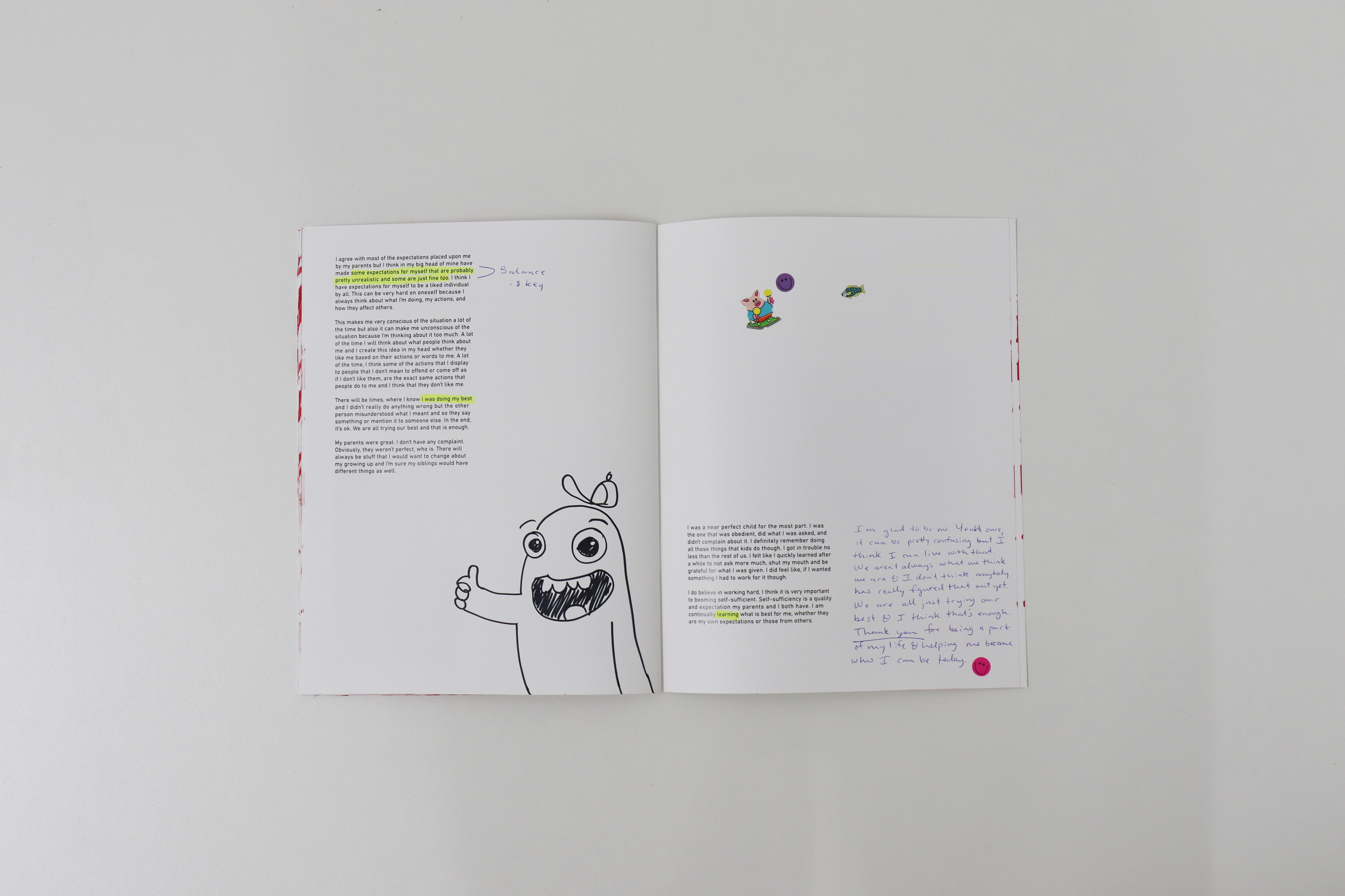
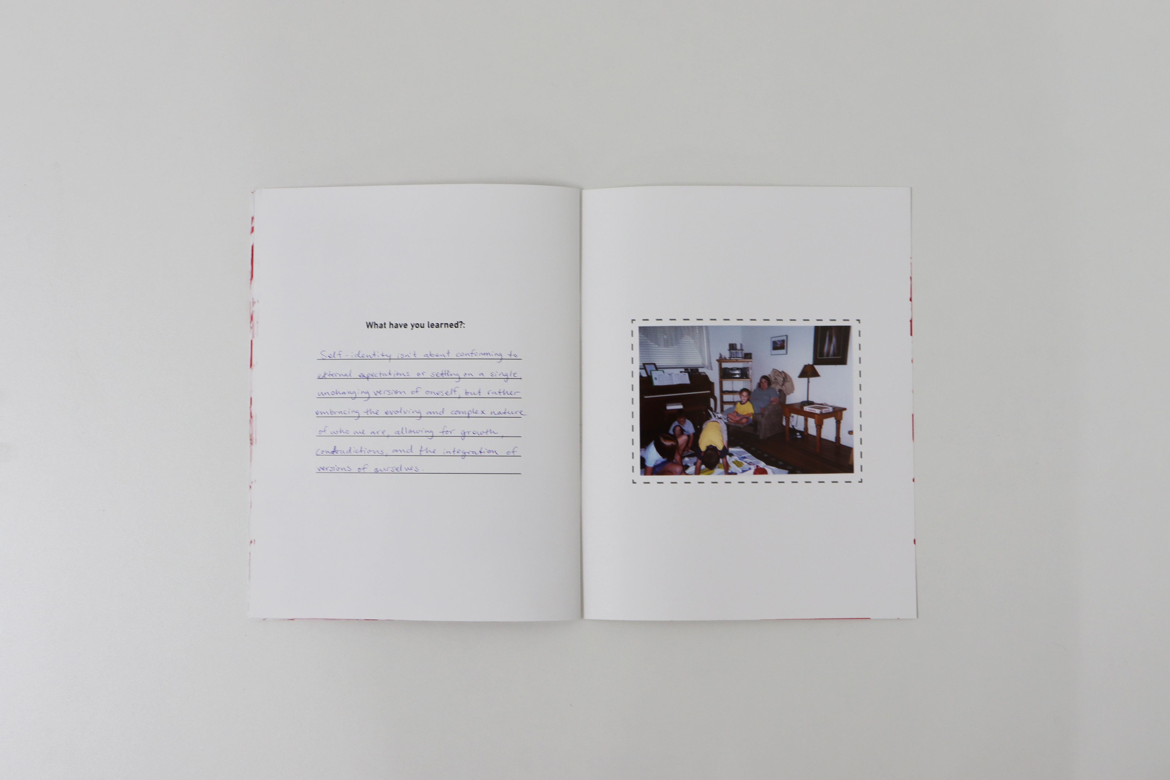
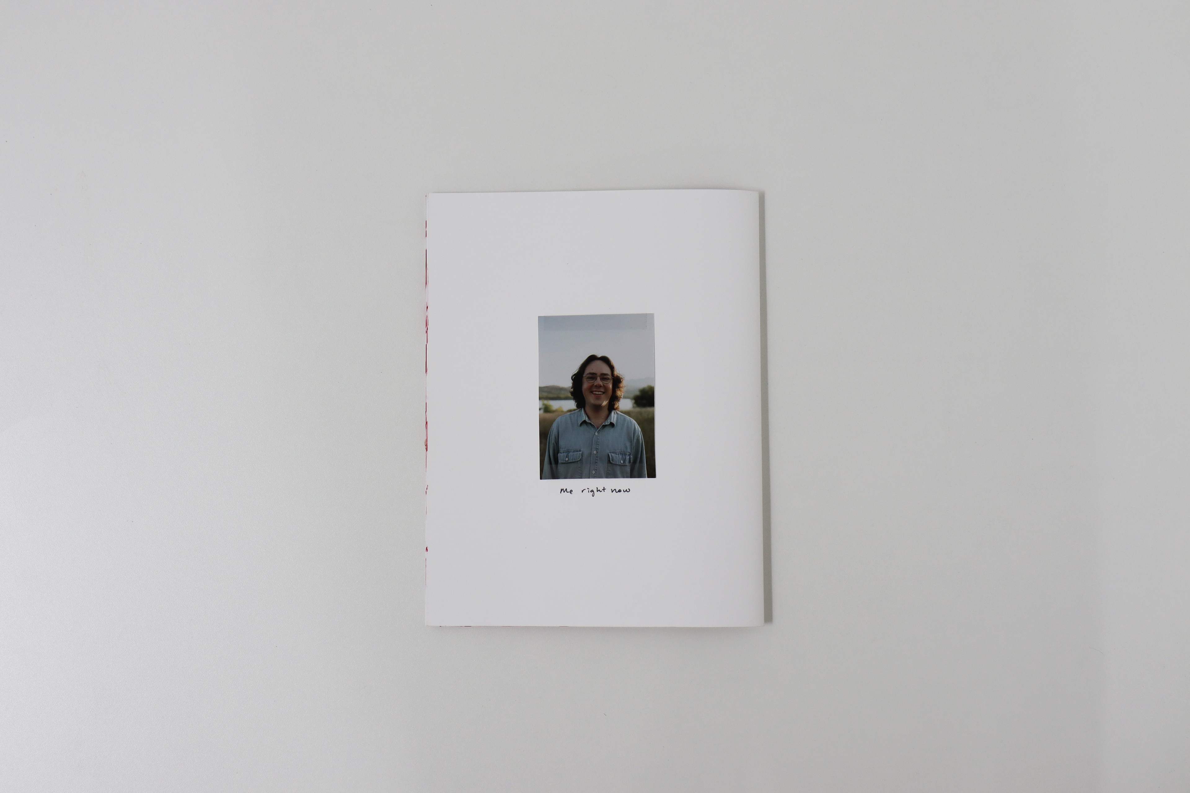
Self publication project titled "Who Am I?" exploring what makes me, me and trying to figure that out. This project is the most personal project I have ever created and I hope it shows. There are real life photos but also real feeling and thoughts written by myself throughout this booklet. This project was accepted into the 2025 UVU Student Art Show, where it was on display at the The UVU Museum of Art at Lakemount during the period of the Exhibit.
The Clyde Theatre
Re-brand project of The Clyde Theatre located in South Whidbey, WA.
Their brand is rooted in authenticity and community spirit and has doing so for over 85 years. I redesigned the logo, a box design, as well as an environmental design of the facade of the building.
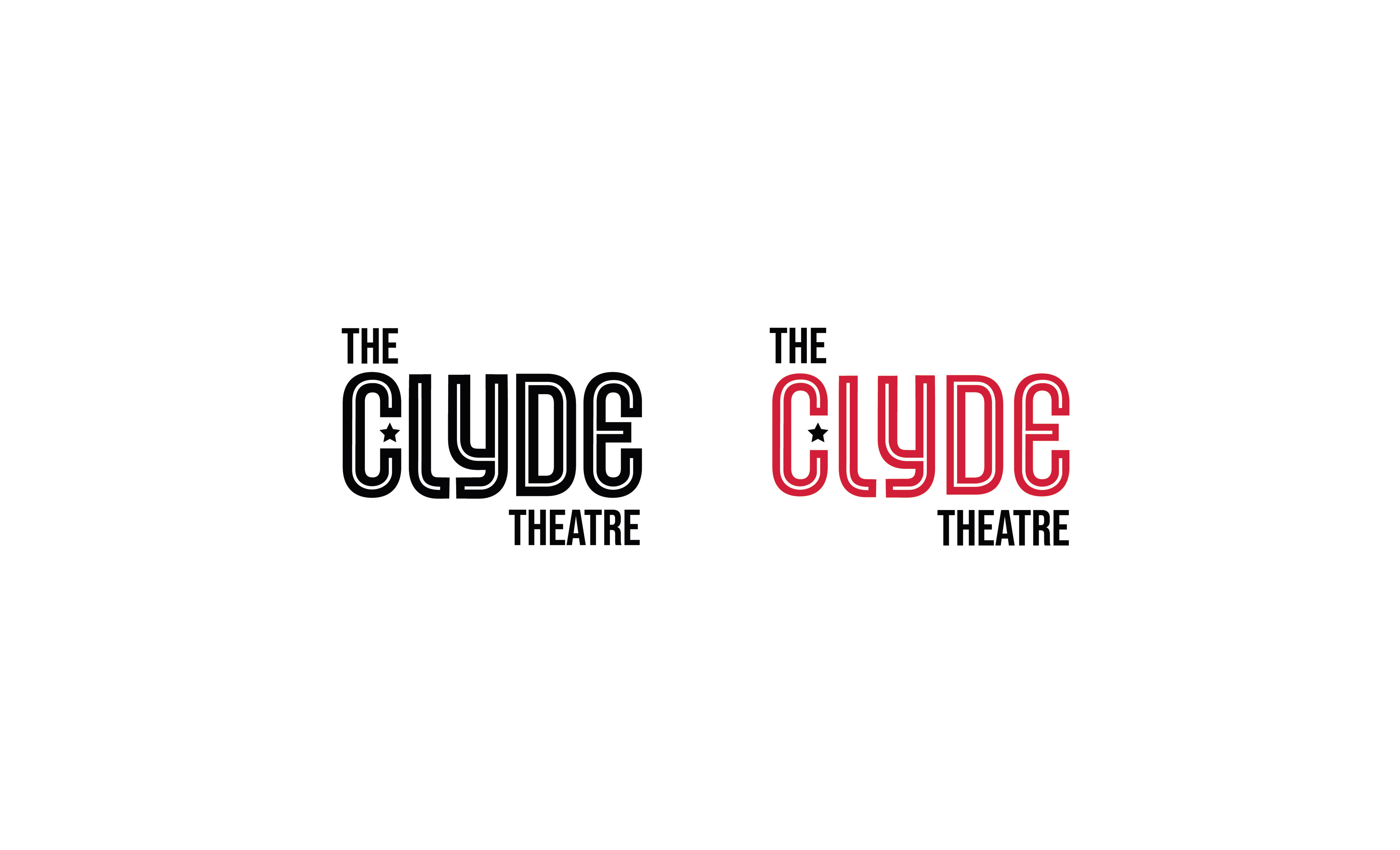
Rebrand of "The Clyde Theatre" in South Whidbey, WA
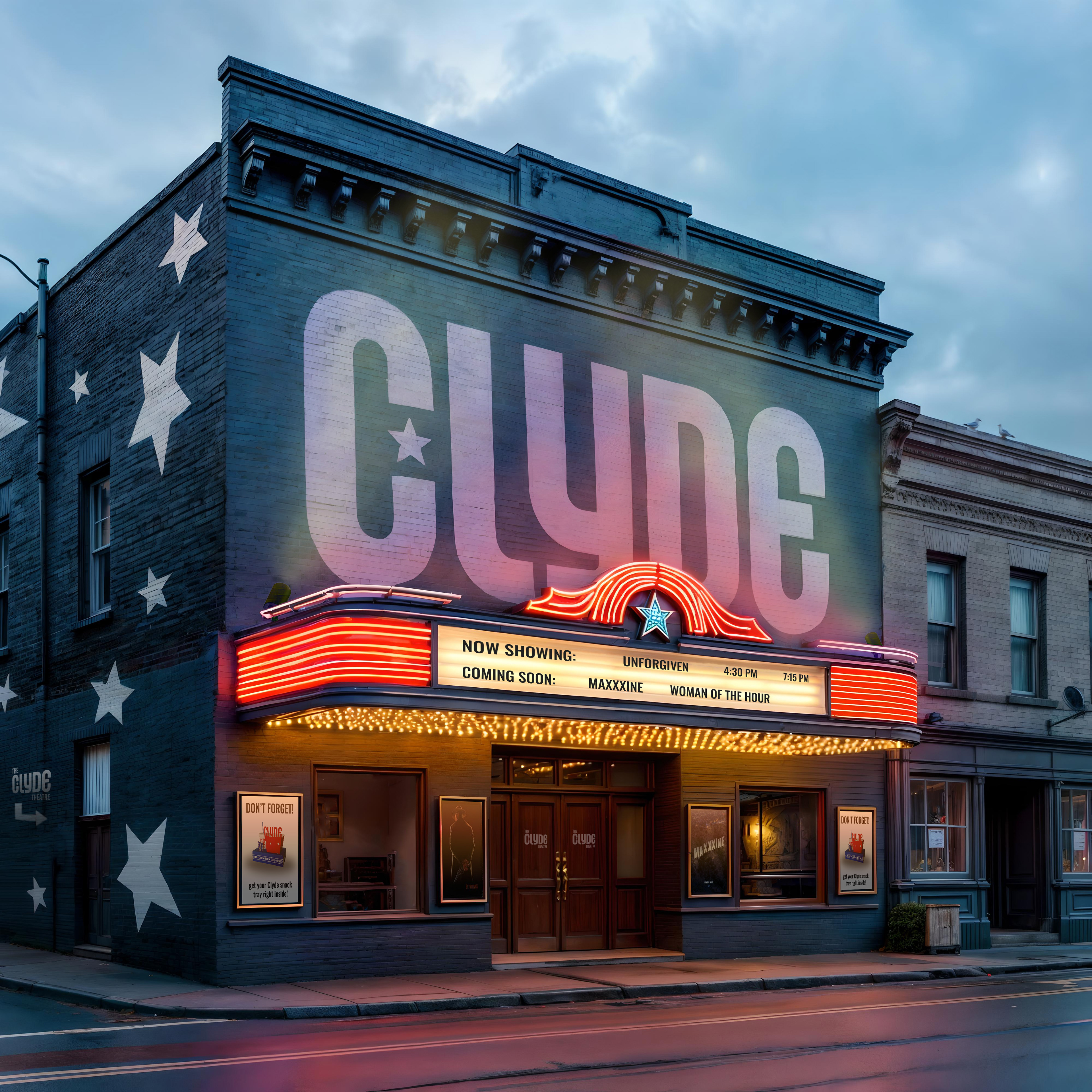
Environmental Design with rebranding
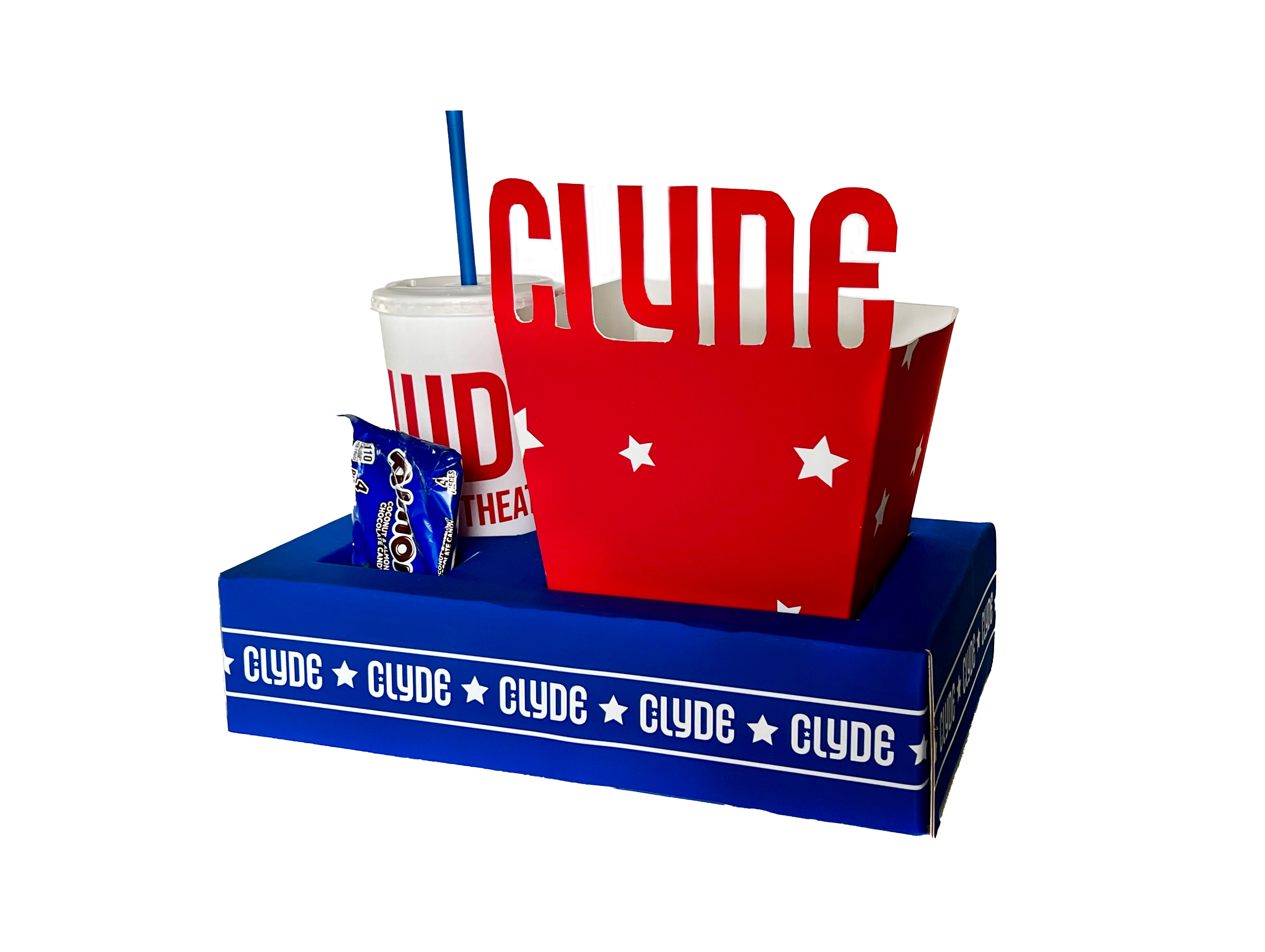
Physical Movie Theatre Tray with Popcorn Box, Cup, & Candy
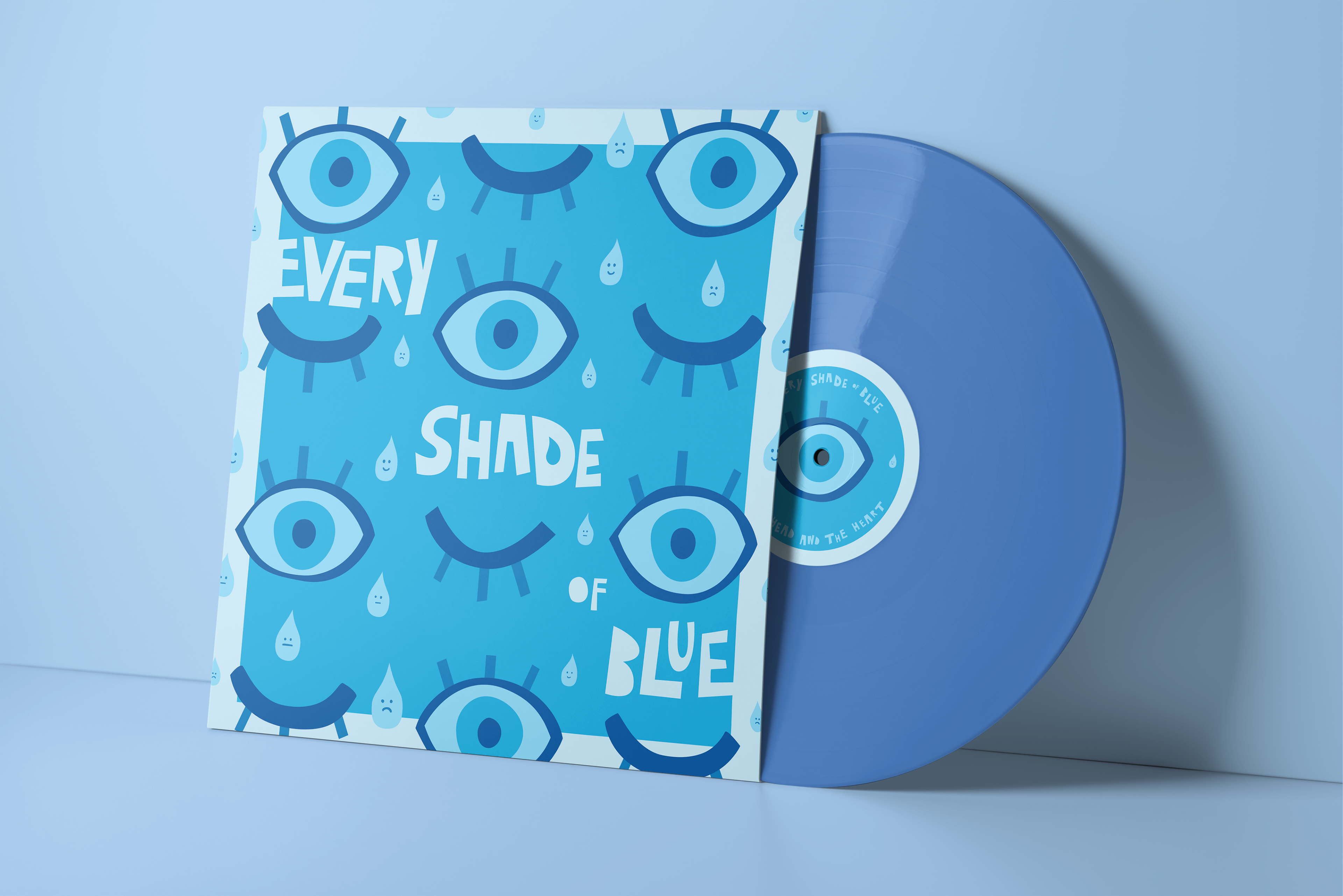
Every Shade of Blue
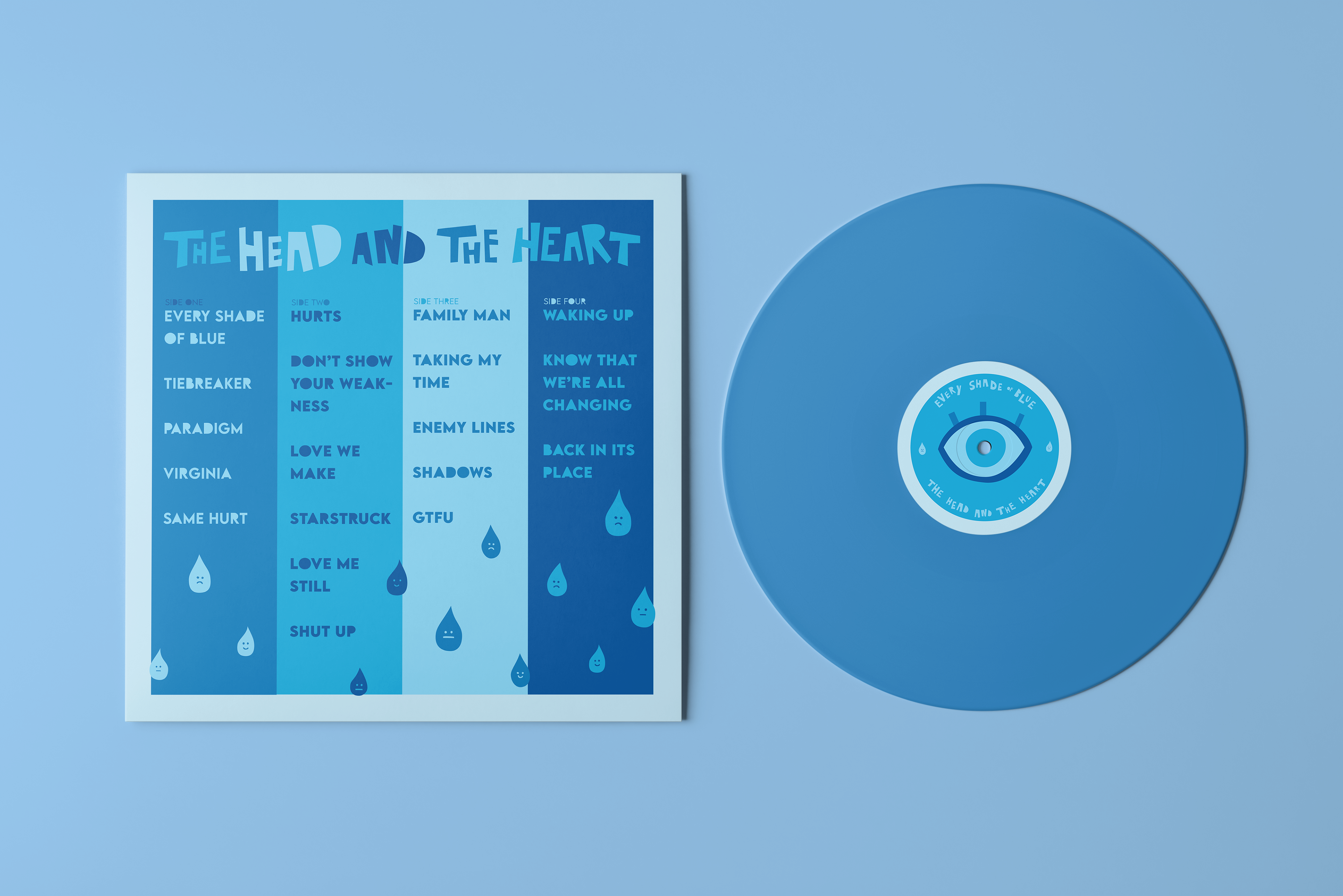
This album is all about emotions and love. This is one of my ideas that I came up with in my mind while listening to the album. I wanted to try out two different things that I haven’t really done much of in my designs so far. A pattern & an analogous color scheme. With that, I wanted to make it seem like it wasn’t just the same thing over and over again. So, I made each eye & drop a little different from the next. The name of the album prompted me to do the analogous color scheme of blue, which was a lot of fun to work with.
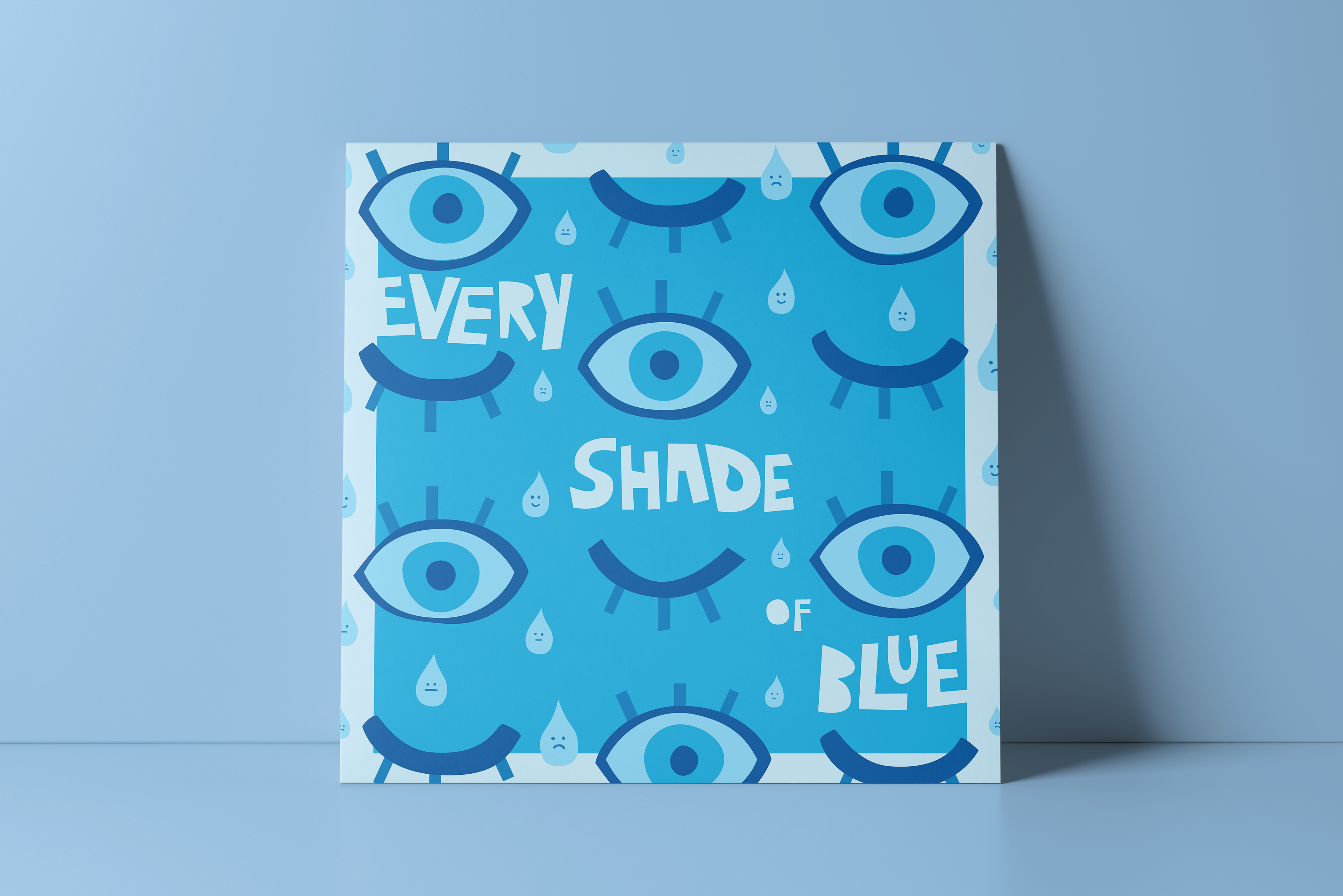
Album Design of Every Shade of Blue by The Head and The Heart
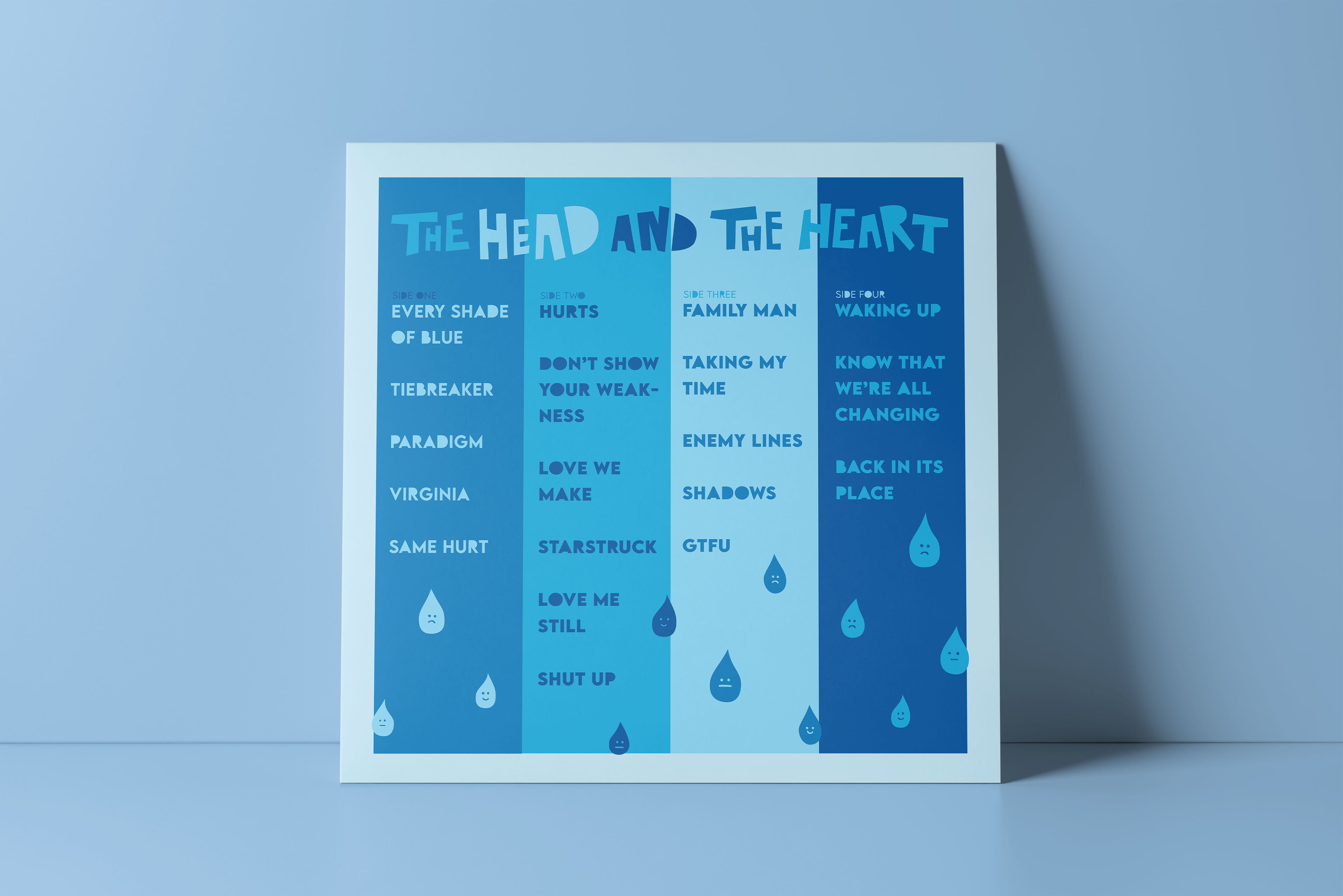
Back of the Album Cover
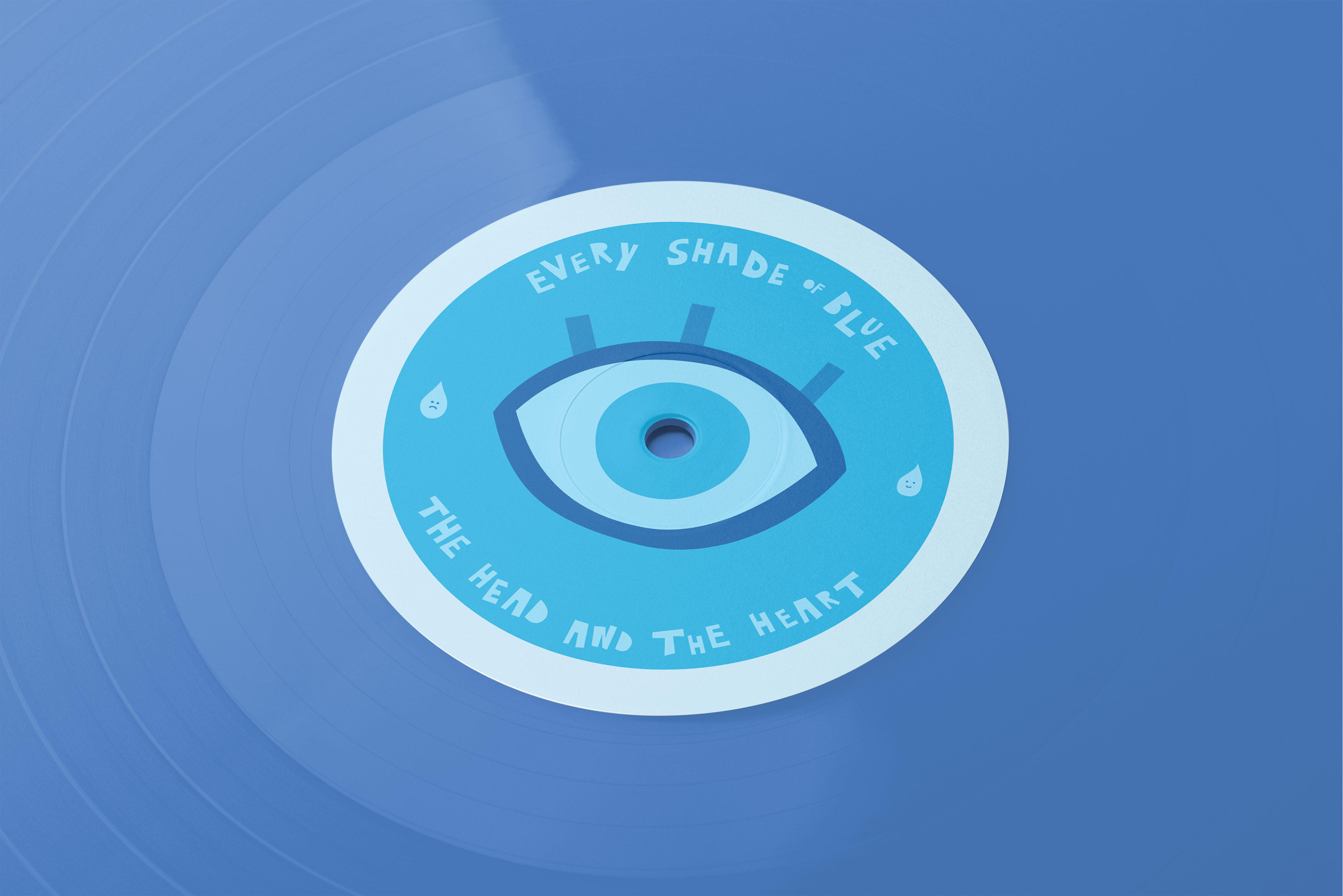
Design of the Center of the Vinyl
Dapper Donuts
At Dapper Donuts, we have made it our mission to deliver the epitome of doughnut perfection to your taste buds. We take pride in prioritizing five key elements that define our culinary philosophy: freshness, speed, lightness, classic flavors, and irresistibly tasty treats. Every doughnut we create is a testament to our unwavering commitment to providing you with the freshest pastries imaginable. Some doughnuts can be too heavy & unpleasant after eating just one, so we are dedicated to crafting light and airy doughnuts that make each bite an experience of sheer delight. We always honor the timeless allure of classic favorite flavors, from glazed to raspberry-filled. At Dapper Donuts, every mouthwatering creation embodies the essence of what a perfect doughnut should be – a delicious, timeless, and unforgettable treat.
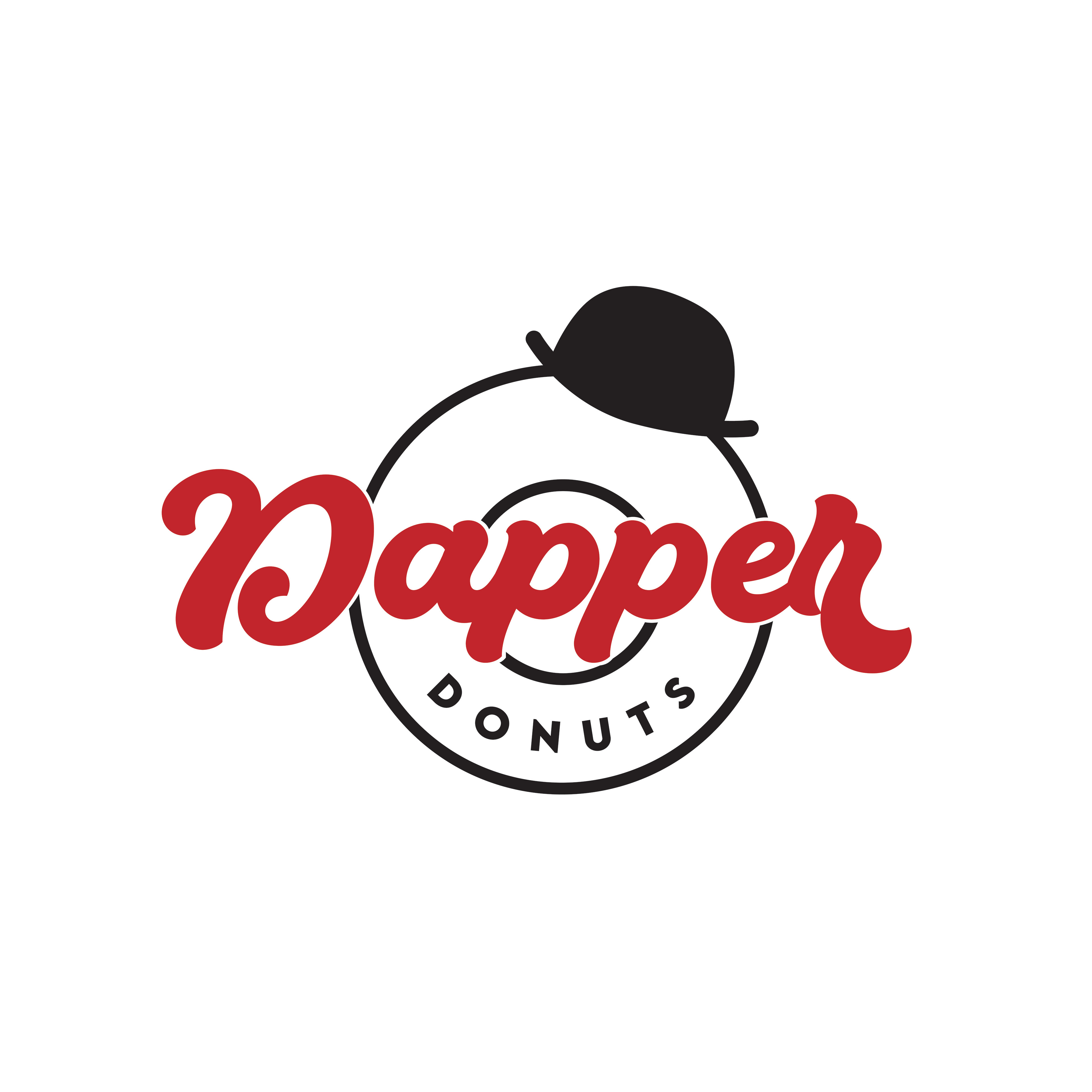
Dapper Donuts Branding Project Logo
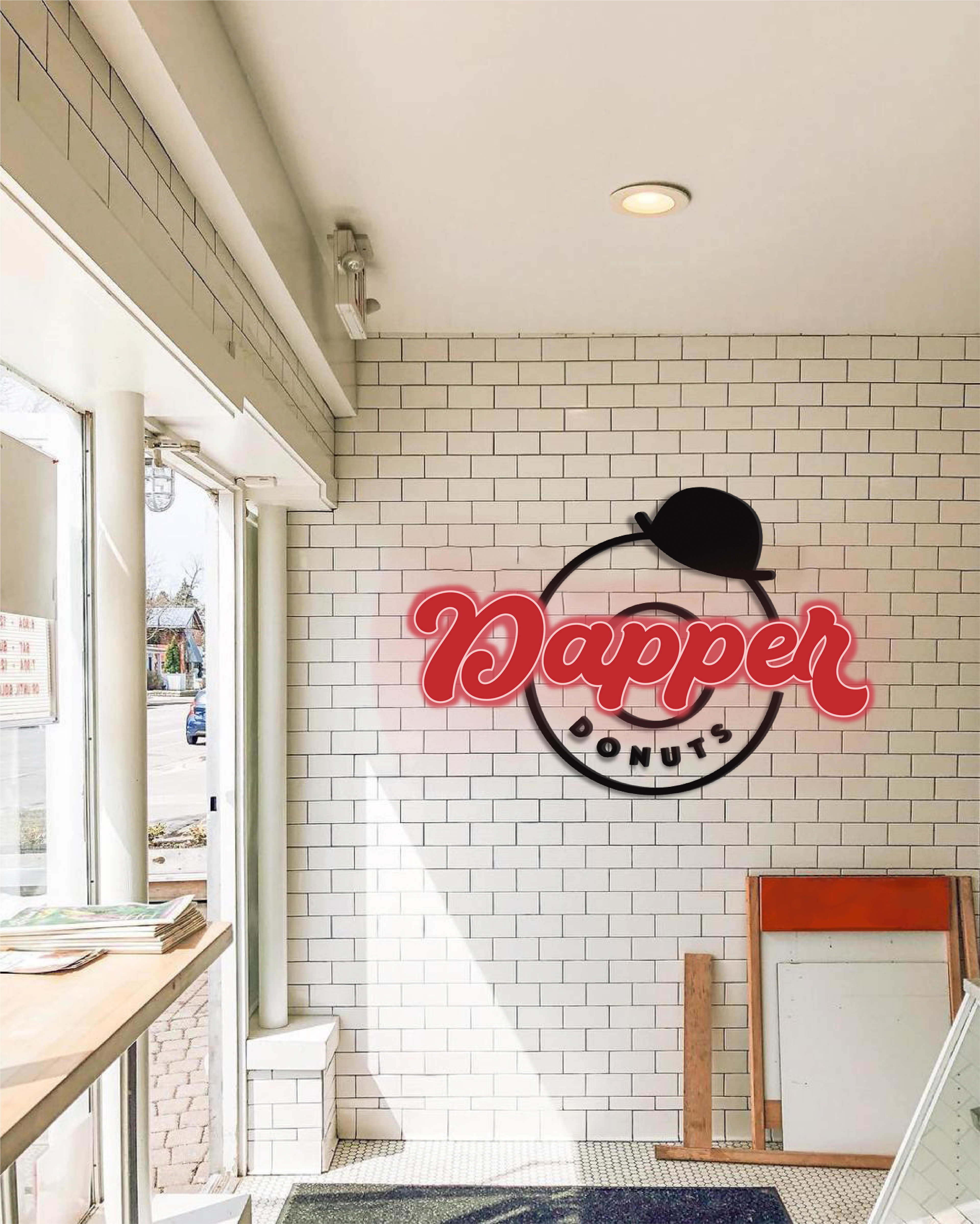
Environmental Design of the logo as a sign
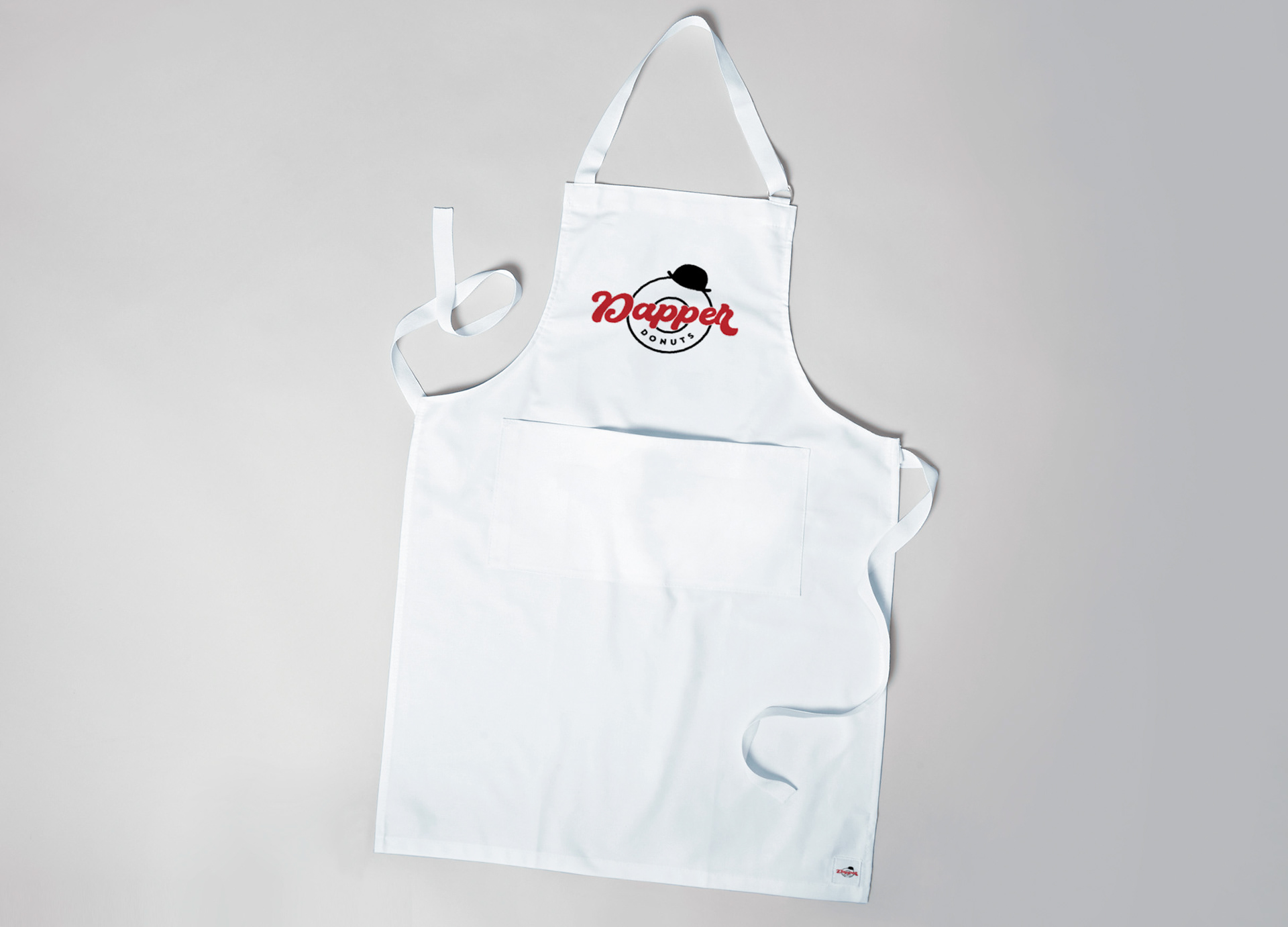
Apron Design with Logo
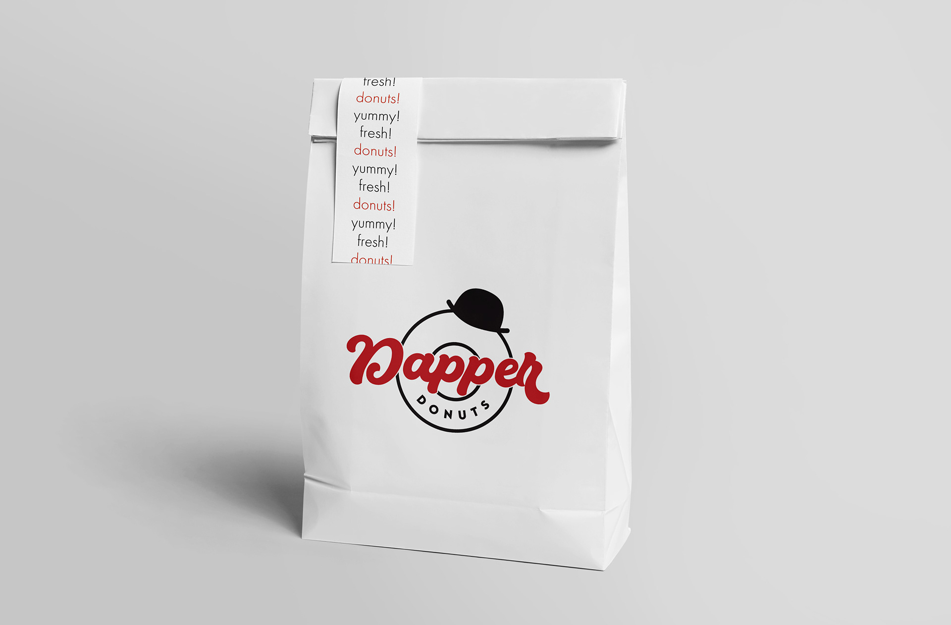
To-go bag with Logo
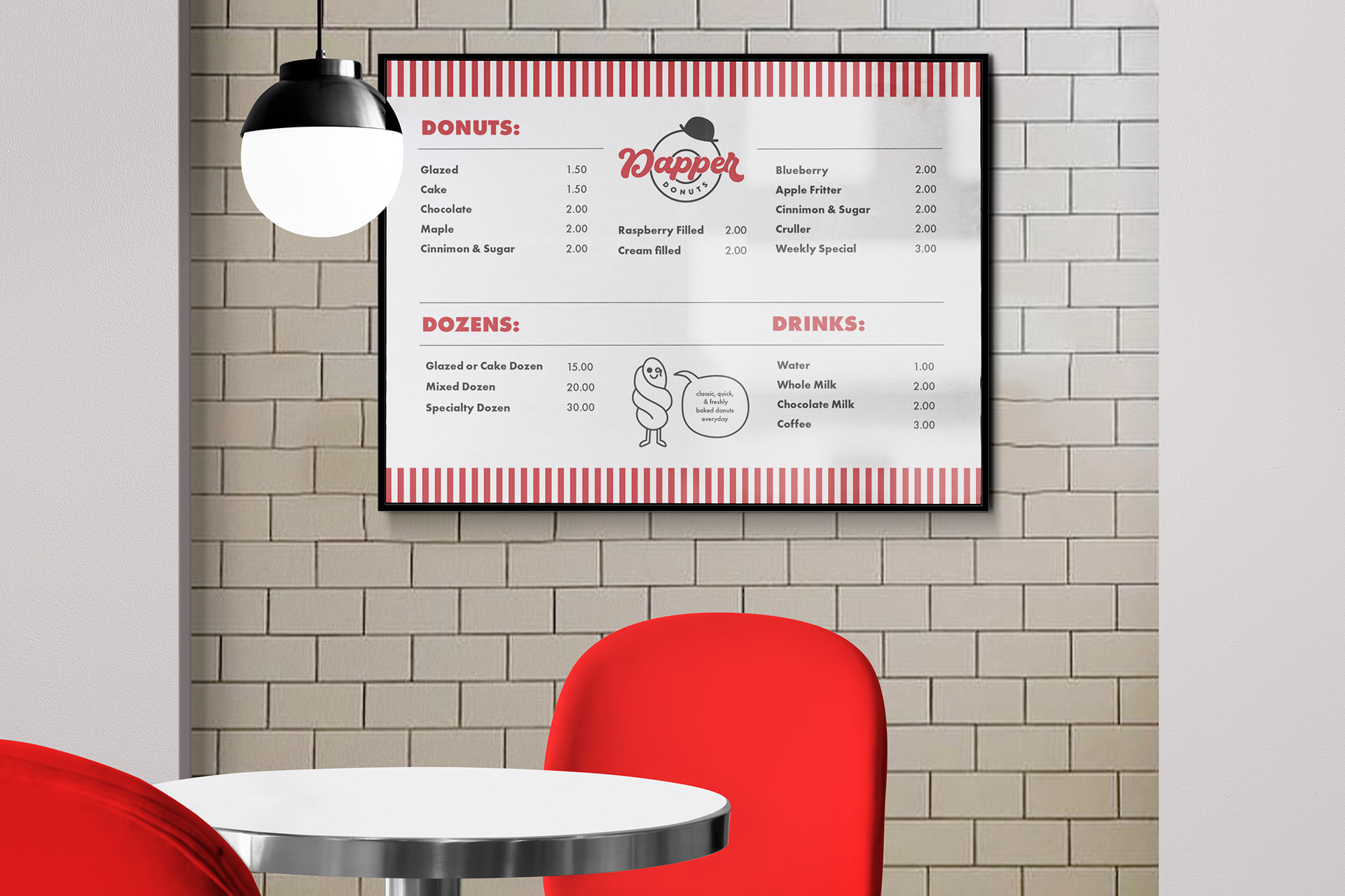
Menu Design
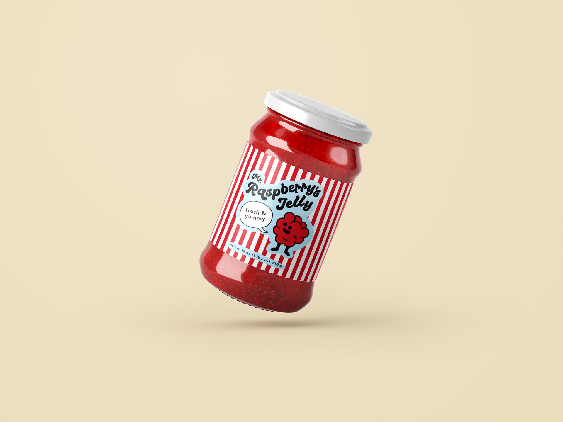
Raspberry Jelly Jar Product off-shoot Design Front
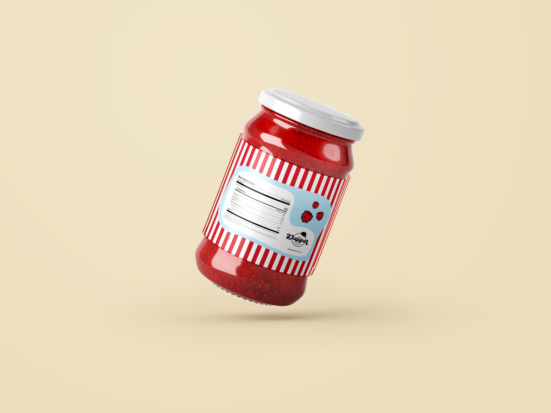
Raspberry Jelly Jar Product off-shoot Design Back
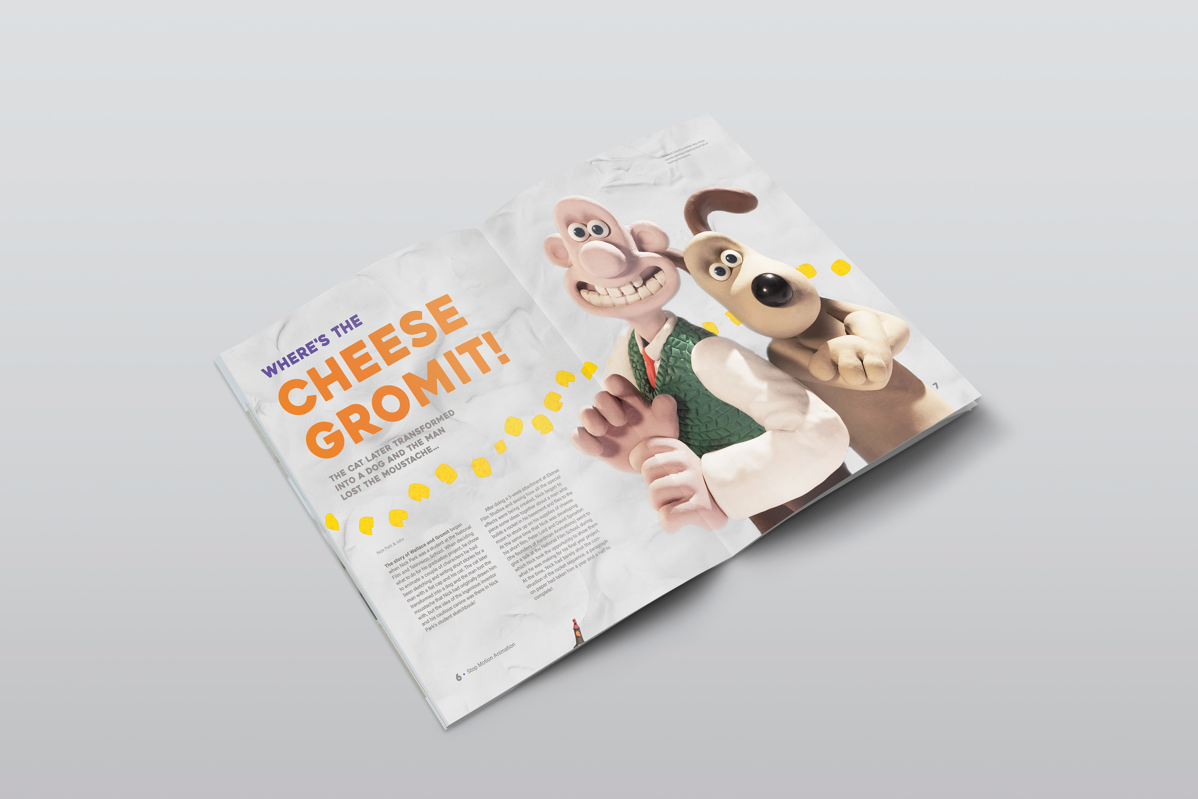
Wallace & Gromit Magazine Spread
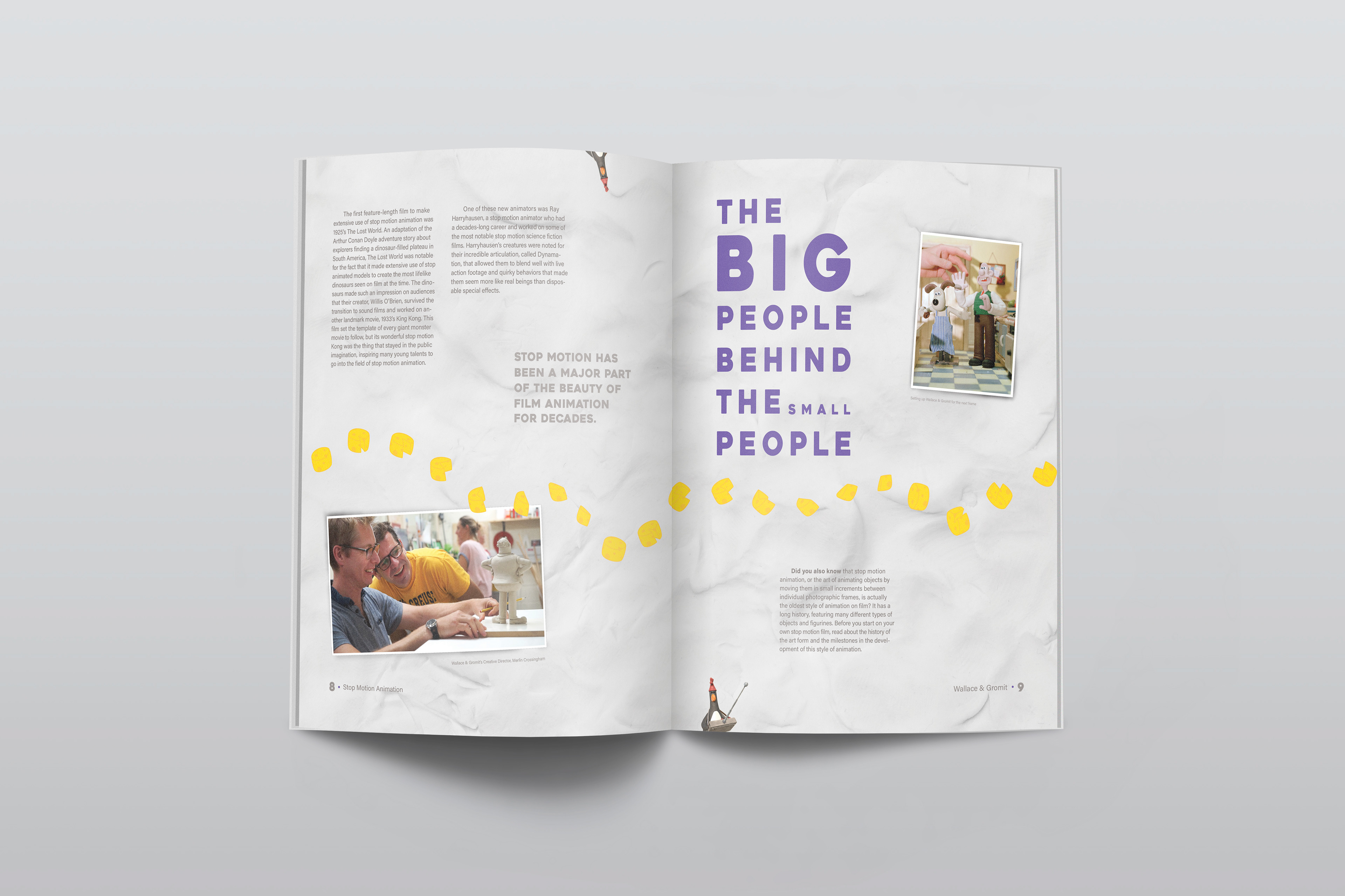
Stop motion animation has been something that has interested me for a long time. I chose Wallace and Gromit as my hero image, because they are quite recognizable, as well as, a classic example of stop motion at it’s finest. A lot of people find stop motion to be a bit creepy, but I wanted to stick with the more fun side of it by utilizes colors and clay-like blobs. I wanted to keep the same feel of the first spread for the second spread, but let it showcase some more information about the behind the scenes aspect that goes into a stop motion animation.
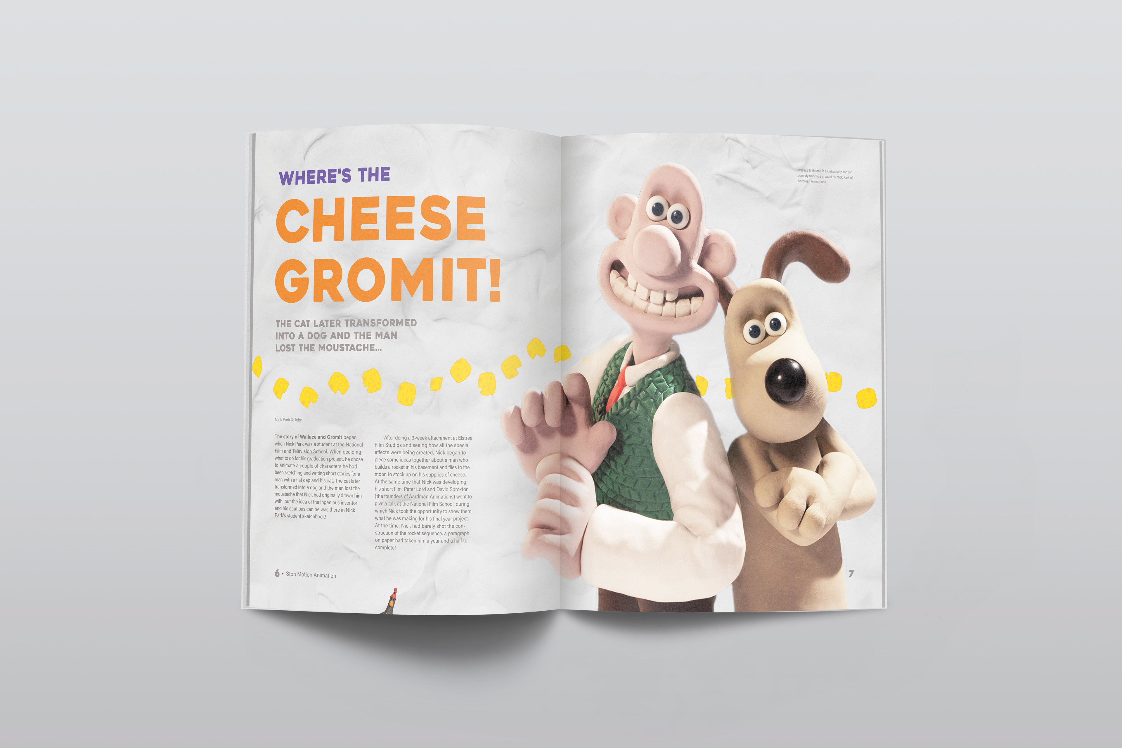
Page Layout Design with Hero Image & Main Title
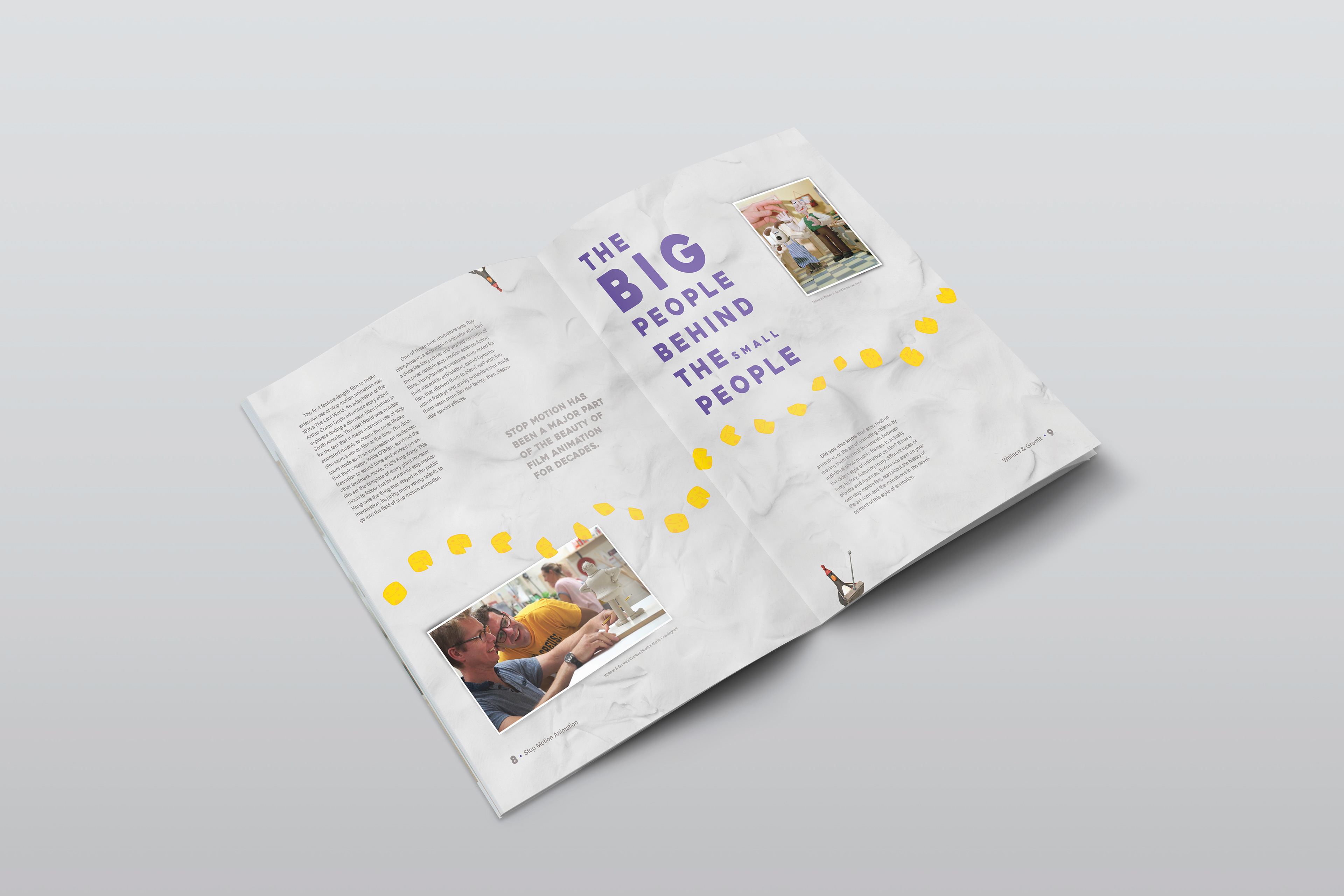
Second Spread of the Layout Design of the continuation of the article
Dragons Keep
I wanted to go for a more original style and look to the new & updated wordmark. I initially thought of going the same medieval route and then stylizing it a little more to make it special but that seemed to cliche. I went for a typeface (kaerobi) that you wouldn't immediately think “oh yeah that is game store!” I thought of using little stylized additions to the wordmark itself giving it some character rather than just plainly saying it with a overused typeface.
Dragons Keep Brand Redesign Logo
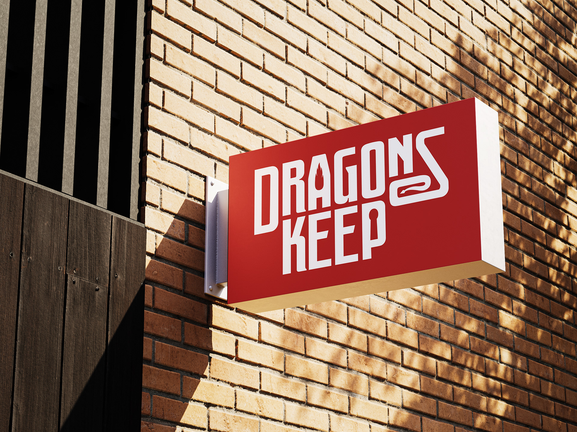
Sign with Logo
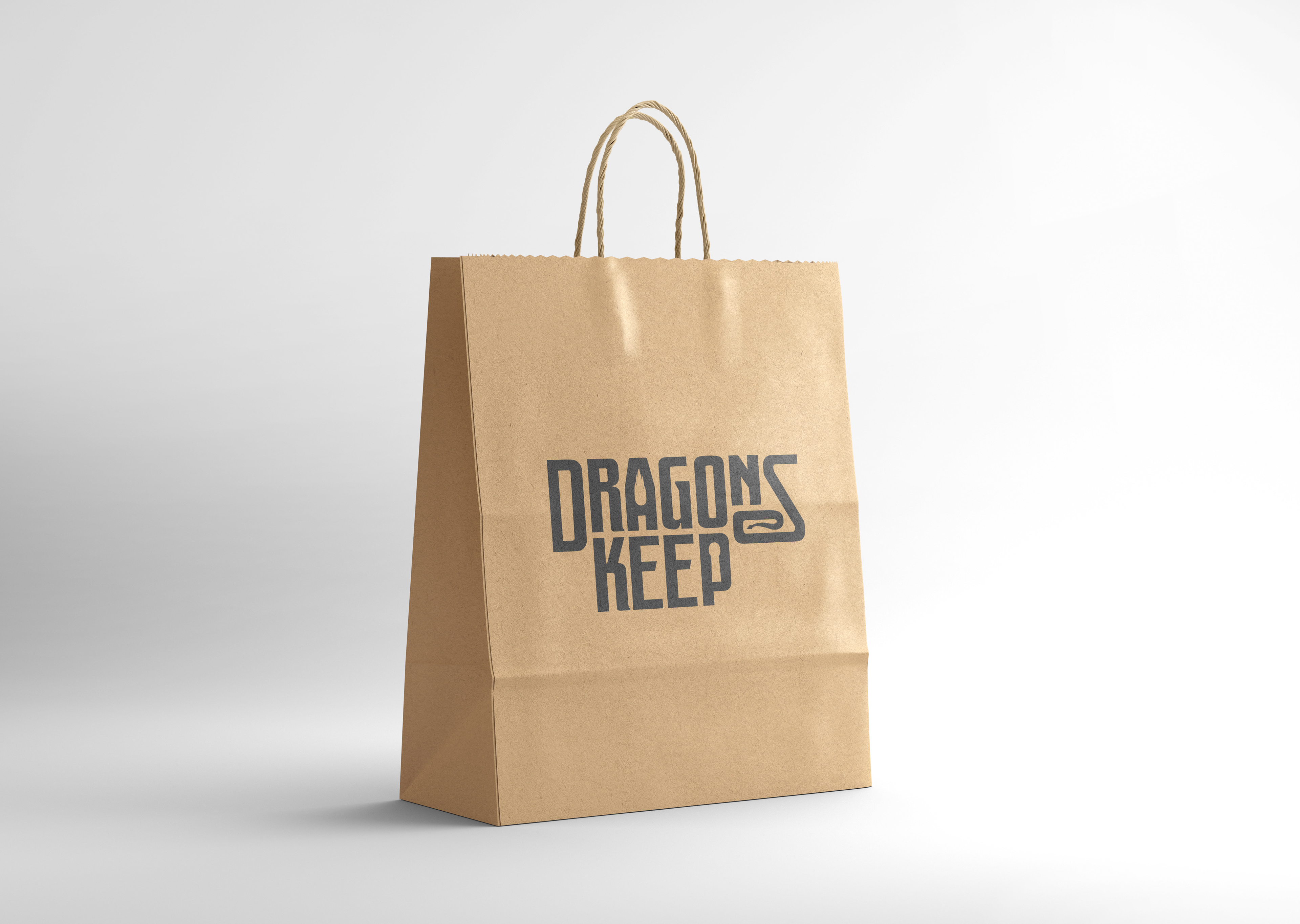
Bag with Logo
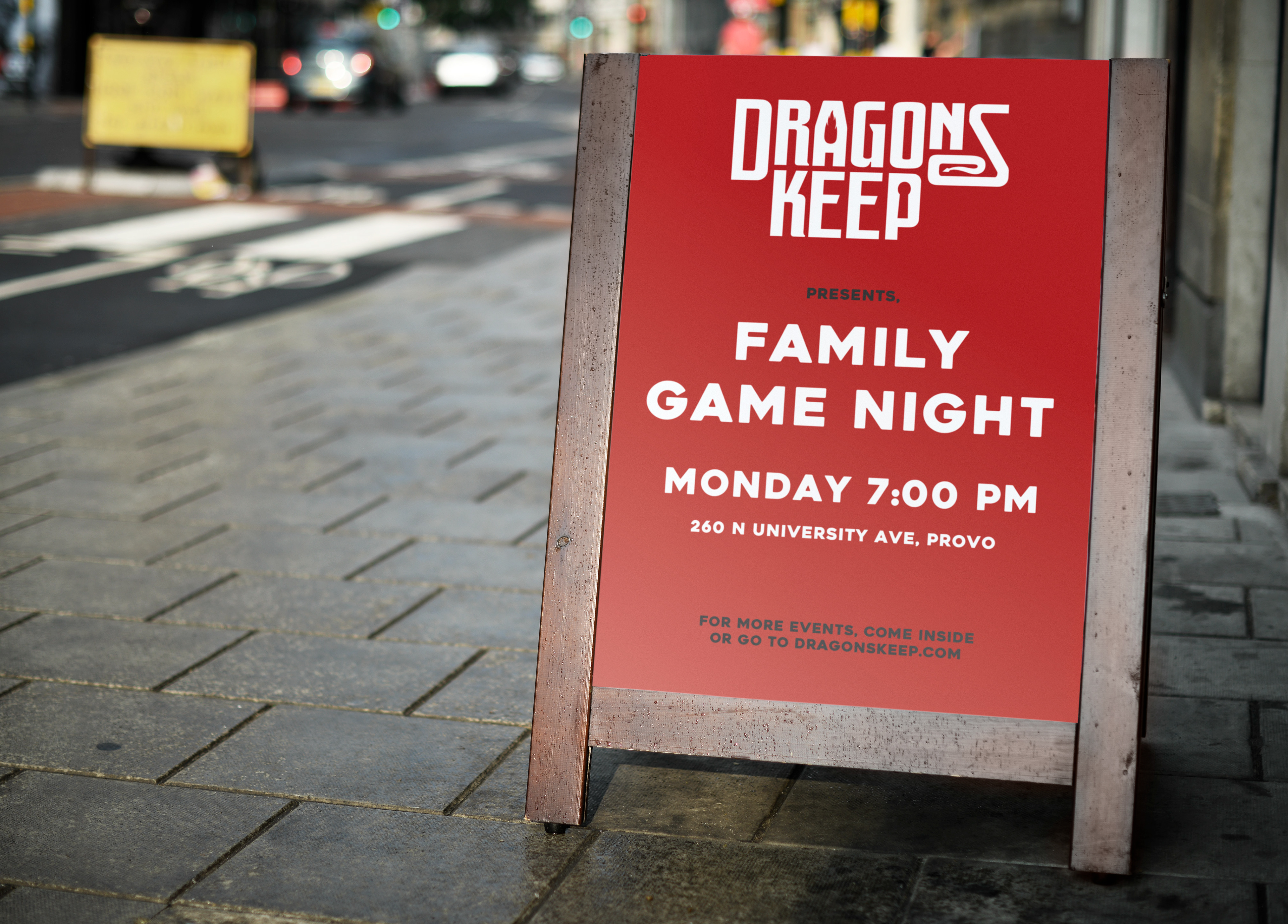
Sign for an event
Apple Picking Pictogram Series
This pictogram series was sparked for my love for the season of fall and what comes along with it, apple picking. I grew up picking apples in my backyard so it was fun to create something that was so close and nostalgic to me. There are do pictograms, the basket of apples and the pie, then the ideogram, an apple tree, combining the overall idea into one icon.
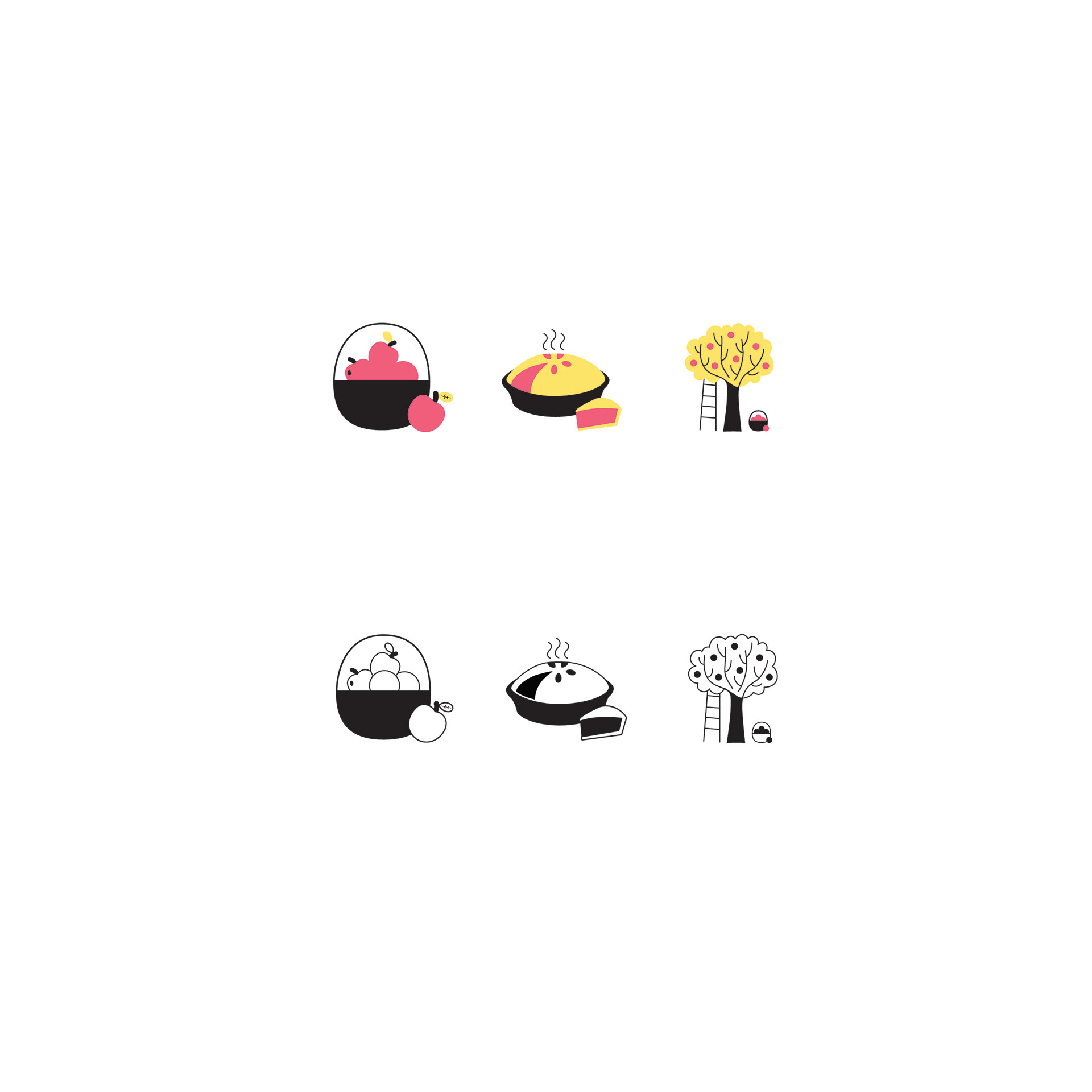
Pictogram Series: Apple Picking
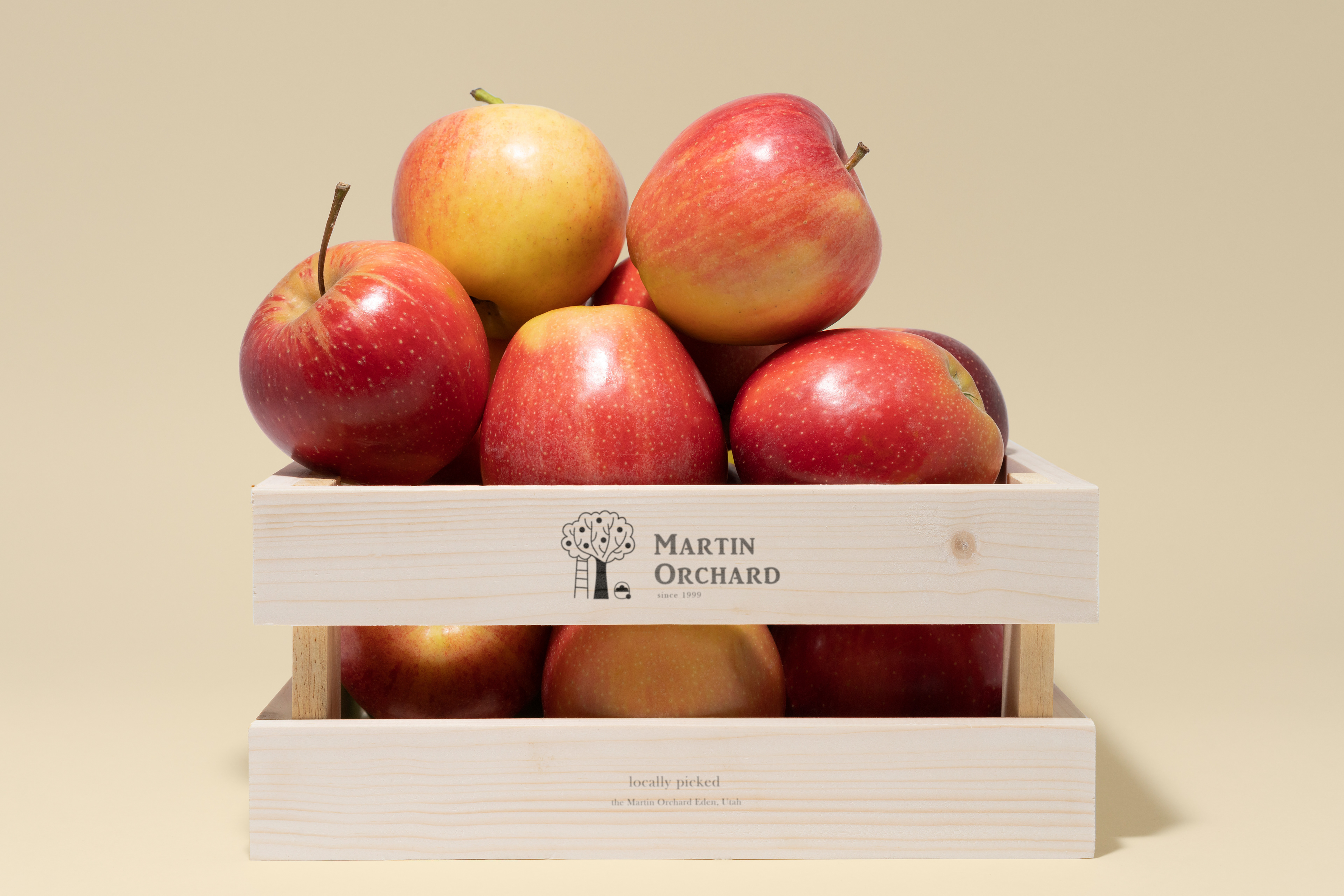
Box Design using pictogram
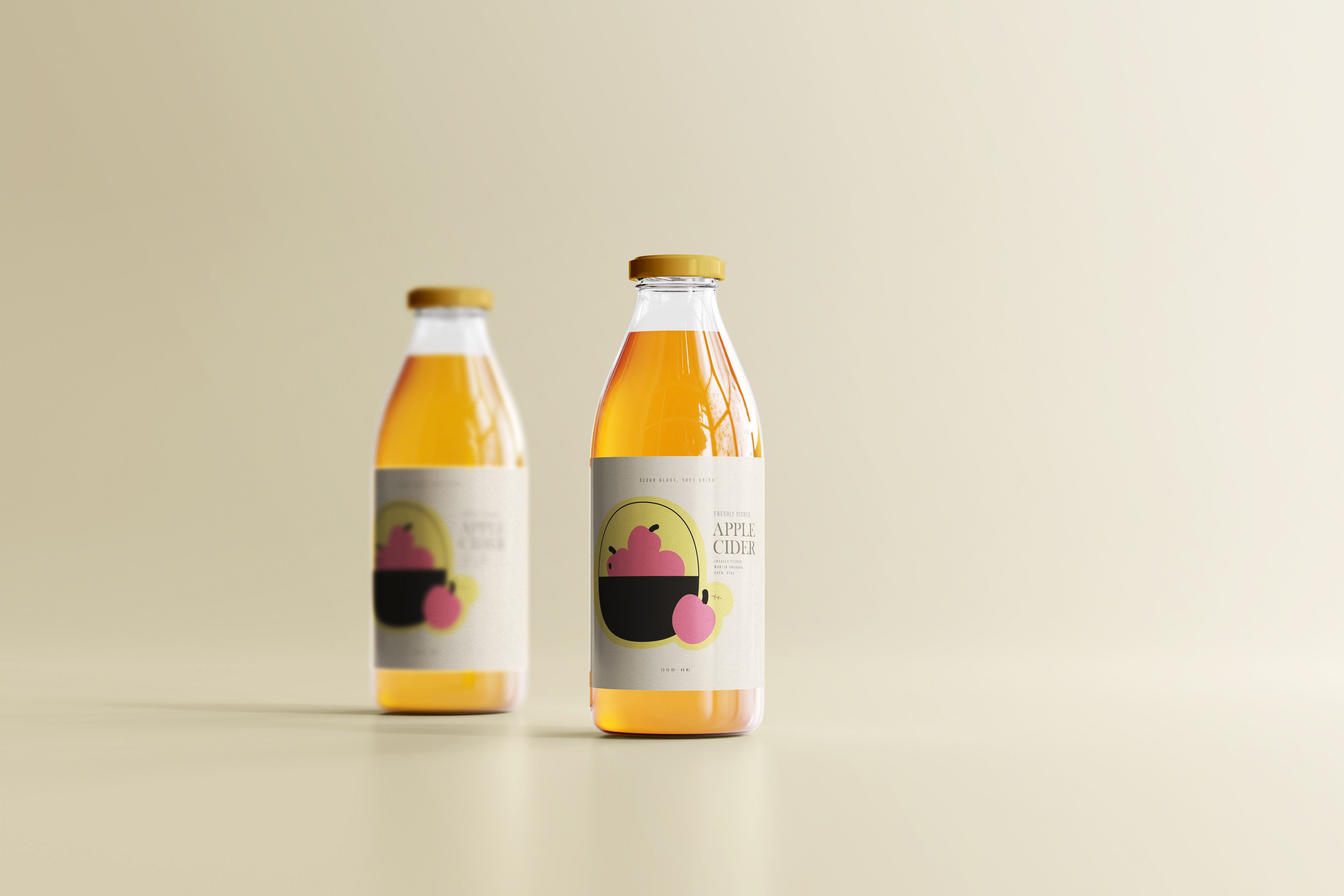
Apple Cider Bottles using pictogram
High Noon
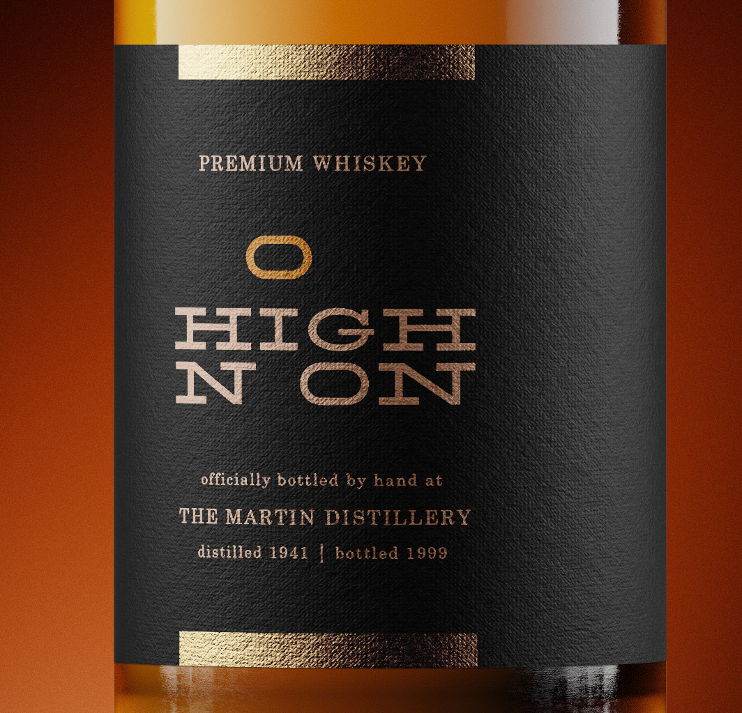
The overarching concept of high noon is, the “o” above the rest of the letters, being the sun in the sky at high noon. I wanted to use a typeface that has a wild west feel, but also incorporating a sense of quality. I envisioned the design as being used for a brand of whiskey or I think it could even work for a name of a bar or saloon
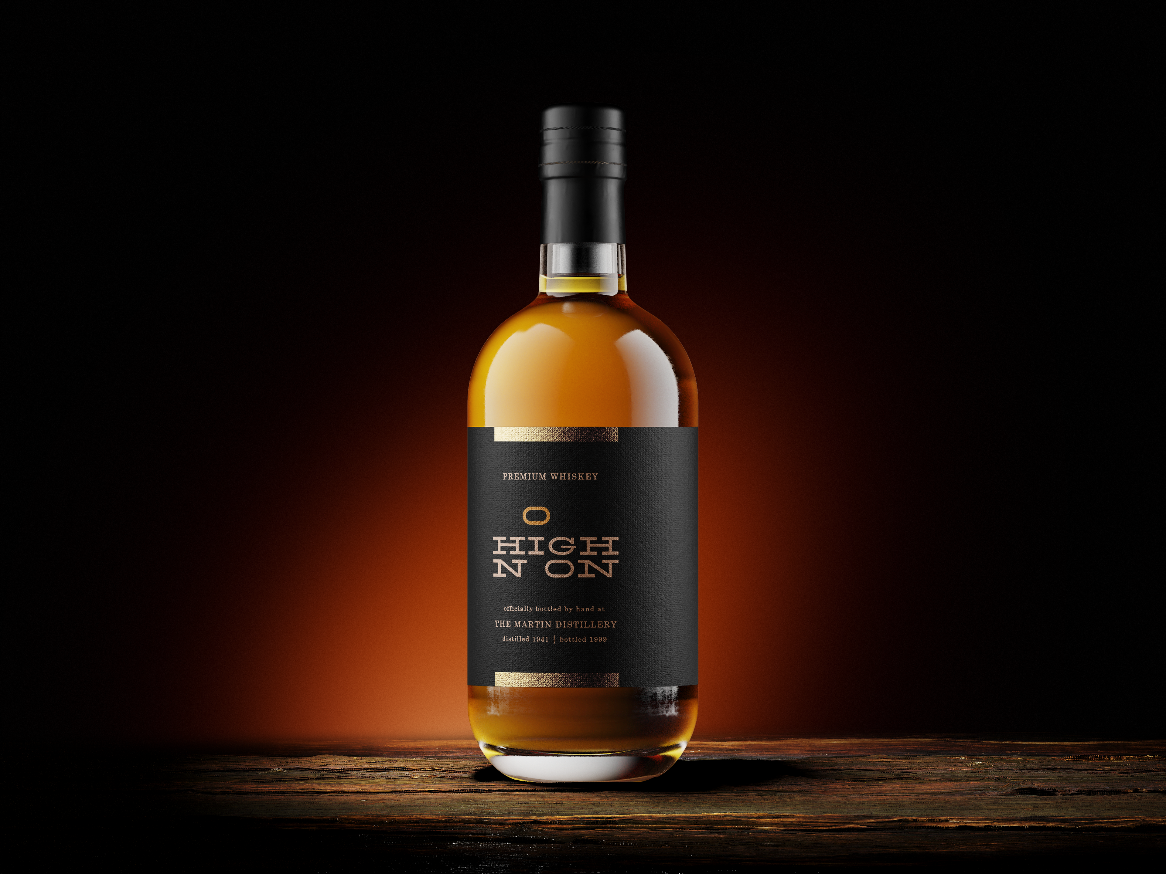
Expressive Typography Design of "High Noon"
Master
With smartphones being such a big part of everyone’s lives now, it can be hard to put them down once and a while, especially when you don’t want to do something you need to do. Master provides a project/schedule management system that feels more user-friendly and cross-platform than any that are on the market. It allows you to seamlessly integrate your work and life for the best control and balance. With easily customizable schedules, calendars, and goal setting systems, integrate work and personal time tracking. Share your work details with co-workers, and your family details with family. Set goals and have the system send you motivational content and reminders.

Project/Life Management App Logo Design
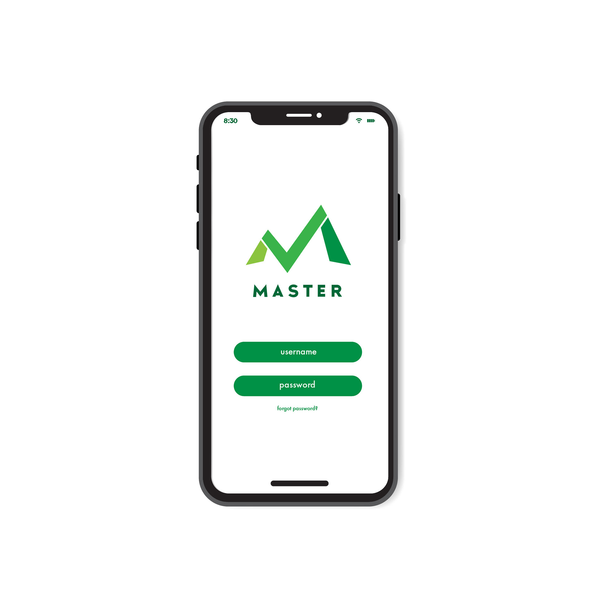
Log-in page for app
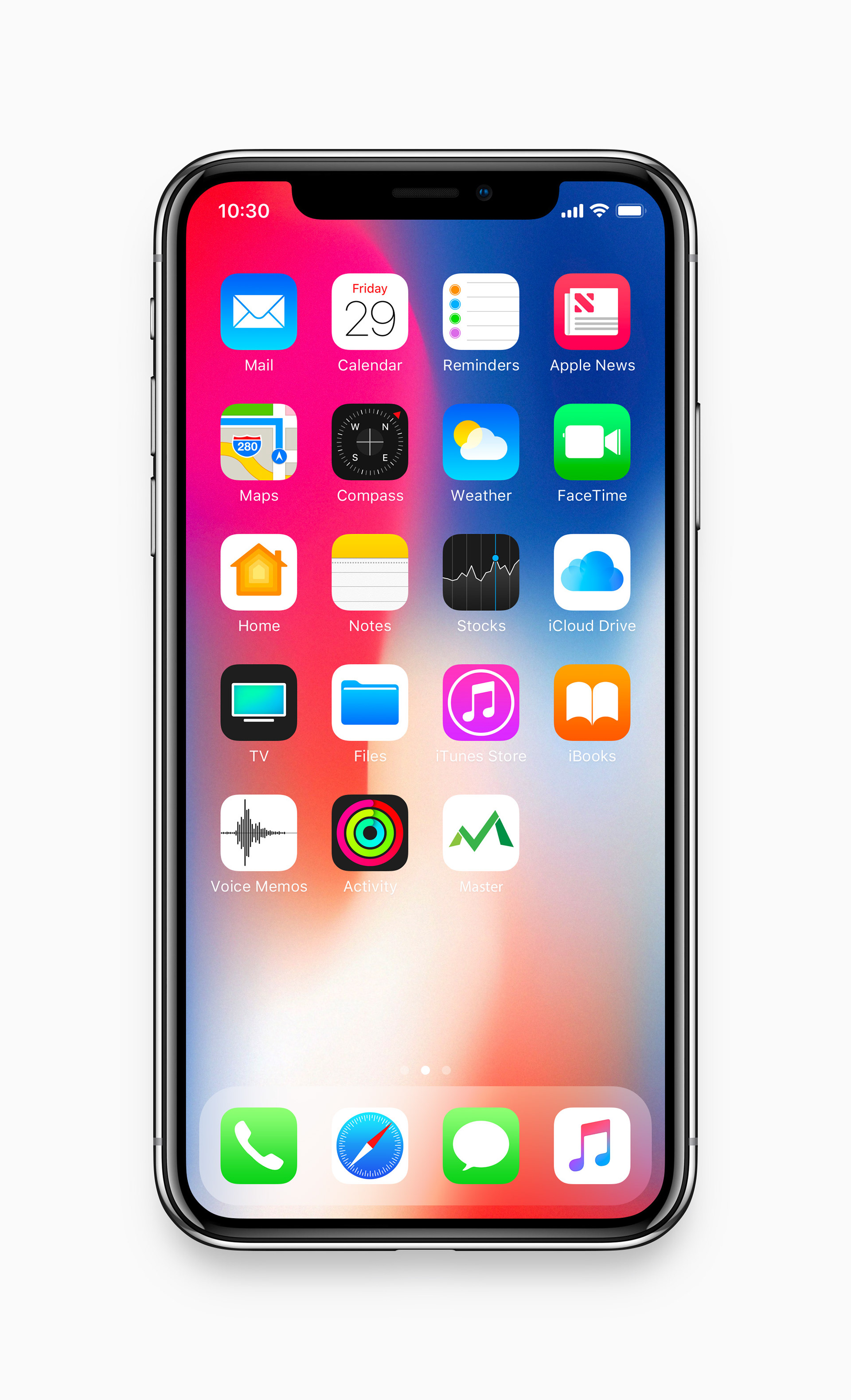
App Cover Image

Connect
Lego has connected me to many things throughout my life. Growing up, my friends and I played with Lego all the time. We would build together, make stories together, and inspire each other. Through the internet, I have been able to connect to people all around the world by sharing Lego photography and stop motion films with each other, making a community fostering friendships. Building Lego sets and making my own creations with Lego by myself has connected me to my own sense of creativity and imagination. Just like one Lego brick connects to another, so can we as a people.
Jelly Bean Sticker Series
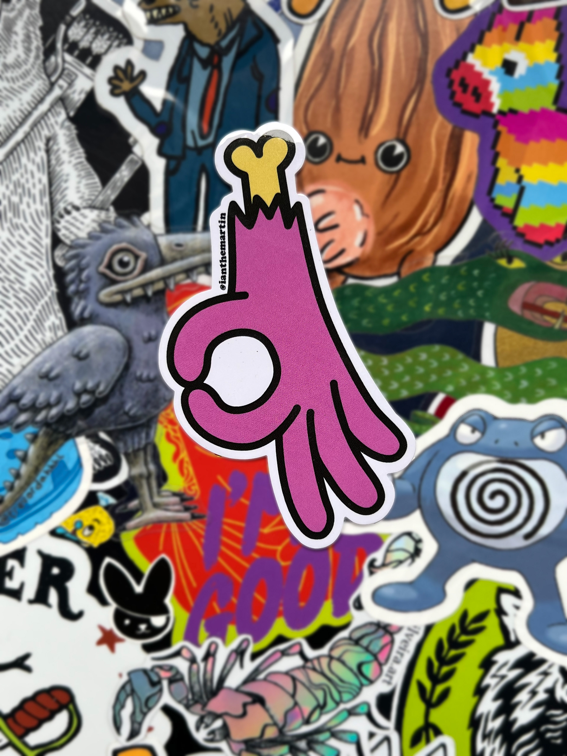
I designed a sticker series for @thelocalstickermachine on Instagram. They have sticker machines around Northern Utah displaying different sticker series from local artists. I also designed a few more stickers as well as got them manufactured.
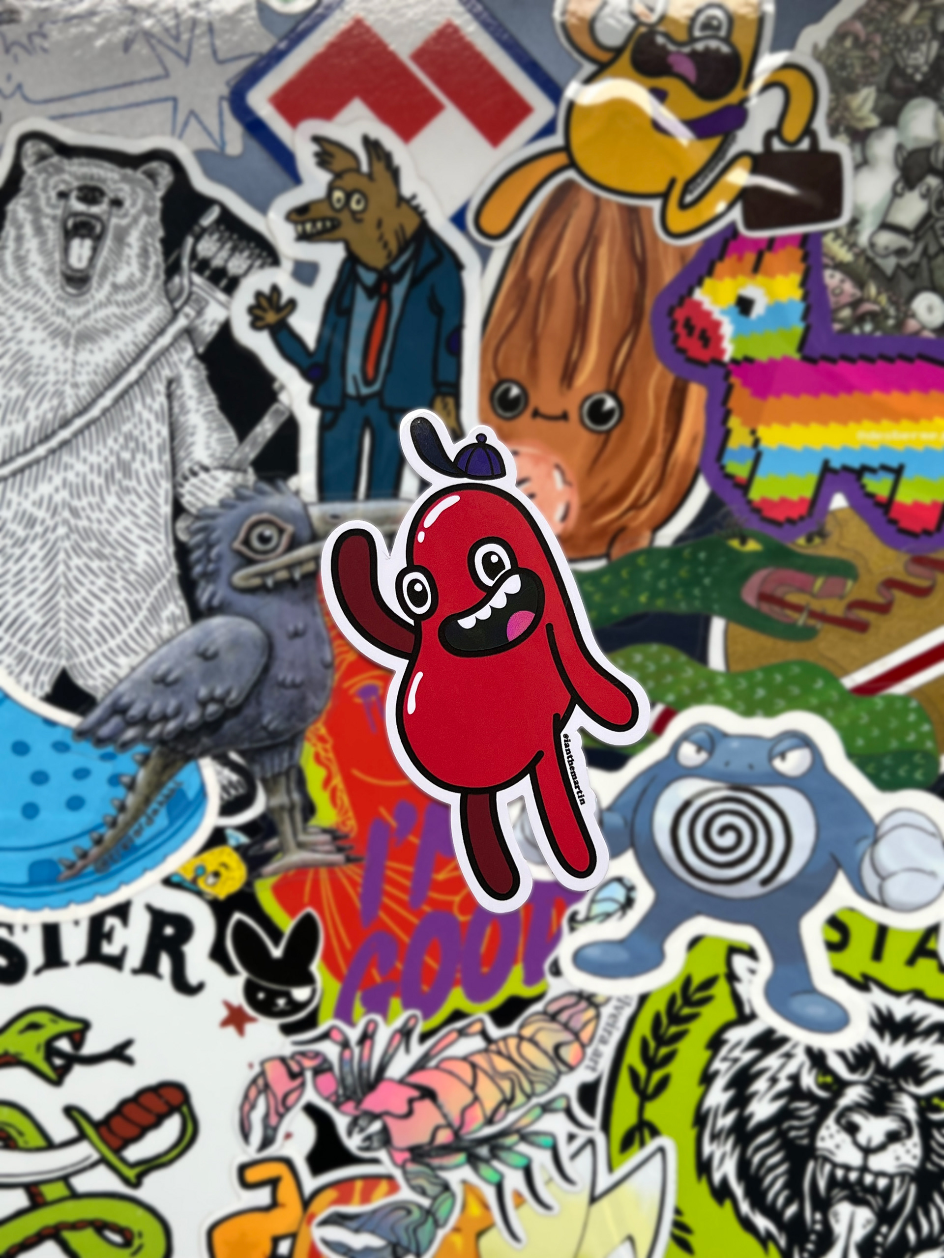
Themed Sticker Collection of Jelly Bean Characters
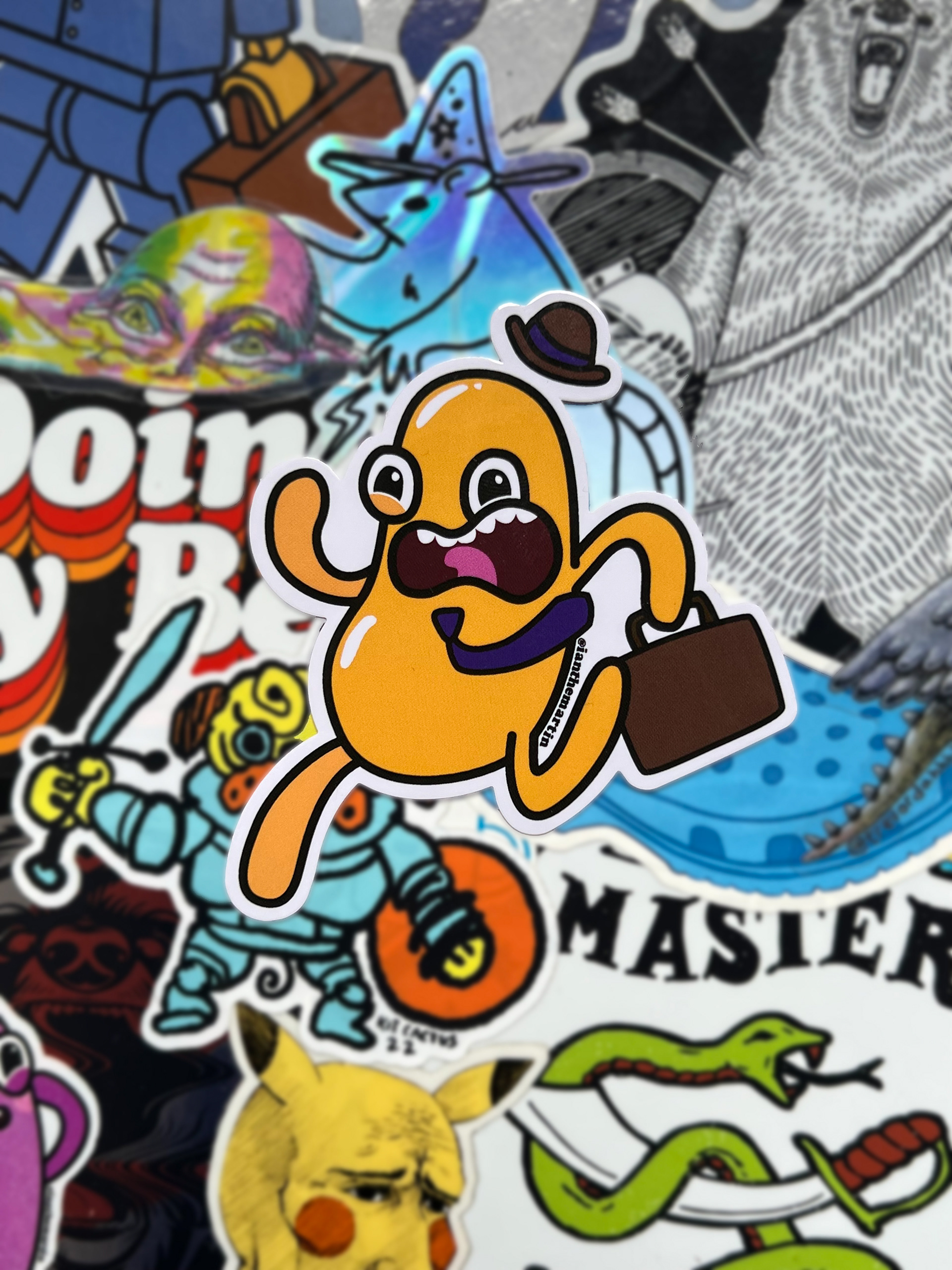
Business Jelly Bean Sticker
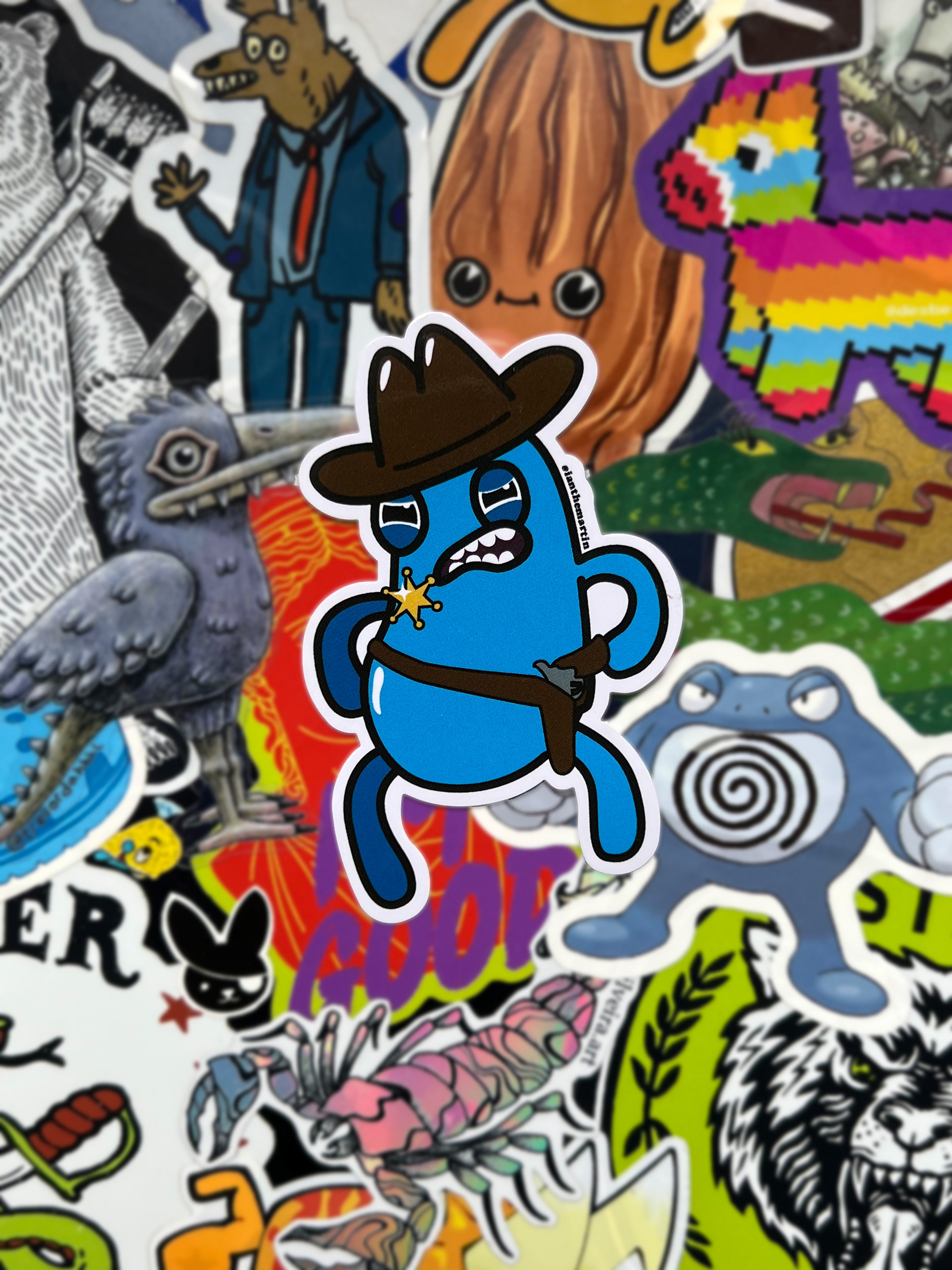
Cowboy Jelly Bean Sticker
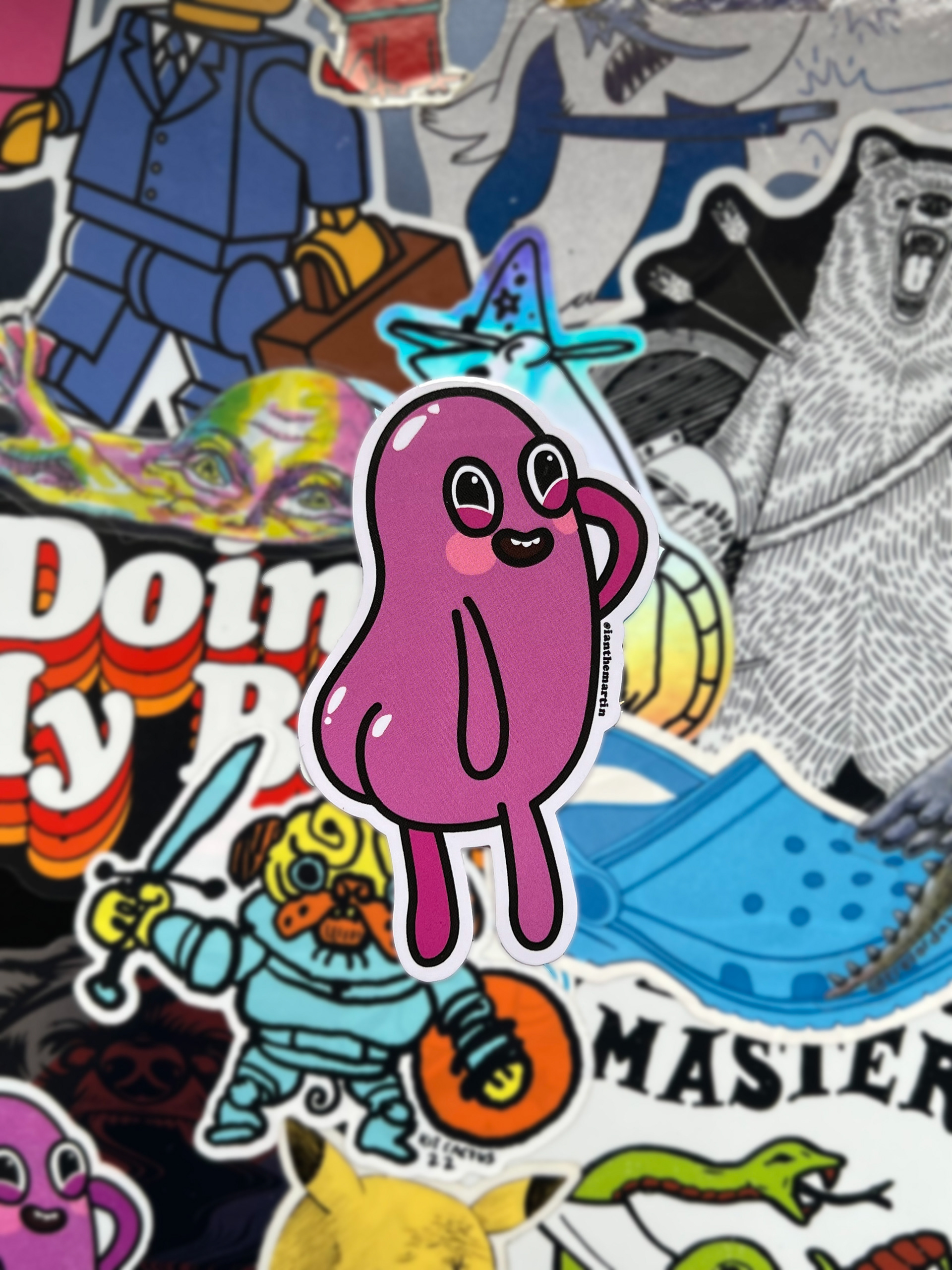
The Cutest Jelly Bean Sticker
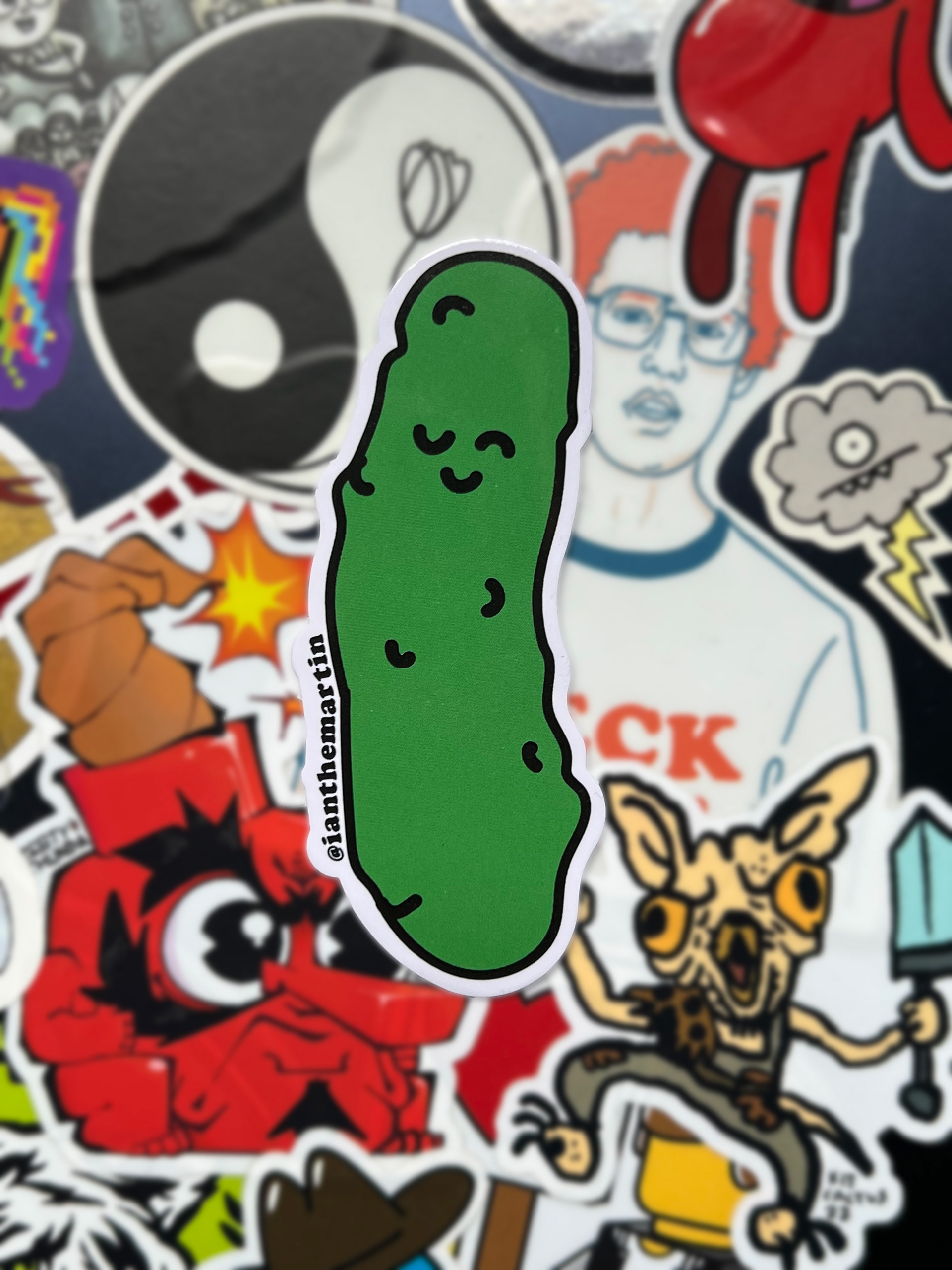
The Pickle Paddle Pickle Sticker
